Mohave Font
Free for Commercial UseAbout
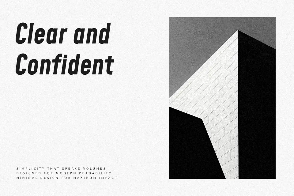
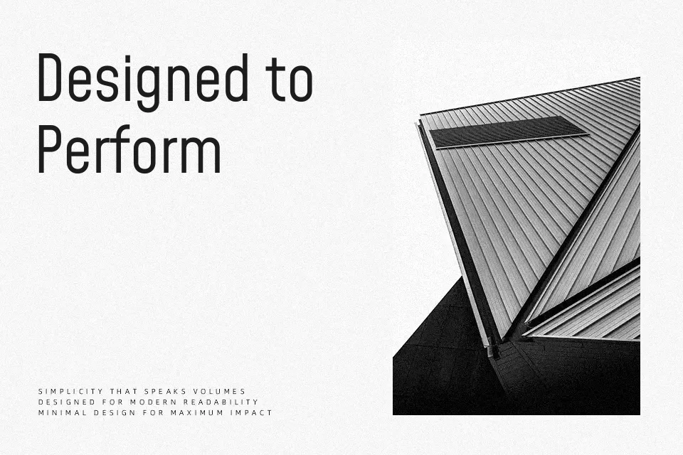
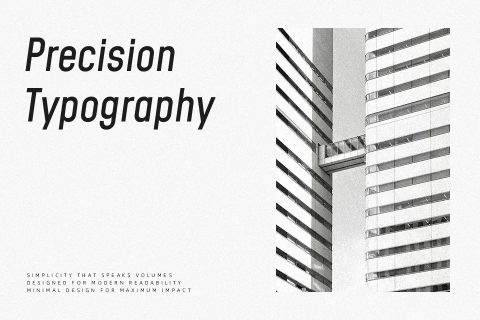
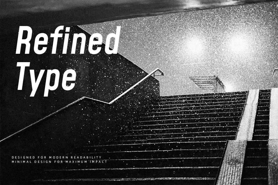
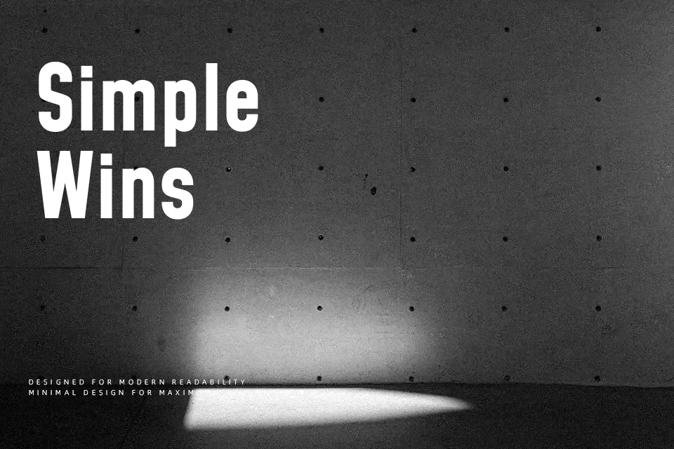
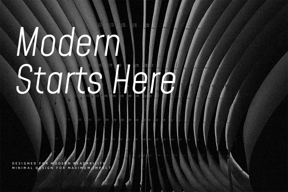
Originally conceived as an all-caps font in 2013, Mohave has evolved into a fully realized four-weight display family equipped with variable axis support. The typeface leans into a bold, geometric-adjacent structure, where nearly monolinear strokes maintain sharp definition even at massive scales. Its tight joints and unyielding verticality give it a distinctly technical, slightly masculine edge. This makes it highly effective for loud visual statements—think music festival posters, sports apparel wordmarks, or aggressive digital advertising campaigns. Because the letterforms prioritize visual weight over reading comfort, the font feels claustrophobic and rigid when forced into body copy or smaller secondary text. Compared to softer sans-serifs, Mohave is unapologetically direct and structural.
Best For: bold display typography, sports team apparel, aggressive digital campaigns, large-scale editorial headers
Not Ideal For: lengthy body text, traditional corporate documents, small secondary captions
Perfect for advertising, branding, and editorial, with a bold and display style.
License
Gallery