46 Inconspicuous Signs Font
Free for personal useAbout
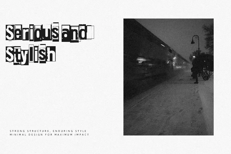
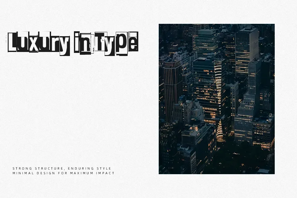
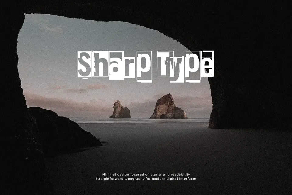
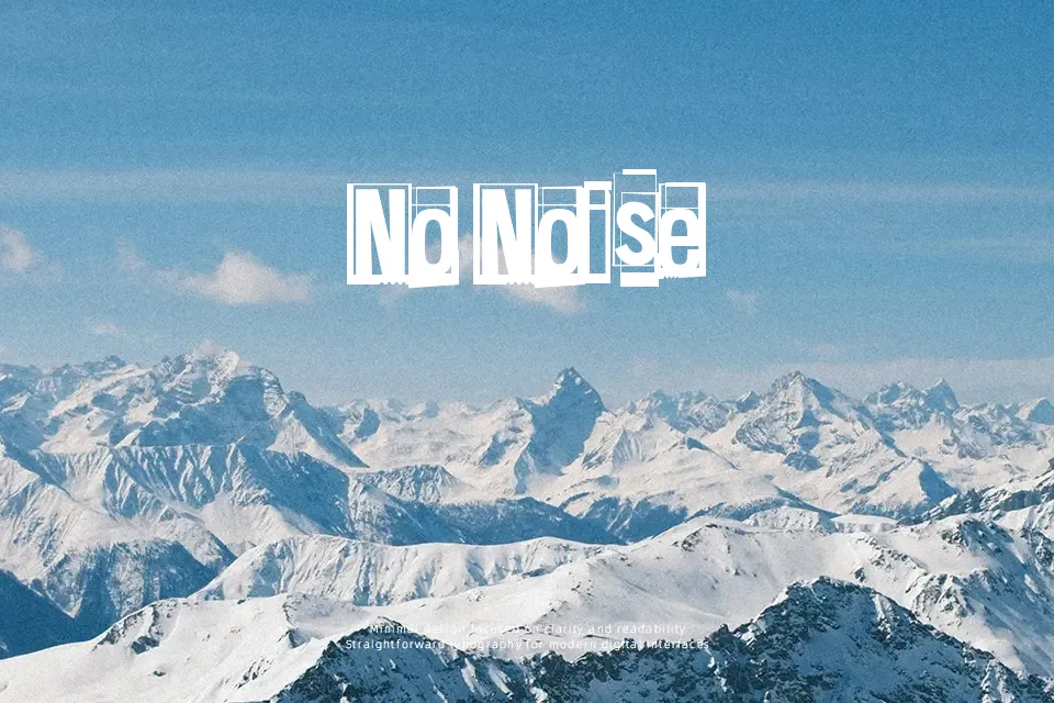
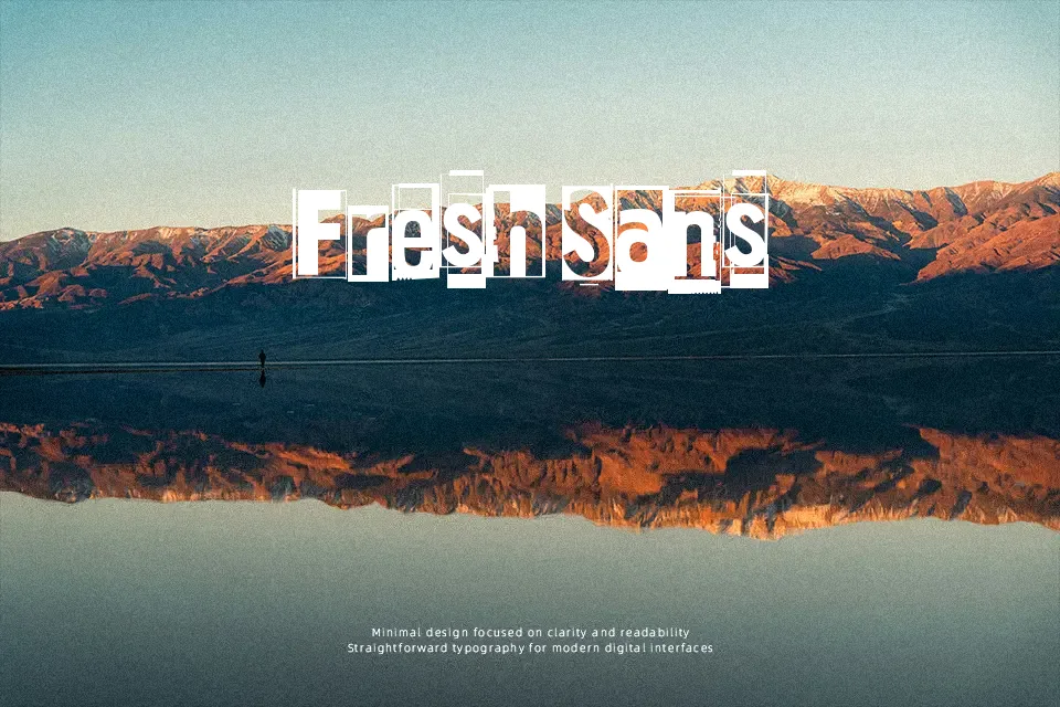
There’s a deliberate awkwardness to this font that actually works in its favor — the letterforms carry an uneven, stencil-meets-handmade quality that feels less constructed and more found, like signage scrawled on a warehouse wall. Spacing is loose and intentionally inconsistent, which adds to the gritty texture rather than detracting from it. It suits short bursts of text where visual personality matters more than readability at scale. Use it for band merch graphics, independent zine headers, or low-fi event promotions where a polished typeface would feel out of place. That said, legibility drops sharply at small sizes, and it carries essentially no formal utility — pairing it with clean body text is necessary if your layout needs balance.
Best For:
– Underground event flyers and concert posters
– Zine or self-published print covers
– Punk or DIY-themed branding headers
– Streetwear or alternative apparel graphics
Not Ideal For:
– Body text or any extended reading contexts
– Corporate, professional, or formal documents
– Small-size applications where legibility is critical
– Multilingual layouts requiring consistent character support
Perfect for branding, fashion, and headline, with a artistic and decorative style.
License
Gallery