321 Perfect Font
Free for personal useAbout
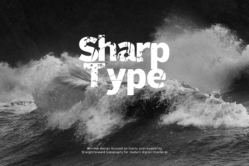
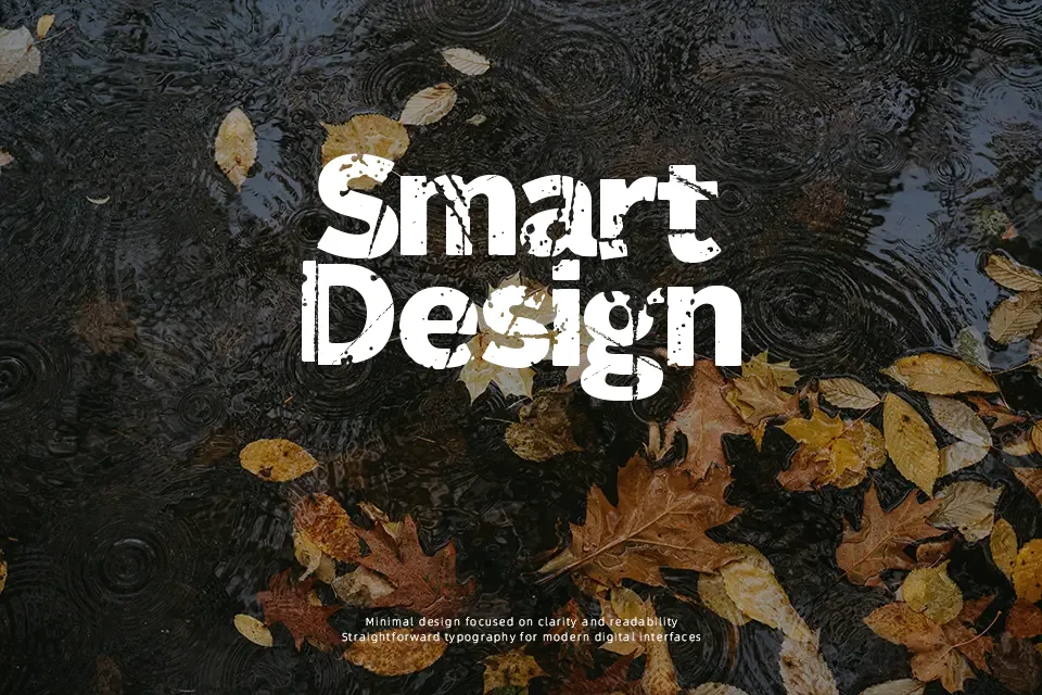
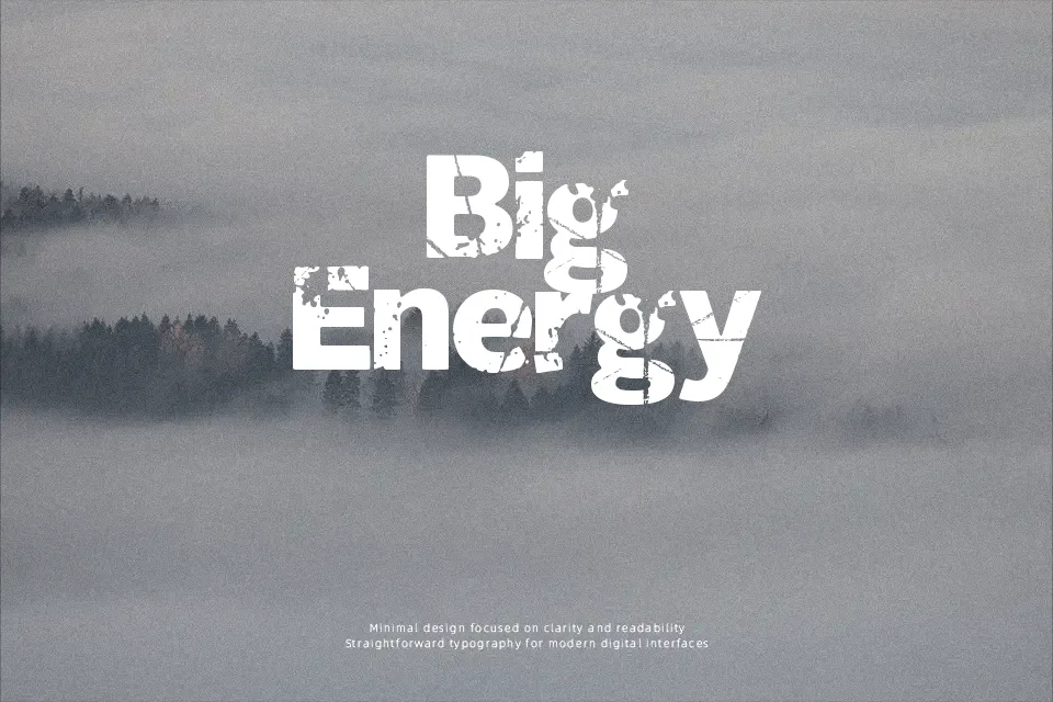
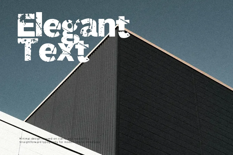
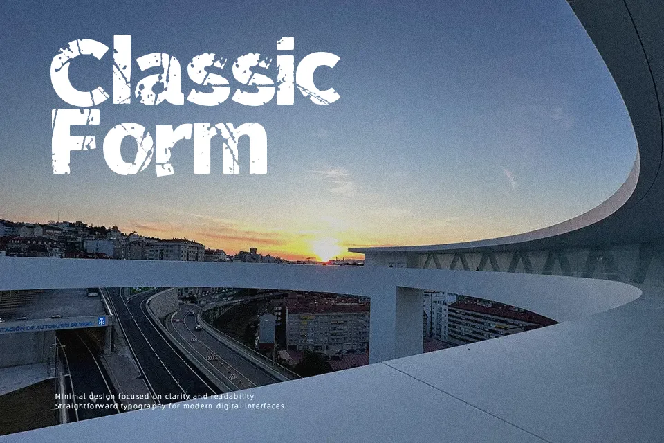
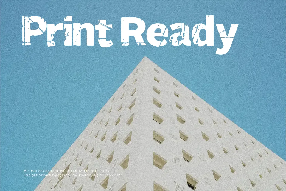
Sitting firmly in the “fancy/destroy” category, 321 Perfect carries rough, irregular strokes that lend it a raw, handcrafted energy. The letterforms feel deliberately imperfect — uneven weight distribution and textured edges give it visual tension that cleans fonts simply can’t replicate. That quality makes it a reasonable pick for band merchandise, event posters, or underground zine headers where grit signals authenticity. However, its distressed style becomes a liability in small sizes or dense layouts where stroke irregularities collapse into noise. It also lacks the neutrality needed for professional or corporate settings. Designers should treat it as a headline-only tool — one accent layer, not a full typographic system.
Best For:- Band or music event poster headlines
– Underground zine and fanzine cover titles
– Halloween or horror-themed social media graphics
– Edgy streetwear or skate brand logotypes
Not Ideal For:- Body text or extended reading at small sizes
– Corporate reports or formal business documents
– Wedding or luxury packaging where refinement is expected
– UI design requiring consistent stroke legibility
Perfect for halloween, headline, and logo, with a bold and decorative style.
License
Gallery