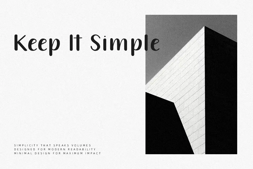
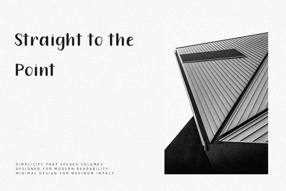
212 Queenie Sans Font
Free for personal useAbout
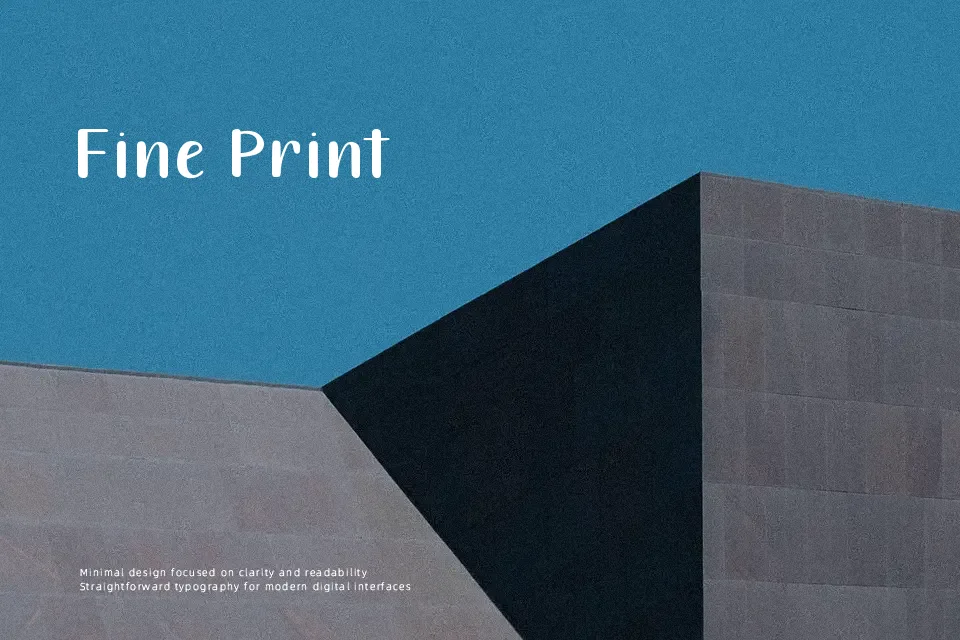
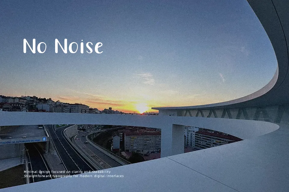
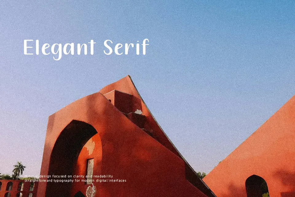
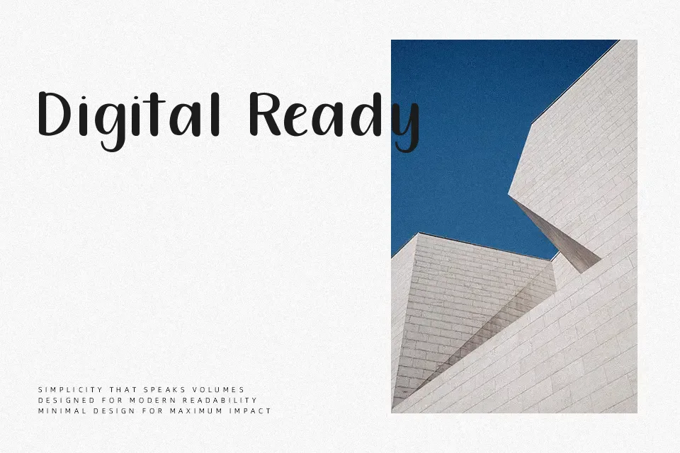
Structured around even stroke weights and open letterforms, 212 Queenie Sans sits comfortably between geometric precision and casual warmth. The spacing feels generous, which helps at larger display sizes but starts to feel loose when set small or in dense blocks. It carries a light, friendly energy that suits consumer-facing brands — think beverage labels, youth-oriented packaging, or event flyers where you want clean type without the coldness of corporate sans serifs. That said, it lacks the weight range and fine-tuned spacing needed for editorial body copy or anything requiring typographic hierarchy beyond one or two sizes. Best deployed as a headline or accent layer rather than a workhorse text face.
Best For:
– lifestyle product packaging and label headers
– social media post titles and story graphics
– casual event poster headlines
– youth-focused branding and logo lockups
Not Ideal For:
– long-form body text or running copy
– formal corporate documents or reports
– typographic systems requiring multiple weight variants
– small-size UI labels where spacing feels too open
Perfect for branding, headline, and packaging, with a clean and geometric style.
License
Gallery