20 db Font
Free for personal useAbout
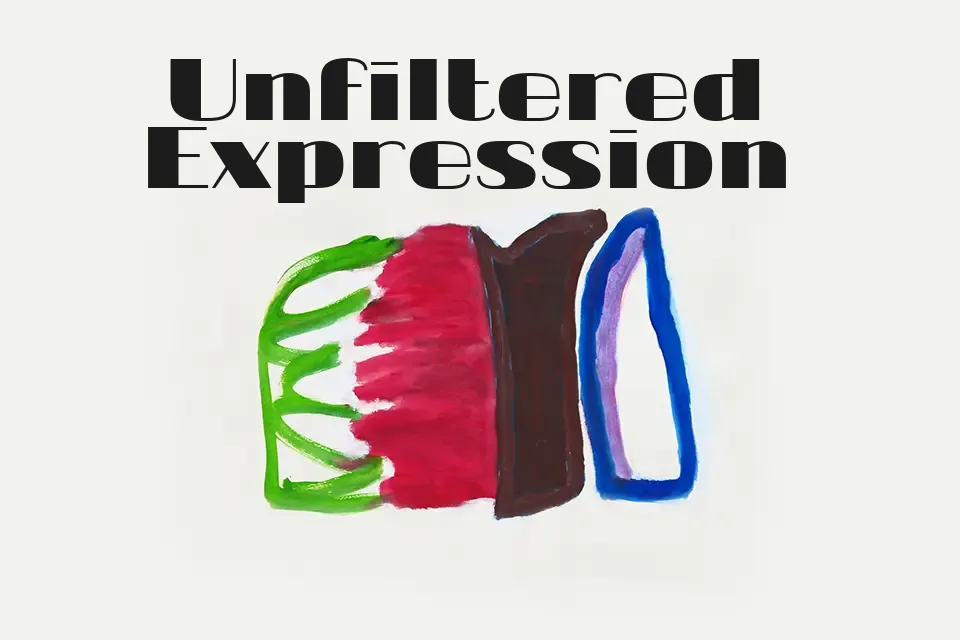
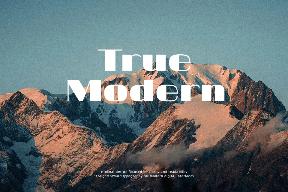
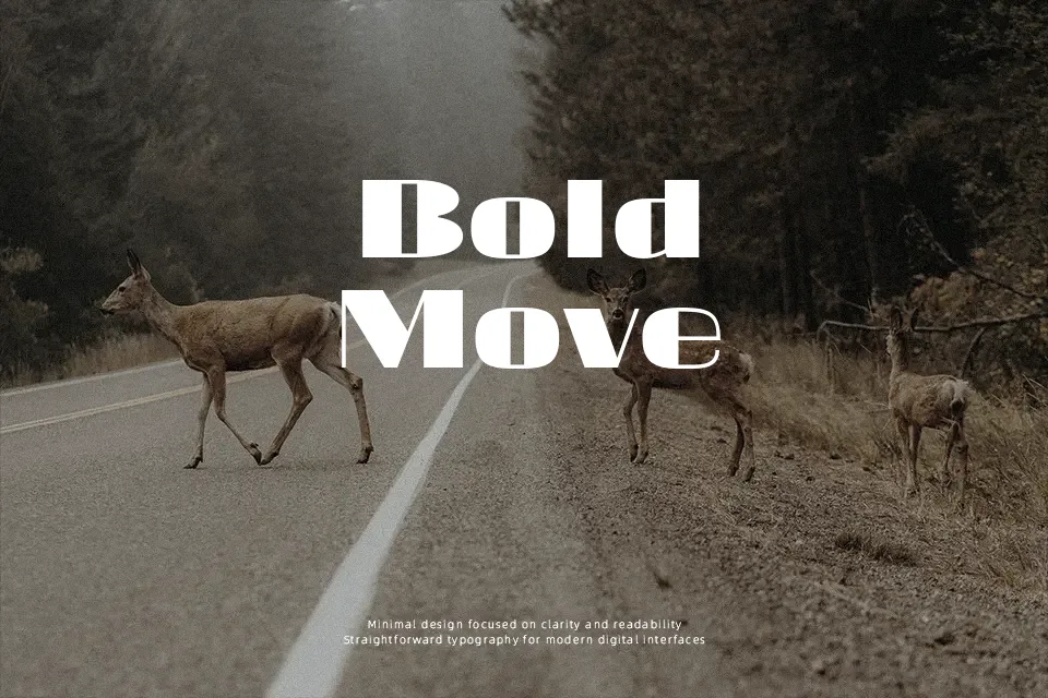
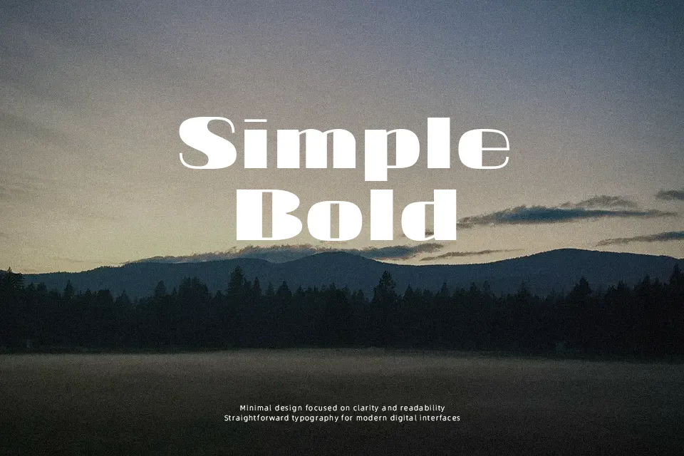
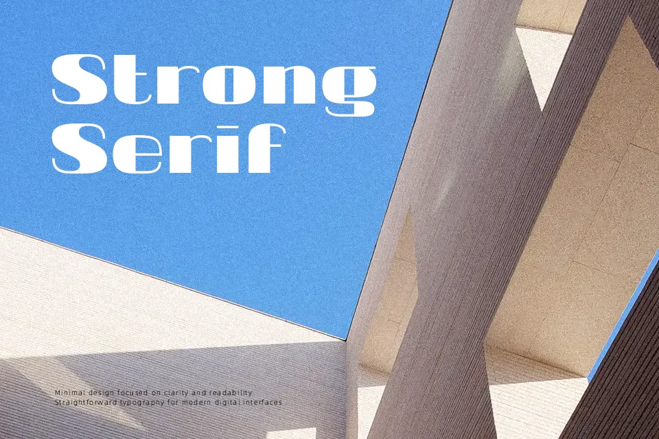
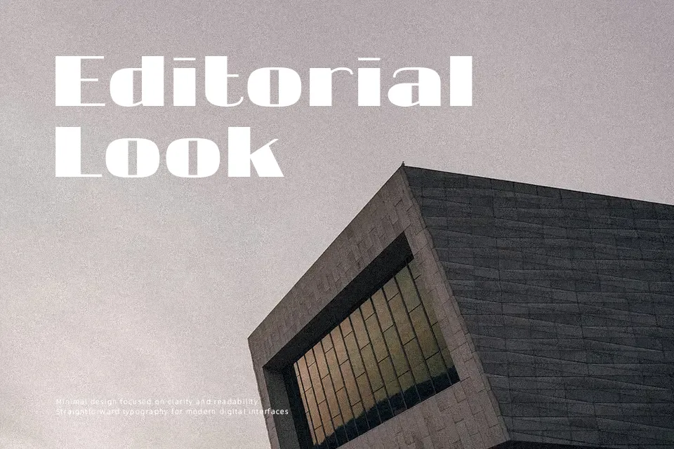
There’s a deliberately unrefined quality to 20 db Font — strokes feel drawn rather than constructed, with uneven weight distribution that reads as intentional rather than accidental. That looseness gives it strong presence in headline applications where the goal is attitude over clarity. It carries a music or street-culture vibe that suits band merchandise, event posters, and niche zine covers reasonably well. However, the irregular letterforms struggle at small sizes, and extended body text becomes uncomfortable to read quickly. Where it earns its keep is single-line statements or short titles where the texture itself communicates tone. Designers wanting something between graffiti and handwritten casual will find it usable, though spacing consistency may require manual kerning adjustments.
Best For:
– Music event flyers and concert poster headlines
– Underground or indie band logo wordmarks
– Edgy social media graphic headers
– Zine covers and streetwear label accents
Not Ideal For:
– Body text or anything requiring sustained readability
– Corporate or professional branding contexts
– Small-size print applications like business cards
– Multilingual or mixed-script layouts
Perfect for advertising, logo, and music, with a bold and display style.
License
Gallery