19 000 Paarmaa Font
Free for personal useAbout
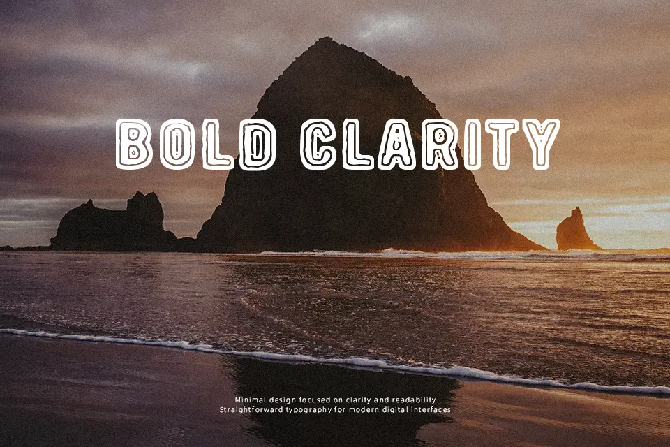
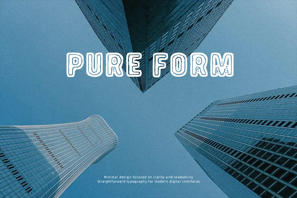
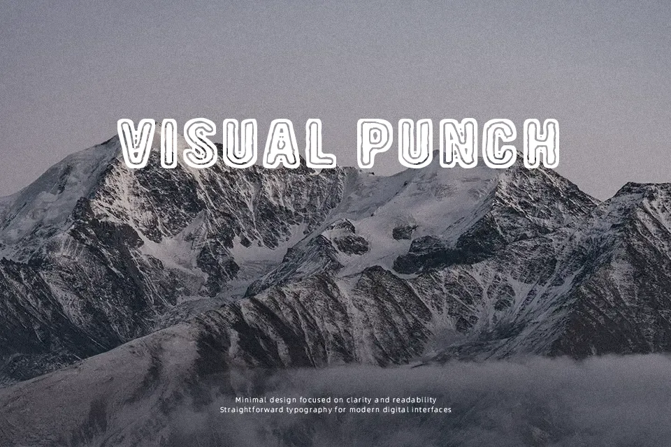
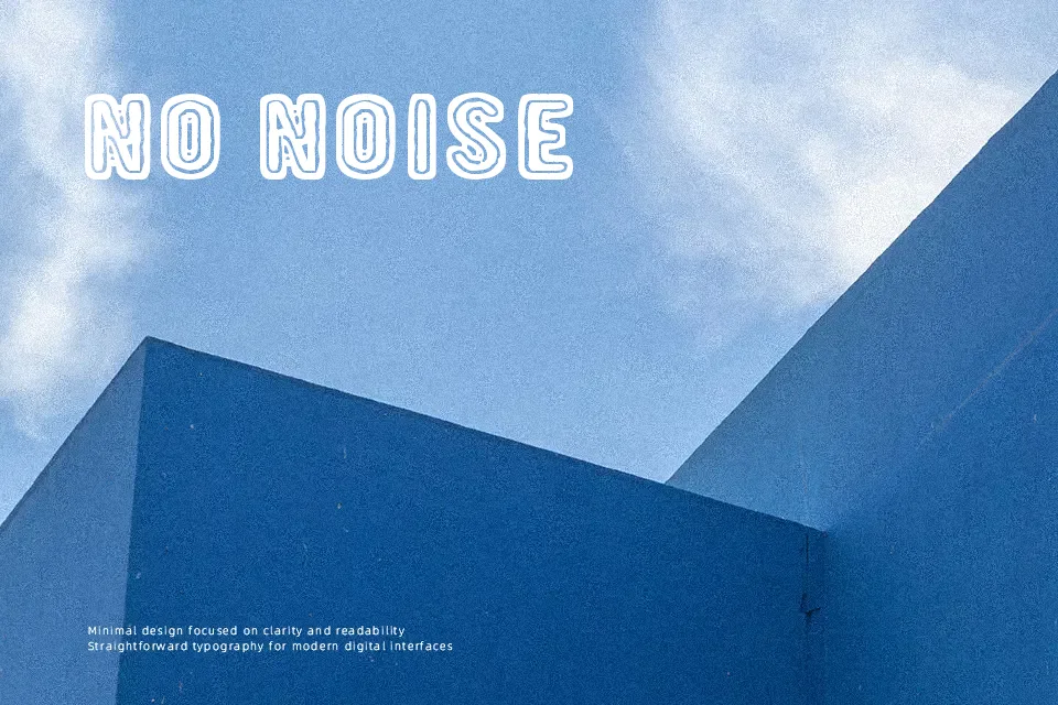
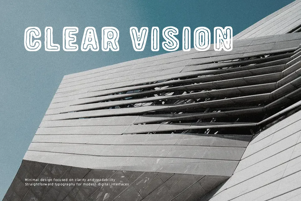
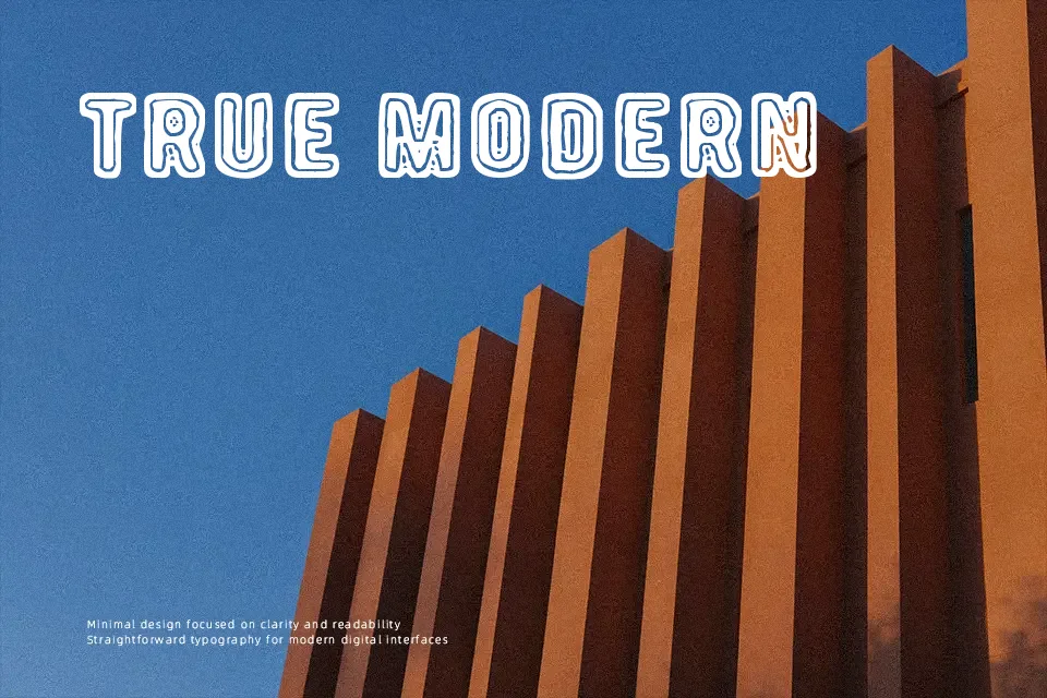
At first glance, 19 000 Paarmaa reads less like a typeface and more like a deliberate visual statement. The letterforms carry an irregular, handcrafted quality — strokes feel intentionally unpolished, with inconsistent weight distribution that gives the font a lo-fi, zine-like energy. Spacing is tight in places and loose in others, which adds to its unpredictable rhythm. This works surprisingly well for music album covers, experimental poster headers, or artist project titles where conventional polish would feel out of place. That said, legibility suffers fast: use it beyond a few words and reading becomes effortful. It’s also a poor fit for any context requiring professional authority. Best treated as a display accent, not a workhorse.
Best For:
– underground music event posters or album artwork headers
– zine covers and experimental print editorial titles
– artist or creative studio branding with a raw aesthetic
– short headline treatments in alternative fashion lookbooks
Not Ideal For:
– body text or any extended reading context
– corporate or institutional identity work
– digital UI where clarity is essential
– multilingual or mixed-script layouts
Perfect for branding, editorial, and fashion, with a artistic and decorative style.
License
Gallery