Zen Kurenaido Font
Free for Commercial UseAbout
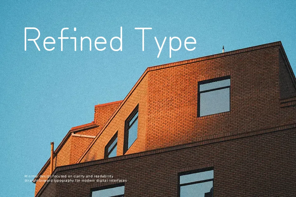
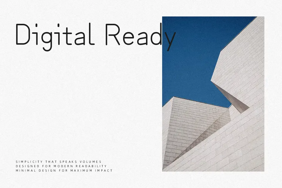
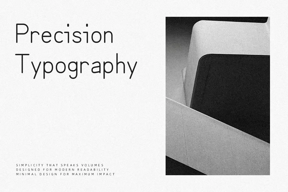
Zen Kurenaido blends the looseness of handwriting with the clarity of a neat sans serif skeleton. Its strokes are light, evenly spaced, and free of calligraphic flares, so text looks like careful ballpoint pen notes rather than decorative lettering. This gives UI labels, app interfaces, and small editorial side comments a gentle, approachable tone without sacrificing legibility in longer reading. It shines when you need Japanese and Latin text to coexist quietly in the same layout, especially in minimalist or tech-oriented designs. On the other hand, the single light weight lacks the punch needed for bold posters, loud branding, or tiny legal text. If you like the vibe of human-written annotations more than stiff system fonts, this family slots in naturally.
Best For:
subtle japanese-english ui text
lightweight app interfaces and tooltips
quiet editorial sidebars and annotations
Not Ideal For:
heavy impact logos or loud headlines
very small legal copy or dense paragraphs
high-contrast luxury branding layouts
Perfect for editorial, headline, and social media, with a calm and handwritten style.
License
Gallery