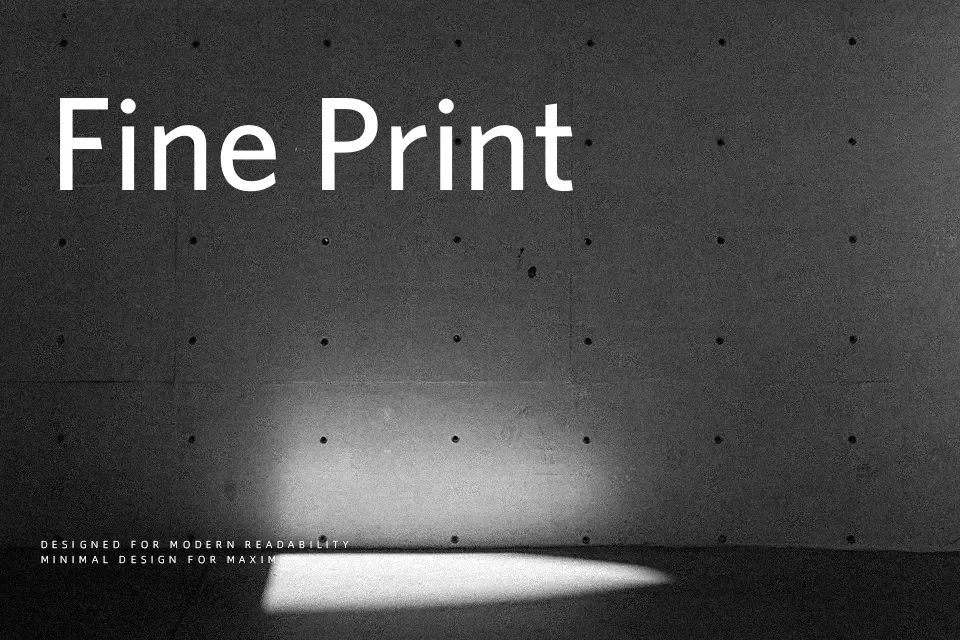
Whitney Font
Free for personal useAbout
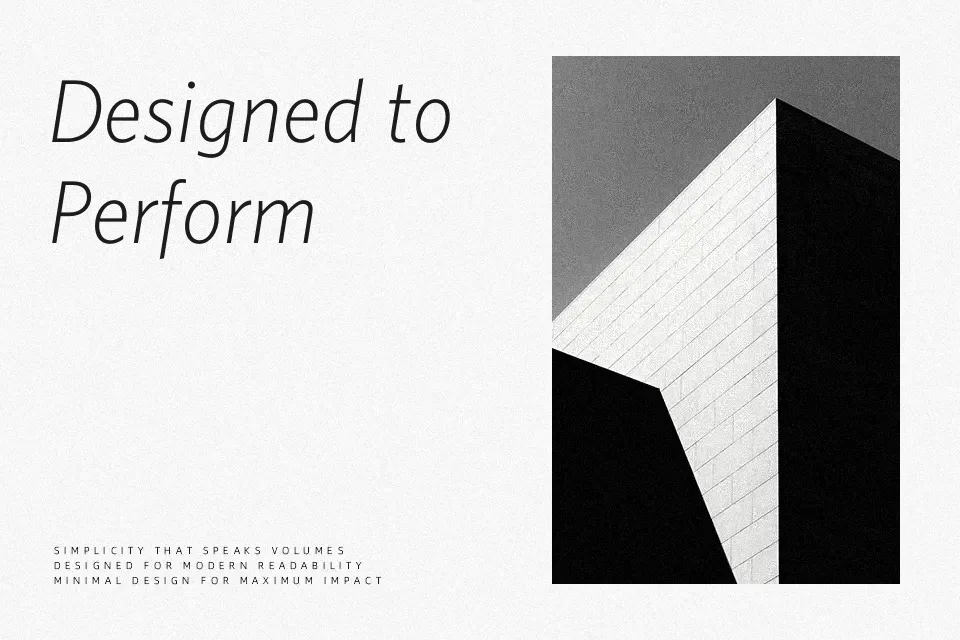
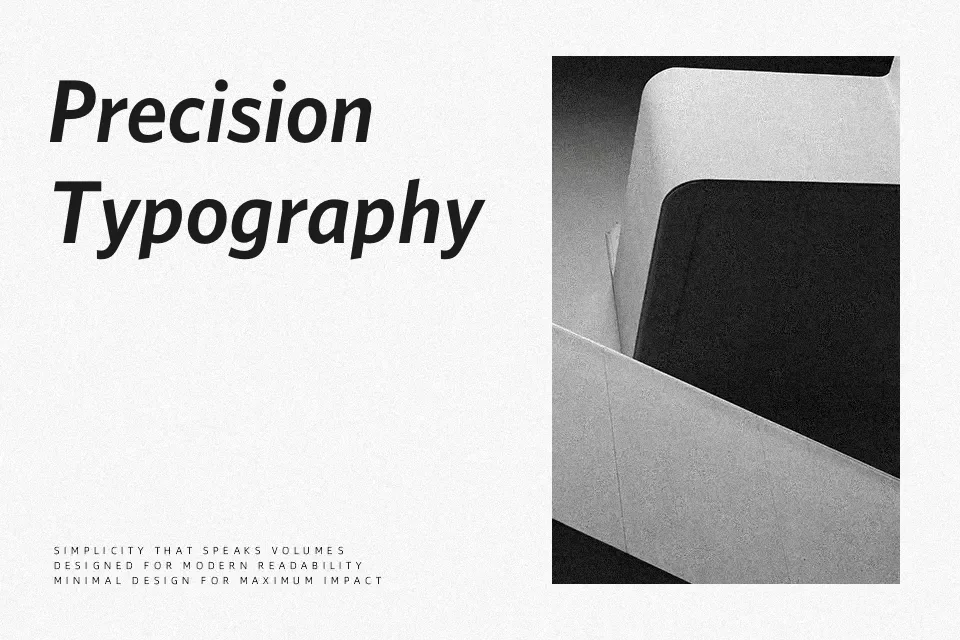
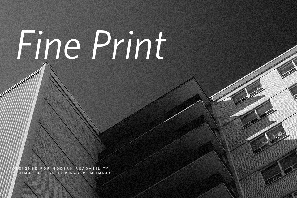
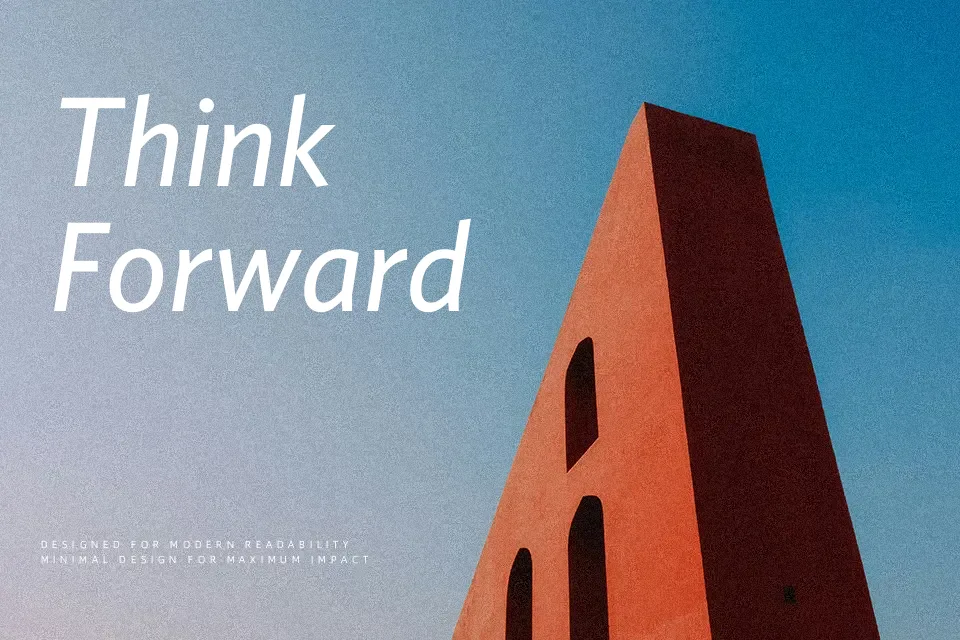
Originally commissioned in 1996 for the Whitney Museum of American Art in New York, the Whitney Font Family is a masterclass in functional, humanist sans-serif design. Created by Tobias Frere-Jones, this typeface intentionally bridges the gap between sturdy American gothics and highly legible humanist forms. It features exceptionally open counters, balanced geometric proportions, and a distinct semi-crossed ‘W’, all of which contribute to its remarkably clear, compact energy that performs flawlessly across different sizes.
Because of its neutral yet friendly aesthetic and massive structural versatility, it is an incredibly effective choice for dense editorial magazines, modern corporate branding, and clear digital user interfaces. However, its straightforward, institutional neutrality means it is not well-suited for highly decorative or romantic contexts, such as boutique floral branding or vintage wedding invitations, where it will simply feel too corporate and dry. It remains one of the most reliable workhorses in modern typography.
Best For:
– dense editorial magazines
– clear digital user interfaces
– modern corporate branding
– institutional signage systems
Not Ideal For:
– romantic wedding invitations
– decorative boutique branding
– vintage-inspired packaging
Perfect for body text, branding, and editorial, with a classic and geometric style.
License
Gallery