Waiting for the Sunrise Font
Free for Commercial UseAbout
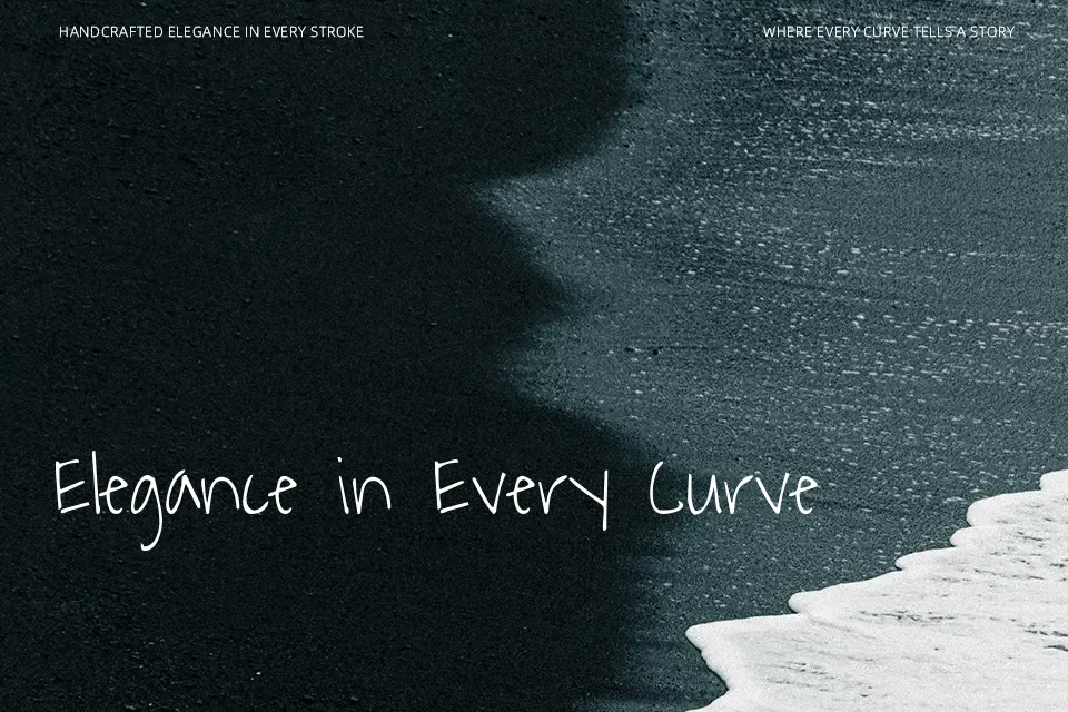
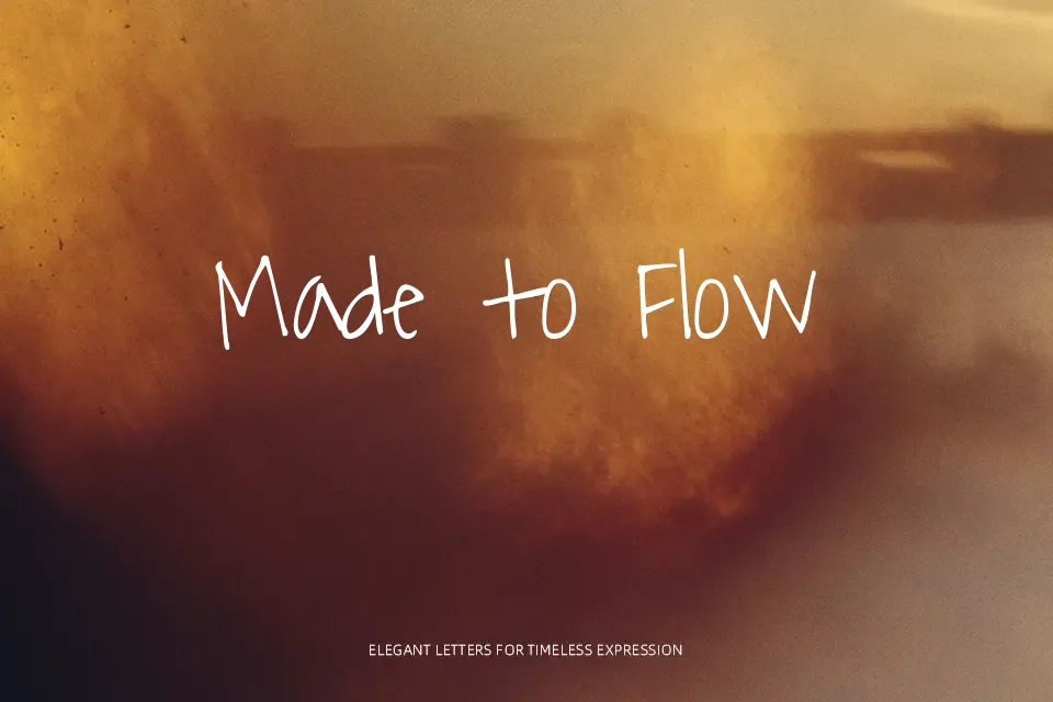
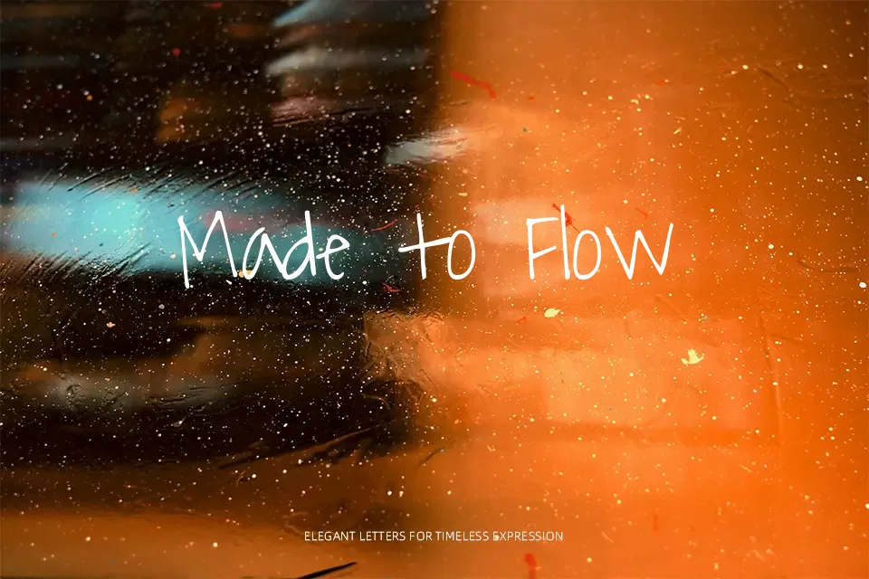
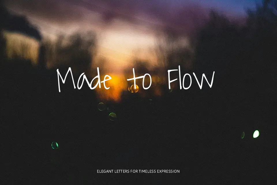
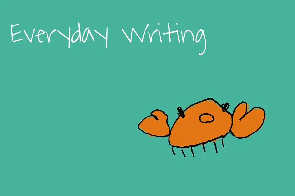
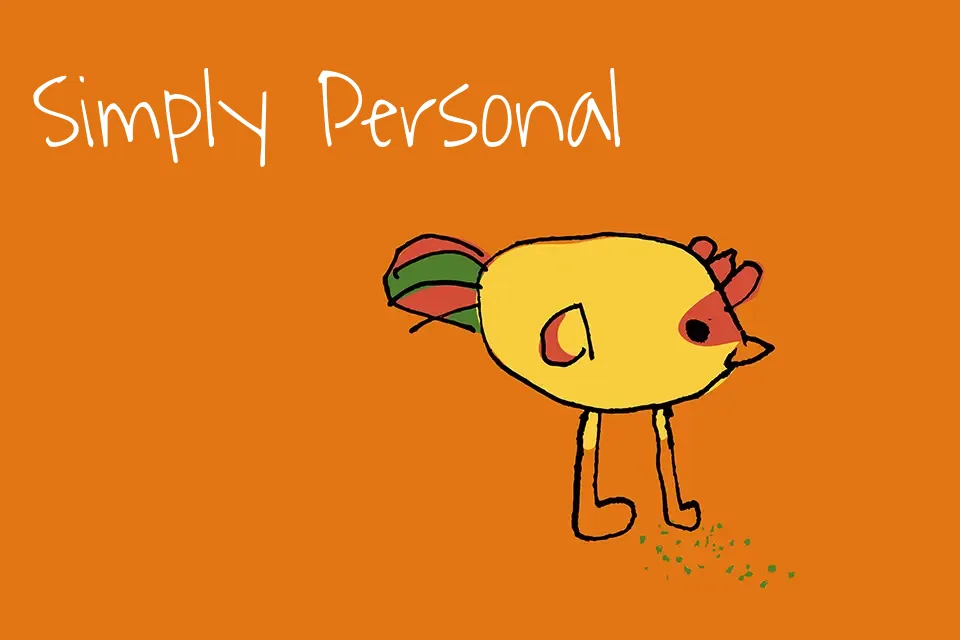
Waiting for the Sunrise is a handwritten script with thin, slightly wobbly strokes, generous x-height, and wide, open counters that read like fast but careful notebook lettering. The letters lean casually with irregular curves and playful joins, so text feels light, informal, and a bit whimsical rather than polished or formal. It shines in short phrases, such as product names, quote images, or friendly headers, where you want handwriting energy without losing clarity. For long paragraphs, small captions, or strict corporate layouts, the uneven rhythm can become tiring, so you are better off pairing it with a clean sans serif body font instead.
Best For:
casual branding wordmarks and taglines
social media quote images and overlays
playful poster titles and event flyers
handwritten-style headings in blogs or portfolios
Not Ideal For:
dense body text or long-reading layouts
formal corporate reports or legal documents
very small UI labels or navigation text
highly technical diagrams that need strict precision
Perfect for branding, headline, and logo, with a creative and handwritten style.
License
Gallery