Trop Flou Font
Free for personal useAbout
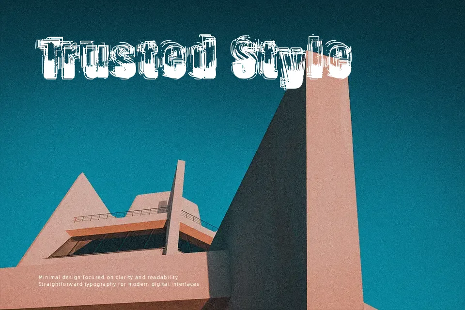
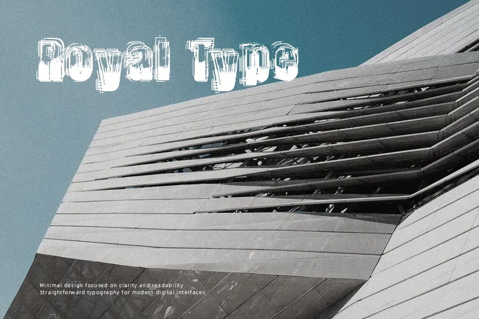
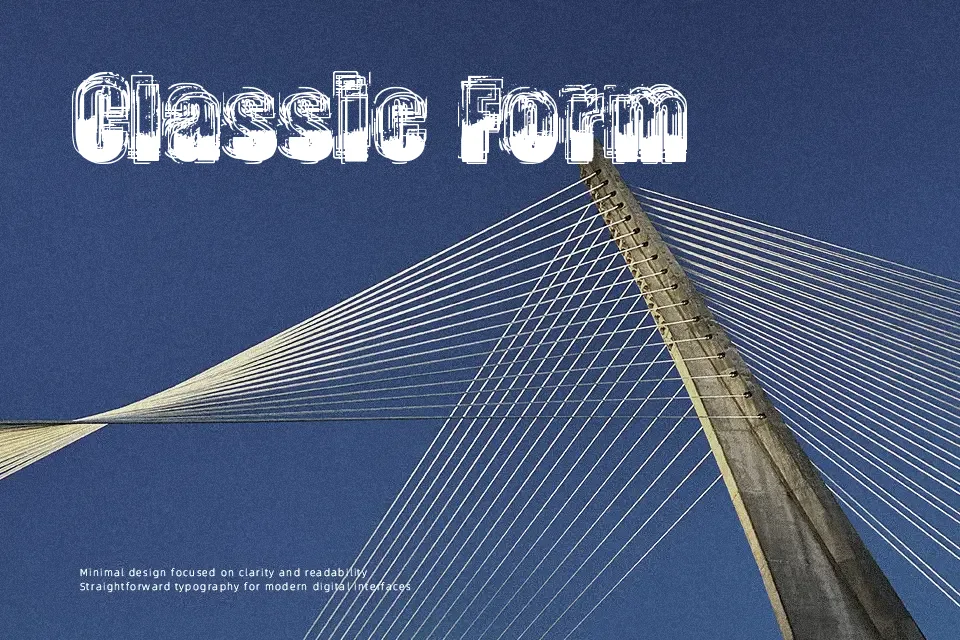
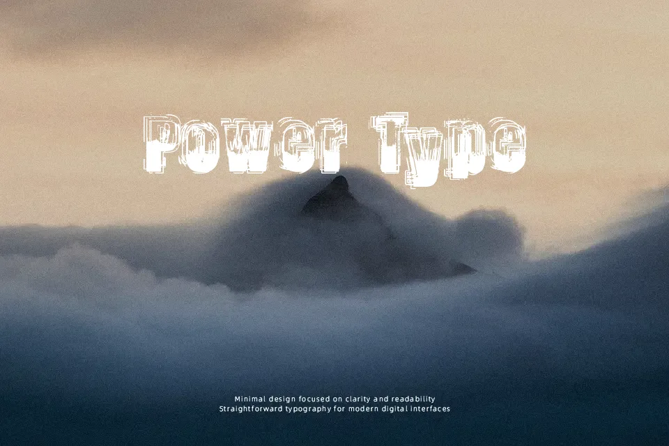
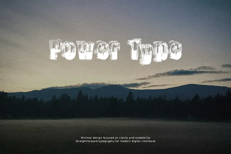
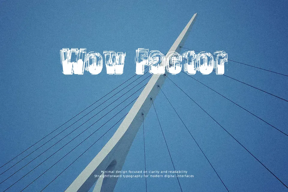
Trop Flou Font relies on severe edge erosion and fractured contours that demand generous sizing to preserve glyph recognition. The letterforms showcase irregular stroke weights marked by porous, decaying borders and compressed inner counters. Character spacing remains relatively snug, producing a dense visual rhythm that emphasizes the chaotic silhouette of each glyph. This aggressive degradation creates remarkable atmosphere for alternative band merchandise, horror film graphics, and editorial title cards. However, the typeface becomes entirely illegible in continuous body text, as fine fissures collapse into visual static at smaller settings. Restricting the design to prominent headline treatments ensures that its raw textural qualities command attention without frustrating the reader.
Best For: horror film graphics, alternative band merchandise, music festival posters
Not Ideal For: continuous body text, mobile interface labels, dense editorial layouts
Perfect for film, headline, and music, with a dark and decorative style.
License
Gallery