Torment Macabre Font
Free for personal useAbout
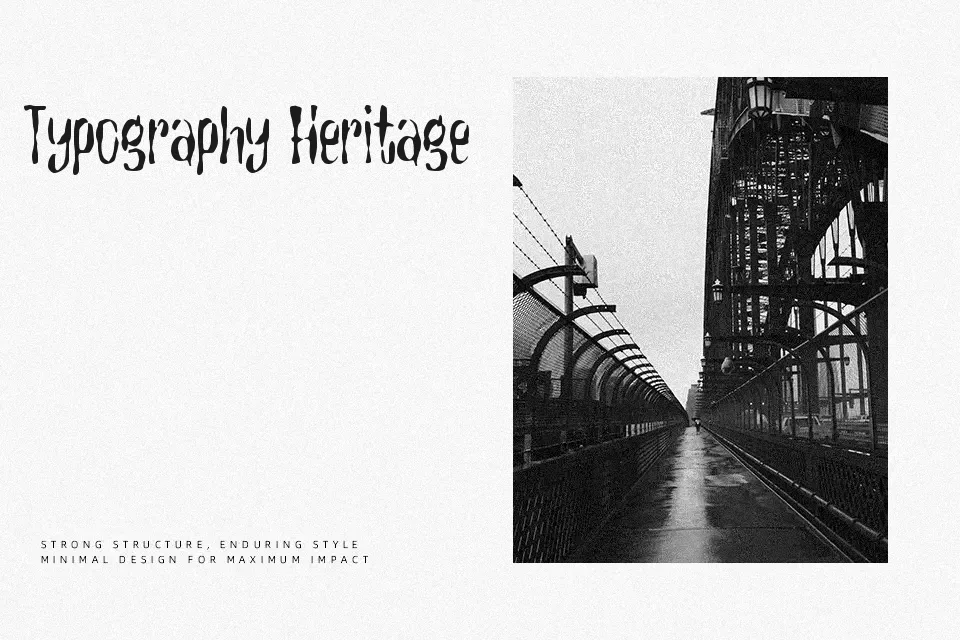
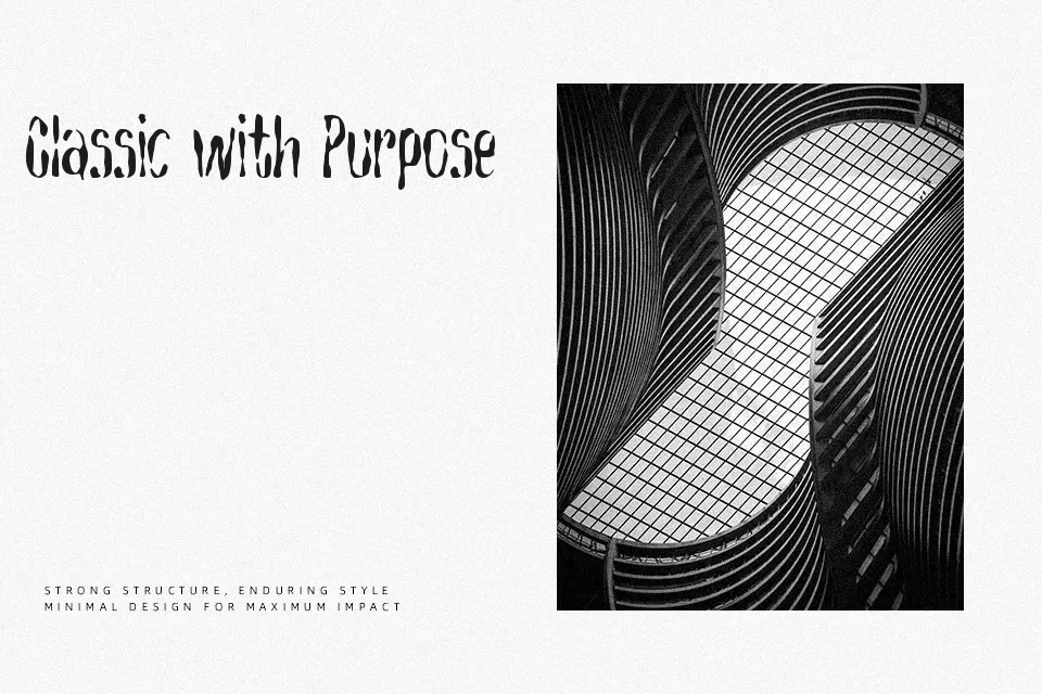
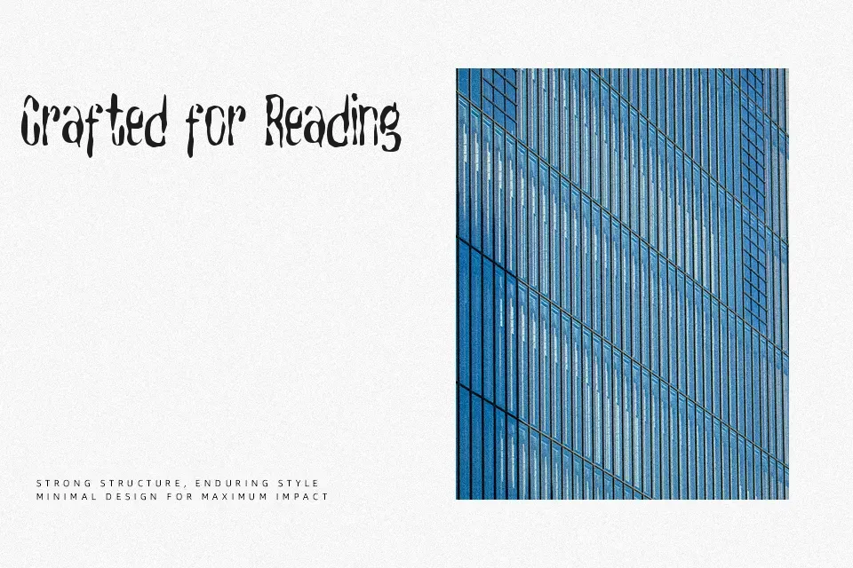
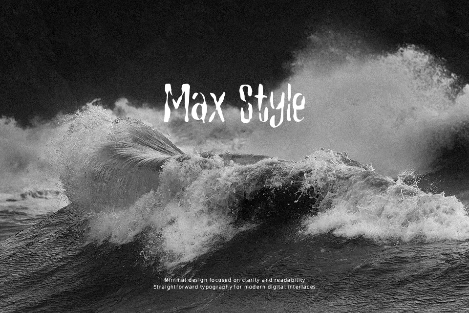
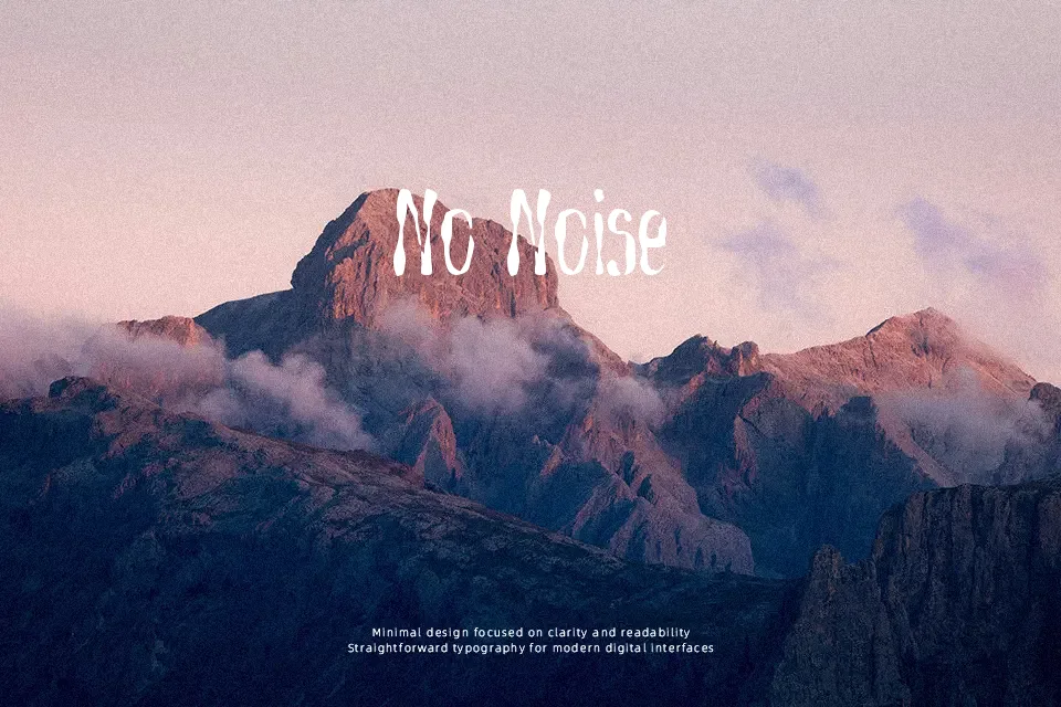
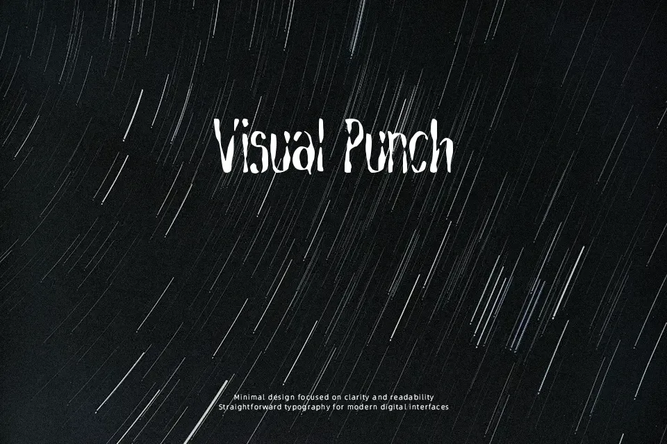
Torment Macabre Font exhibits uneven character proportions defined by aggressive, visceral strokes that taper into spiky terminal extensions. The glyph architecture combines narrow widths with tight default spacing, creating an abrasive visual rhythm reminiscent of erratic brushwork. While capitals maintain commanding presence on video game packaging, haunted attraction signage, and apparel graphics, the heavy, irregular contours compromise legibility when set below headline scales. The letterforms become particularly difficult to decipher within continuous body text, where dense counters tend to fill in rapidly. This decorative design performs best when deployed as isolated title lettering with generous surrounding space to preserve outline clarity.
Best For: horror video game packaging, haunted attraction banners, apparel graphics, dark music festival posters
Not Ideal For: long paragraph text, small interface labels, editorial body copy, corporate stationery
Perfect for gaming, halloween, and headline, with a creative and brush style.
License
Gallery