Tokyo City Pop Font
Free for personal useAbout
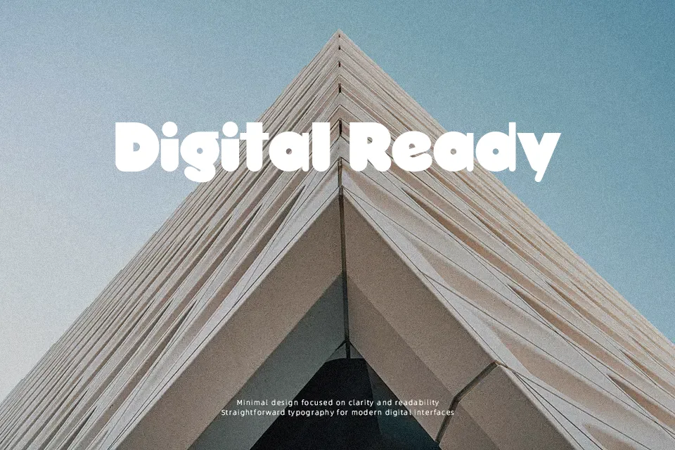
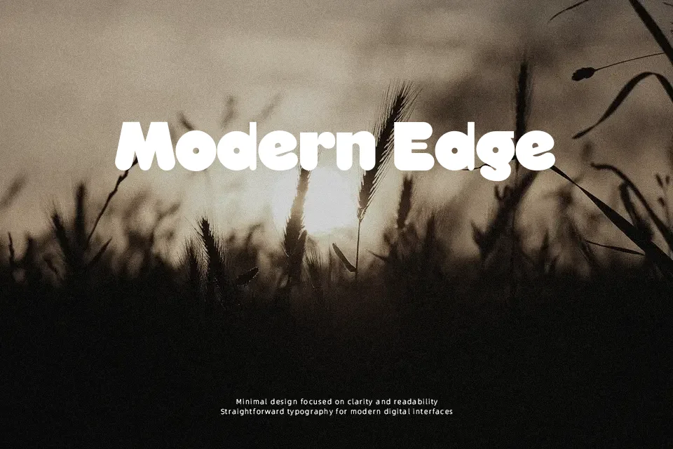
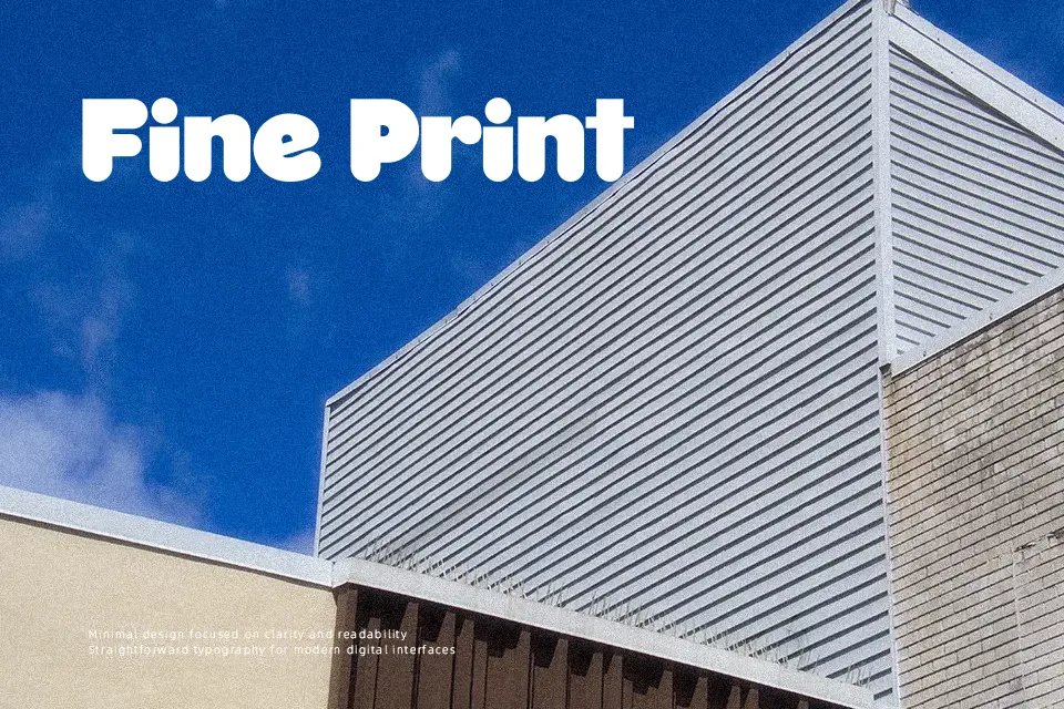
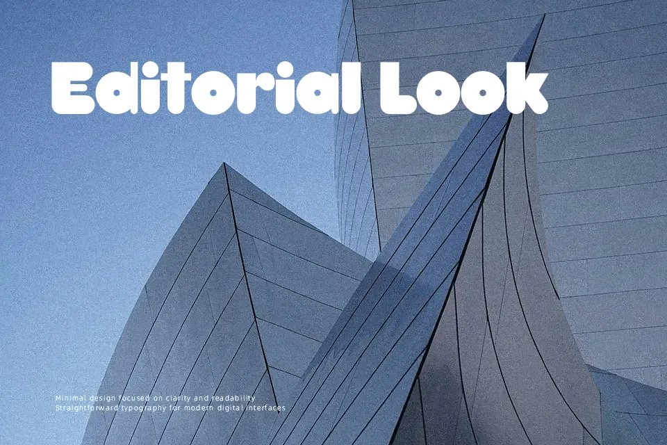
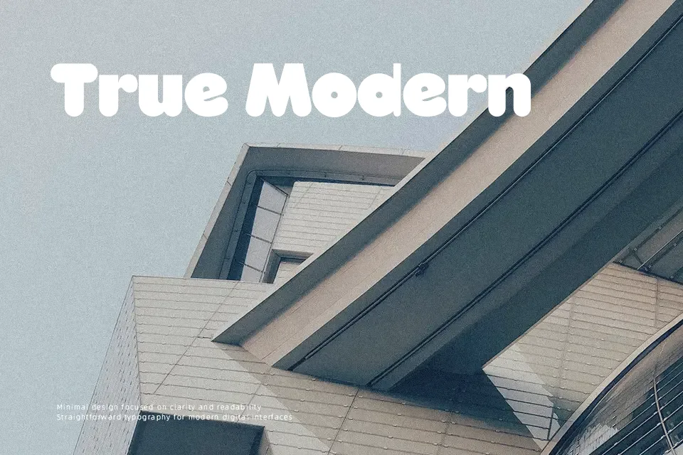
Tokyo City Pop Font commands attention through heavy stroke weights, softened terminals, and an upbeat tempo. The characters maintain consistent line thickness across uppercase and lowercase sets, creating uniform proportions that sustain clarity across compact title arrangements. Wide interior counters prevent dense glyphs from clogging, while narrow letter spacing keeps wording tightly unified on merchandise labels and restaurant signage. However, the exaggerated bulk reduces comfort during extended reading, making small interface captions illegible. As a practical judgment, the design succeeds most convincingly at generous display sizes where nostalgic geometry can take center stage.
Best For: retro poster headlines, snack packaging labels, music event banners, apparel graphic prints
Not Ideal For: long body paragraphs, mobile interface labels, legal documents, dense editorial layouts
Perfect for headline, logo, and music, with a bold and cartoon style.
License
Gallery