Their Child Font
Free for personal useAbout
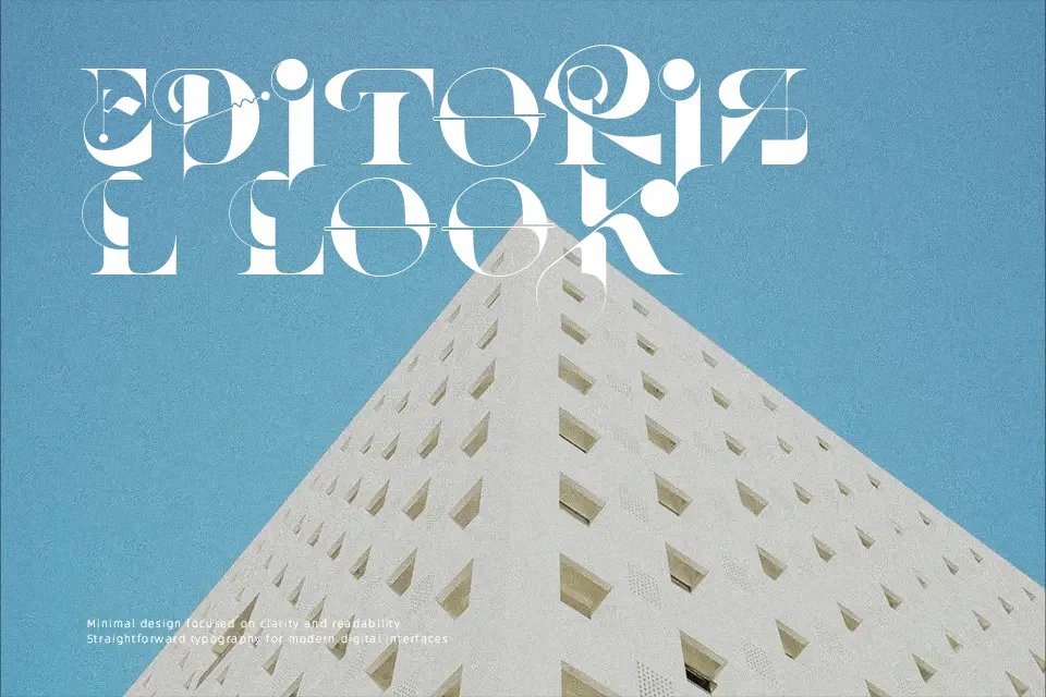
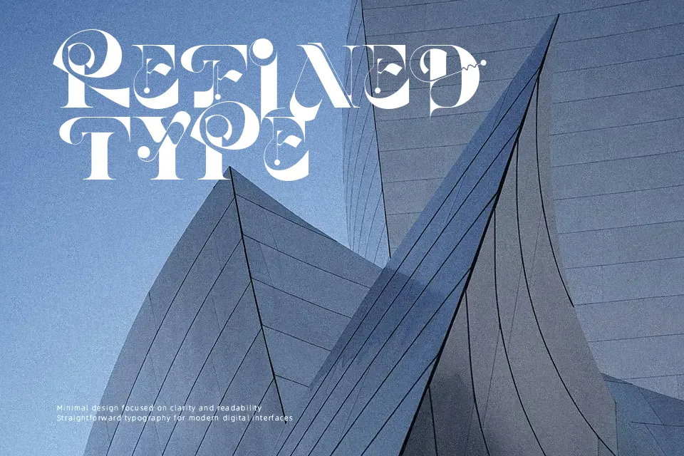
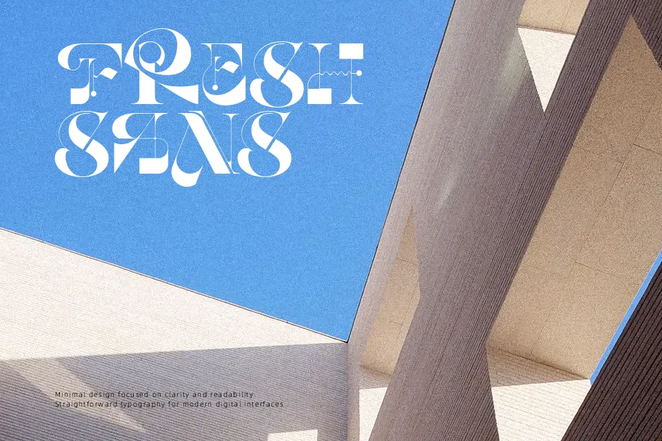
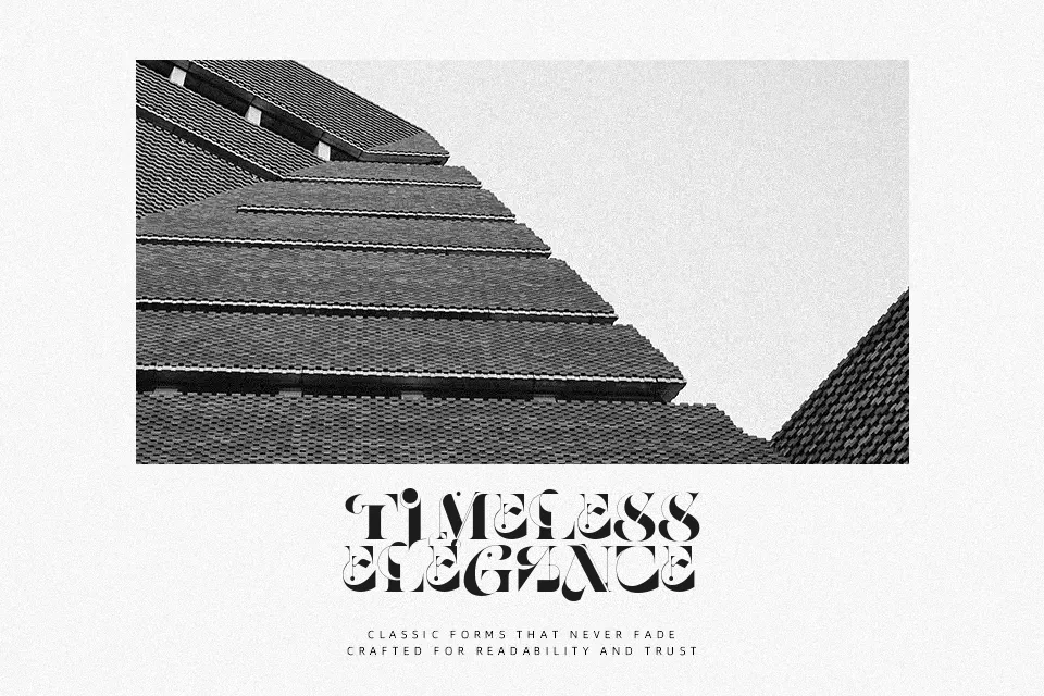
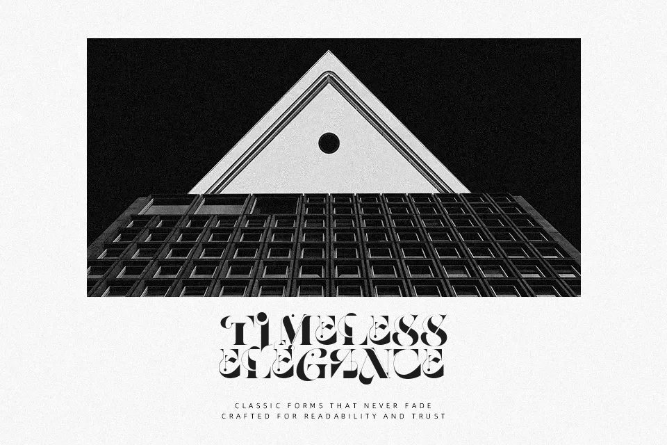
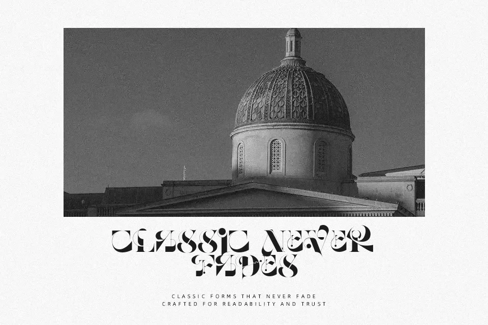
Their Child Font combines rigid geometric structures with sliced terminals and high stroke contrast across all capitals. The letterforms feature segmented incisions and compact horizontal proportions, giving each character an aggressive, industrial silhouette. Tight letter spacing enhances cohesion across brief display arrangements, though it limits visual breathing room in crowded compositions. While glyph legibility remains sharp in title sequences, packaging headers, and electronic music banners, decorative cuts quickly lose definition at reduced scales. As a practical judgment, the intricate stroke cutouts degrade clarity within continuous body text. Consequently, the typeface remains unsuited for multi-line editorial passages or dense technical manuals.
Best For: sci-fi movie title sequences, technology magazine covers, futuristic apparel graphics
Not Ideal For: dense paragraph text, small interface labels, formal legal documentation
Perfect for film, headline, and logo, with a dramatic and display style.
License
Gallery