The Drunk Designer Font
Free for personal useAbout
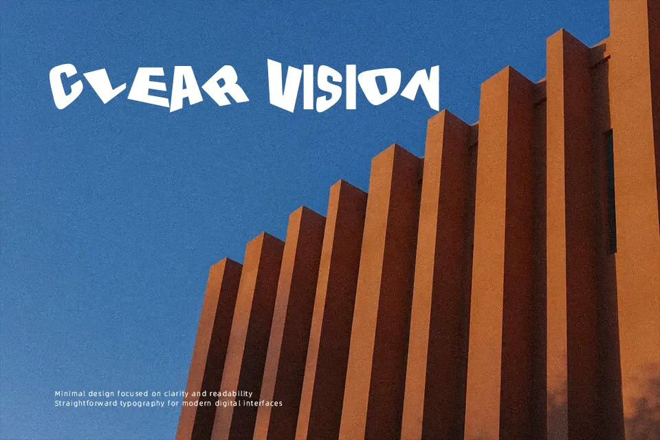
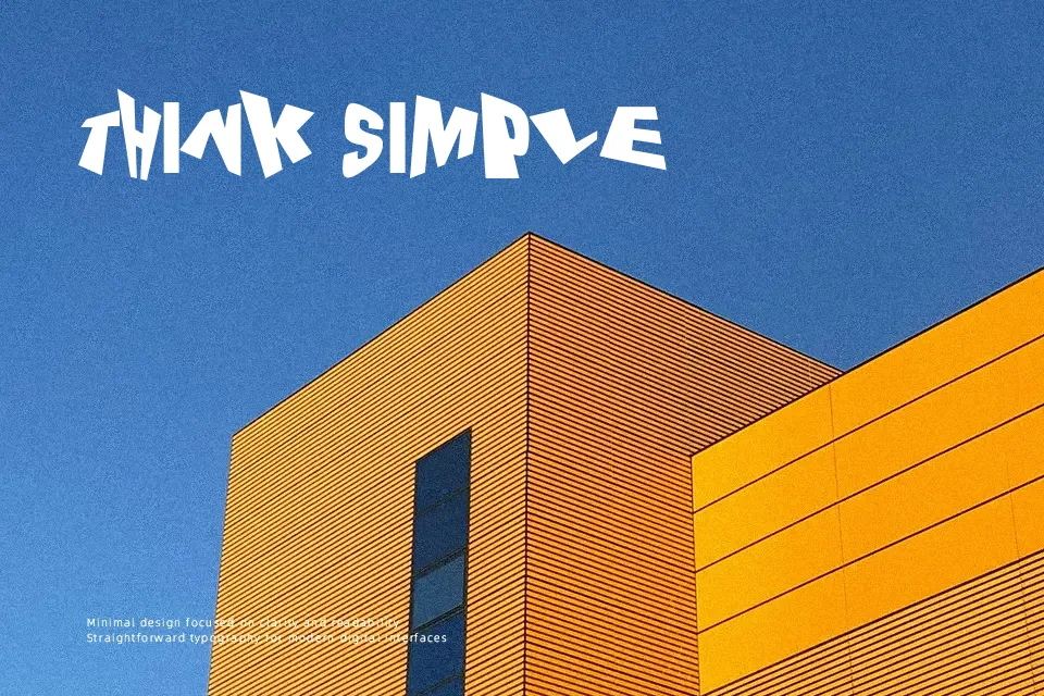
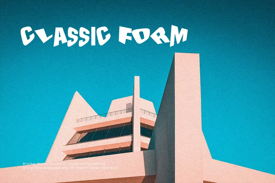
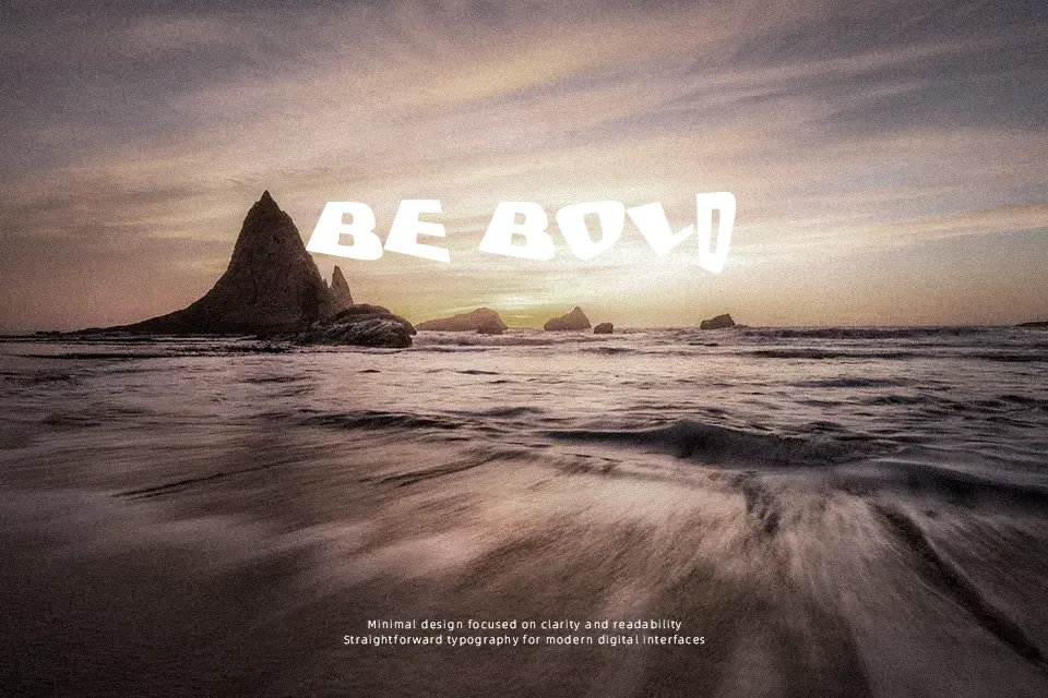
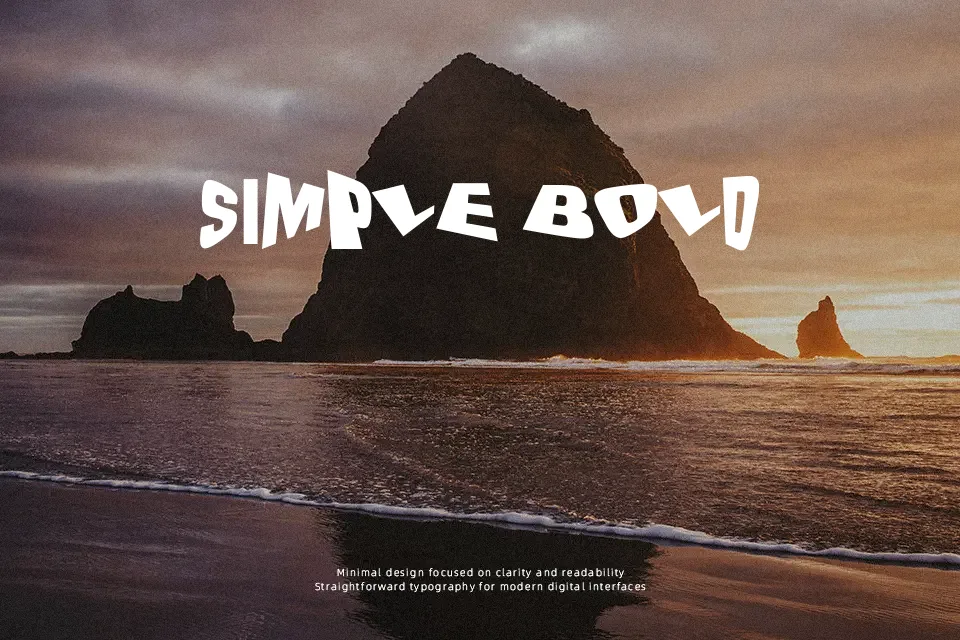
The Drunk Designer Font delivers an off-kilter display style defined by warped stems, erratic stroke thickness, and intentionally uneven letter heights. Its irregular spacing and shifted baselines produce a chaotic visual rhythm that catches attention immediately in headline and poster work. Because the exaggerated contours vary significantly in width and angle, the design excels when set at larger display scales where its distressed structure remains legible. However, the disjointed alignments and heavy distortion impair readability across continuous passages, making it impractical for multi-line body text.
Best For: music festival posters, apparel graphics, alternative album covers, rebellious product packaging
Not Ideal For: continuous body text, mobile user interfaces, corporate annual reports, dense editorial layouts
Perfect for branding, headline, and music, with a artistic and decorative style.
License
Gallery