Syne Font
Free for Commercial UseAbout
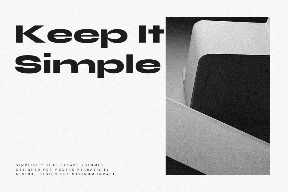
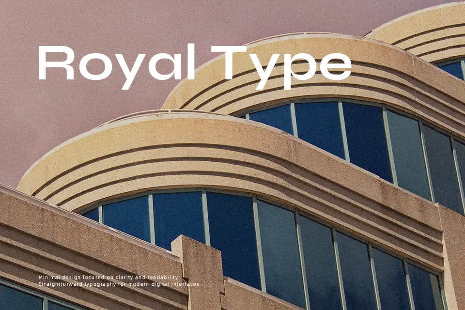
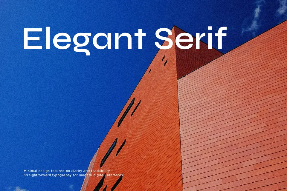
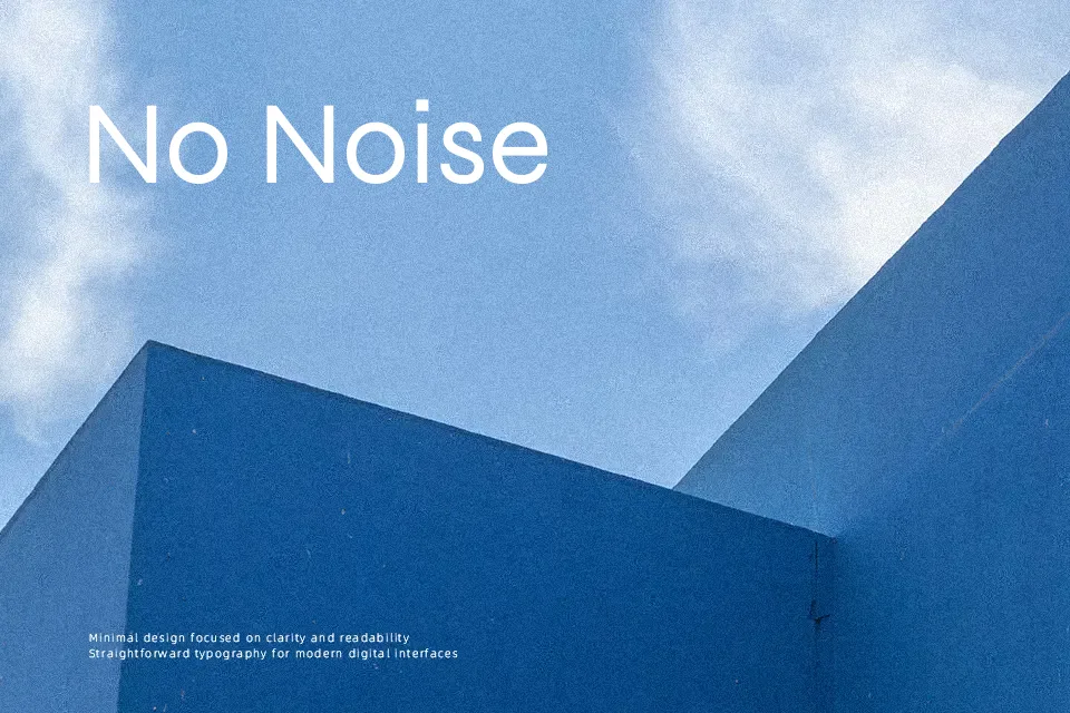
Syne is a characterful sans serif family that pushes proportions: wide counters, abrupt curves, and assertive terminals give each weight a slightly offbeat, graphic feel. Stems feel sturdy rather than delicate, with spacing that stays fairly tight, so text locks together into solid blocks rather than drifting apart. Overall it reads as modern and artistic rather than neutral, better for display sizes and short text than for long-form reading. It shines in cultural branding, posters, portfolios, and expressive interfaces, especially when you lean into its heavier weights. If you need a quiet, highly conventional corporate voice or dense paragraphs of body copy, Syne tends to draw too much attention to its own shapes.
Best For:
experimental branding systems and wordmarks
posters and event visuals for art, music, or culture
hero headlines on modern websites and apps
Not Ideal For:
long-form body text or dense reading layouts
very conservative corporate documents
traditional book typography or formal certificates
Perfect for branding, headline, and logo, with a artistic and display style.
License
Gallery