Stick Font
Free for Commercial UseAbout
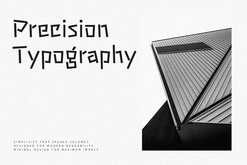
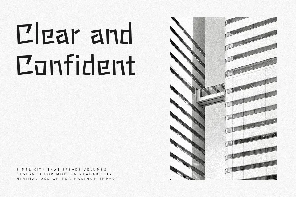
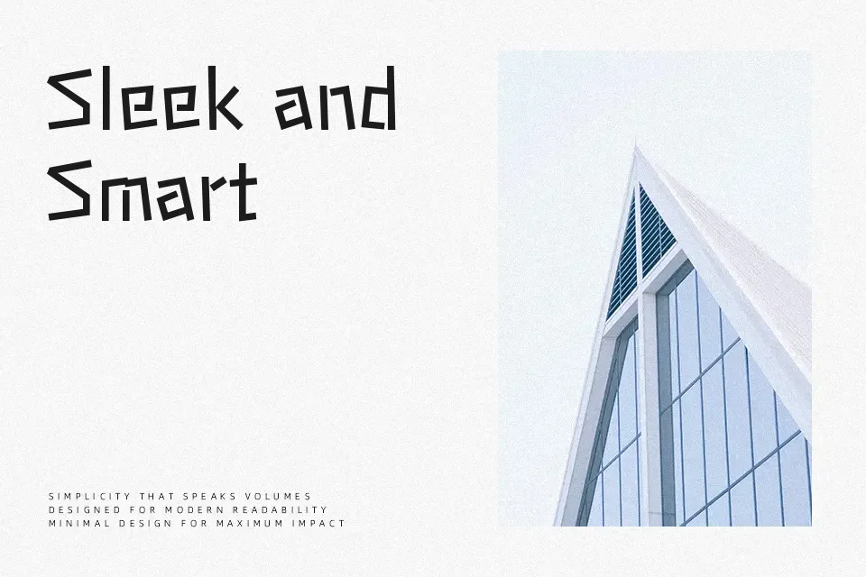
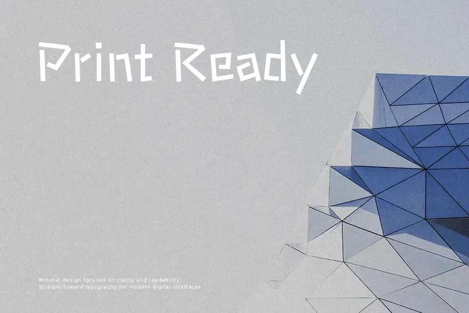
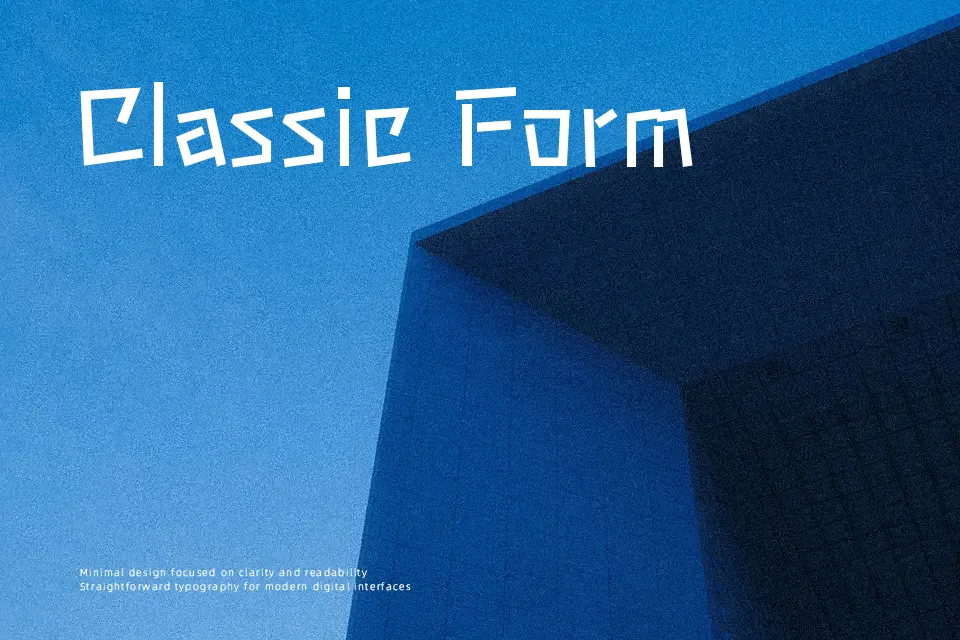
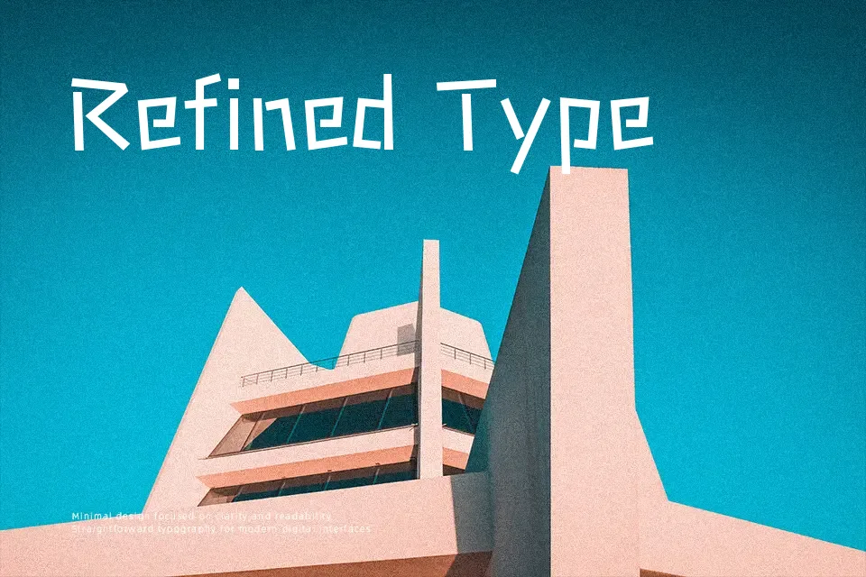
Stick leans heavily on straight strokes and minimal curves, so text feels like it was drawn with a fine marker and a ruler. The lines are thin, spacing is generous, and letterforms stay narrow, which helps longer strings remain readable even in compact interfaces or captions. Overall it comes across as casual and approachable rather than formal, with a hint of technical neatness that suits Japanese and mixed-script layouts. I like it for tooltips, map labels, lightweight UI chrome, or friendly product microcopy, but it can feel too faint for loud posters or dense editorial layouts that need stronger typographic hierarchy.
Best For:
soft-spoken ui labels and tooltips
lightweight japanese or multilingual app interfaces
friendly microcopy in product onboarding
subtle headings in calm, content-first websites
Not Ideal For:
large loud posters that rely on heavy impact
tiny body text on low-resolution screens
projects needing a formal editorial tone
logos that demand distinctive iconic letterforms
Perfect for body text, editorial, and headline, with a calm and handwritten style.
License
Gallery