Spline Sans Mono Font
Free for Commercial UseAbout
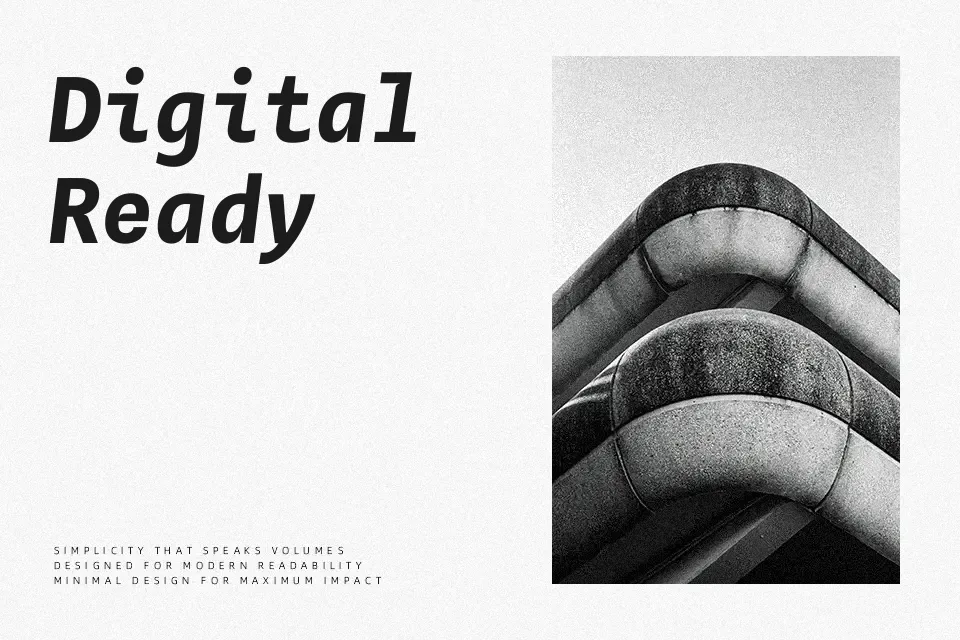
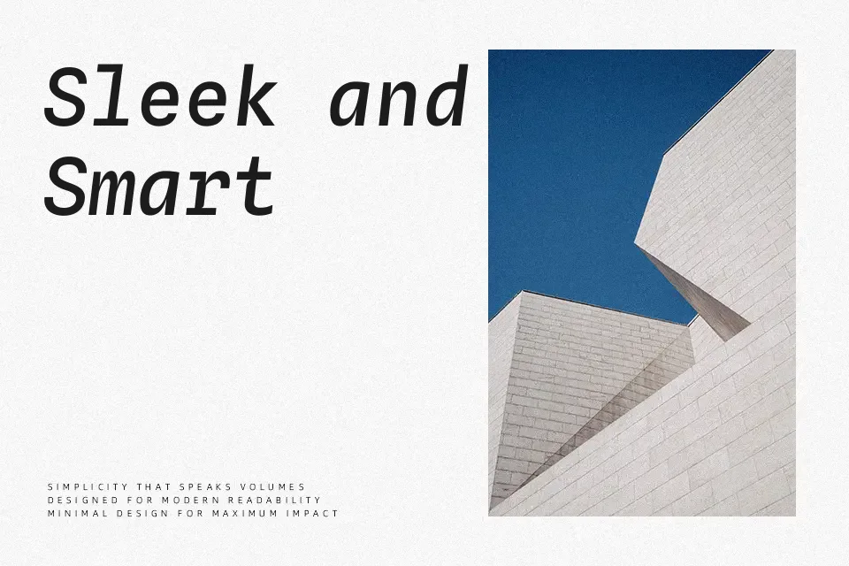
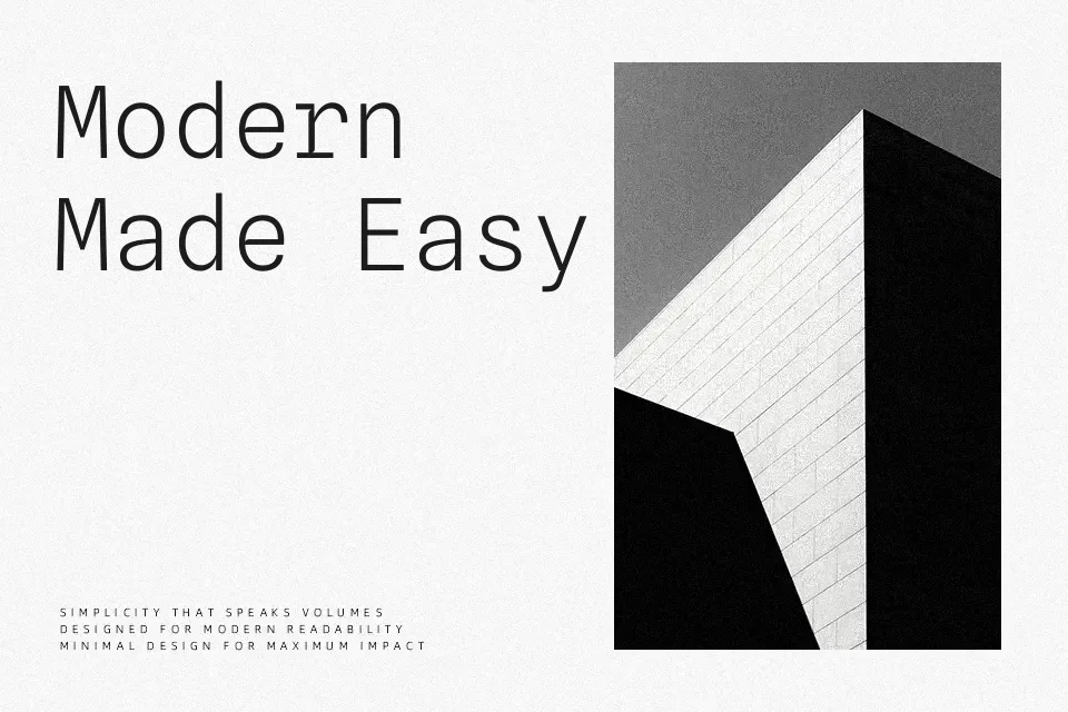
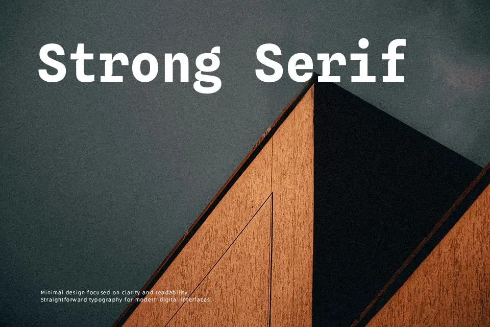
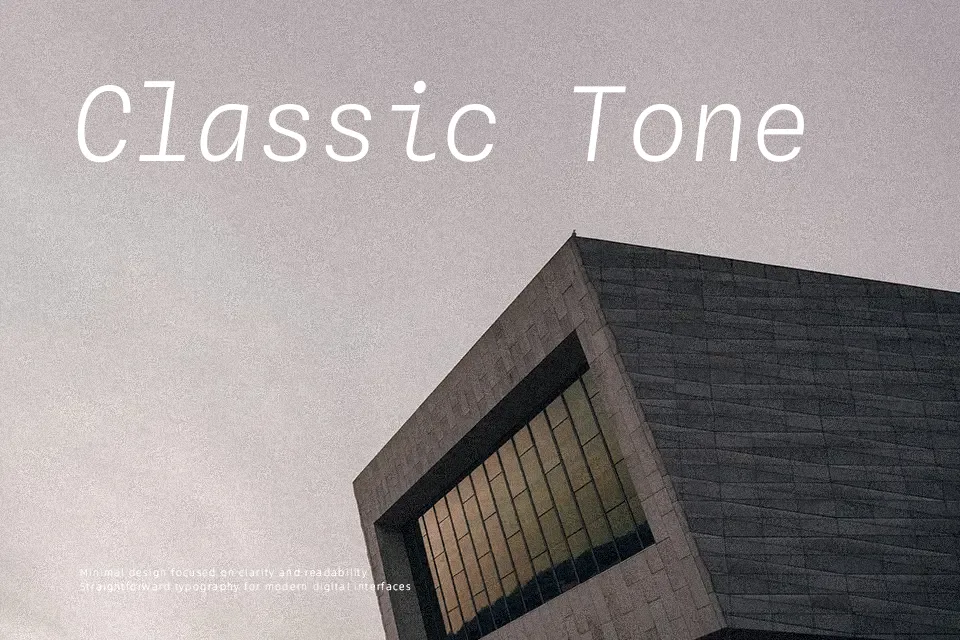
Spline Sans Mono is a monospaced neo‑grotesque with compact letterforms, even strokes, and carefully tuned spacing that keeps columns, code, and UI labels tightly aligned without feeling cramped. Its tone is understated rather than flashy, with subtle “thorn” details that become visible at larger sizes and add a bit of character to an otherwise workmanlike texture. In practice, it works well in design systems, developer tools, terminals, and data-heavy product dashboards where space is limited but clarity still matters. It is less convincing for expressive branding or long-form editorial reading, where a proportional sans or serif will usually feel more natural.
Best For:
UI dashboards and design systems
Developer tools, terminals, and code snippets
Checkout flows and compact form interfaces
Technical documentation and data tables
Not Ideal For:
Expressive logo-driven brand identities
Long, immersive editorial reading
Playful kids or display lettering that needs strong personality
Perfect for body text, editorial, and headline, with a calm and geometric style.
License
Gallery