Spinnaker Font
Free for Commercial UseAbout
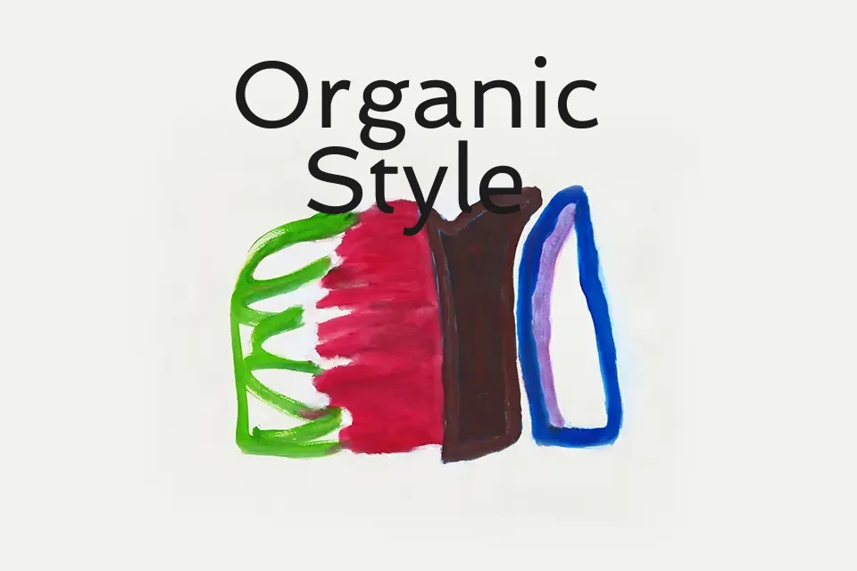
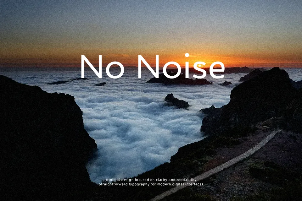
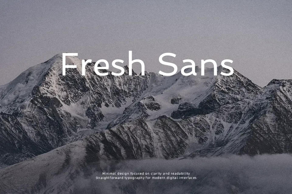
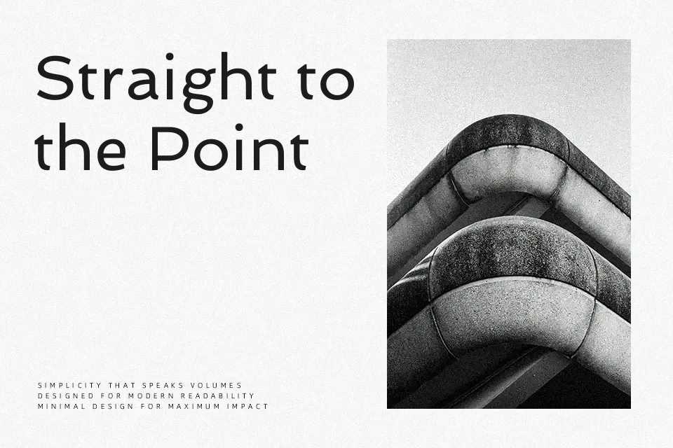
Spinnaker takes cues from French and UK ship-travel lettering, translating that nautical poster feel into a low-contrast, mildly wide sans serif with open forms and relaxed rhythm. Strokes stay fairly even, counters feel generous, and the letters sit with a buoyant, informal stance that reads casual rather than corporate. I tend to lean on it for titles, travel or lifestyle graphics, and apps that want a friendly voice without slipping into cartoon territory. It stays readable at medium sizes, but its personality thins out in dense body copy, and designs that demand strict seriousness or high-end luxury usually call for something crisper and more neutral.
Best For:
playful travel or lifestyle posters and headlines
youthful branding or product packaging needing a friendly sans serif tone
apps or websites that want a relaxed, nautical-tinged display font
Not Ideal For:
long-form body text or highly dense editorial layouts
formal corporate reports or minimalist luxury branding
very small UI text where pixel-tight clarity is critical
Perfect for advertising, branding, and headline, with a creative and sans serif style.
License
Gallery