Special Elite Font
Free for Commercial UseAbout
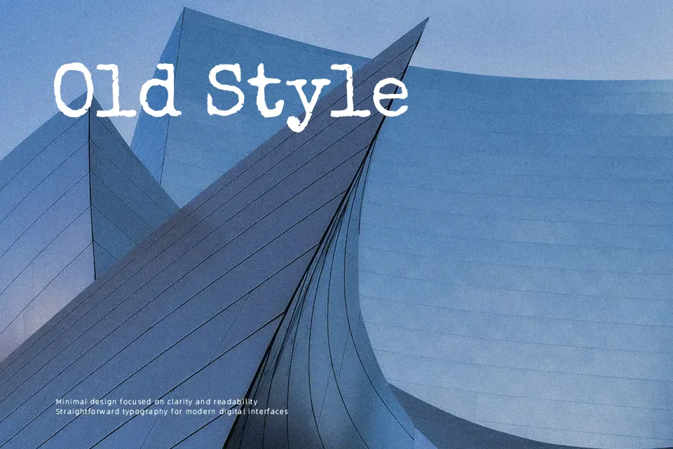
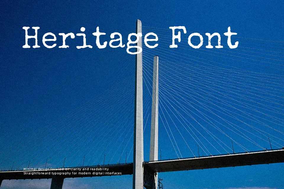
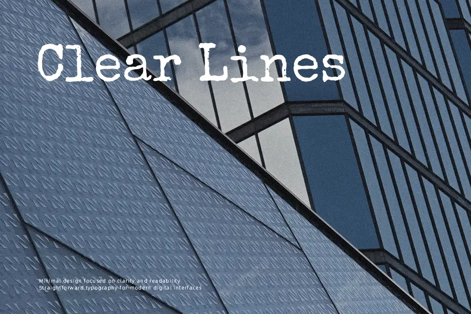
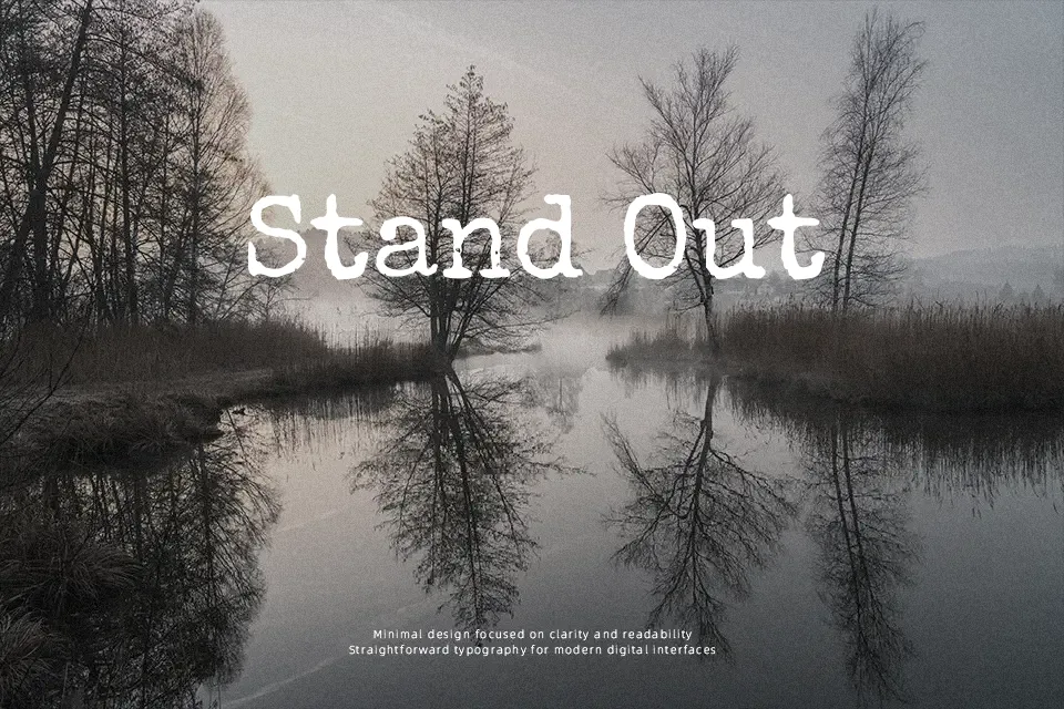
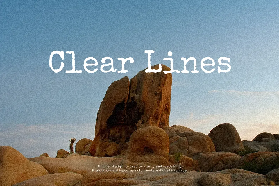
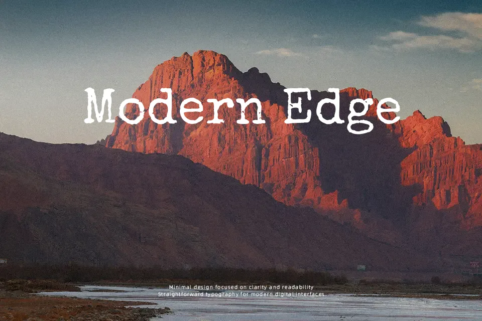
Special Elite recreates the look of inked-up, slightly irregular typewriter text, with uneven strokes, soft edges, and subtle grunge that prevents it from feeling too clean or digital. Letters sit with fairly open spacing, so lines remain readable even when the texture is heavy. The overall voice is casual, vintage, and a bit tense, which works nicely for faux-official documents, zine-style layouts, suspense graphics, and Halloween or mystery themes. It does its best work in short headlines, labels, and overlays; long paragraphs quickly feel noisy and tiring, especially at small sizes. If you like classic typewriter faces but want something rougher and more atmospheric than a clean monospaced font, this is a practical option.
Best For:
Vintage poster titles and overlays
Mystery, thriller, or horror themed graphics
Mock documents, tickets, or stamped-style labels
Social media visuals that need a worn, analog edge
Not Ideal For:
Long body text or dense paragraphs
Formal corporate branding or clean UI layouts
Small-size captions where texture hurts legibility
Projects needing a neutral, modern voice
Perfect for branding, halloween, and headline, with a dark and display style.
License
Gallery