Sono Font
Free for Commercial UseAbout
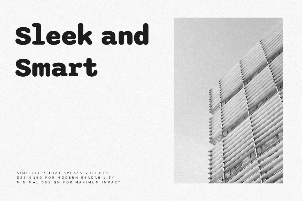
Sono blends the discipline of a monospace grid with softened, rounded shapes, so code and data feel less harsh on screen while staying easy to scan. The low cap height and generous x-height give text a compact but readable texture, especially in dense environments like terminals, admin tools, and stat-heavy landing pages. With seven weights and both mono and proportional styles, you can keep headings, labels, and body copy in the same family without visual noise. It tends to shine in digital products and tech-forward branding; for delicate editorial work or highly expressive display typography, its engineered feel can come across as too restrained.
Best For:
developer dashboards and admin panels
code snippets in documentation and blogs
data-heavy UI design and analytics views
tech-focused branding with a softer edge
Not Ideal For:
highly decorative posters or expressive display lettering
luxury or fashion branding that needs refined contrast
long-form print body text at small sizes
traditional editorial layouts seeking classic serif rhythm
Perfect for body text, branding, and headline, with a clean and geometric style.
License
Gallery