Slabberton Font
Free for Commercial UseAbout
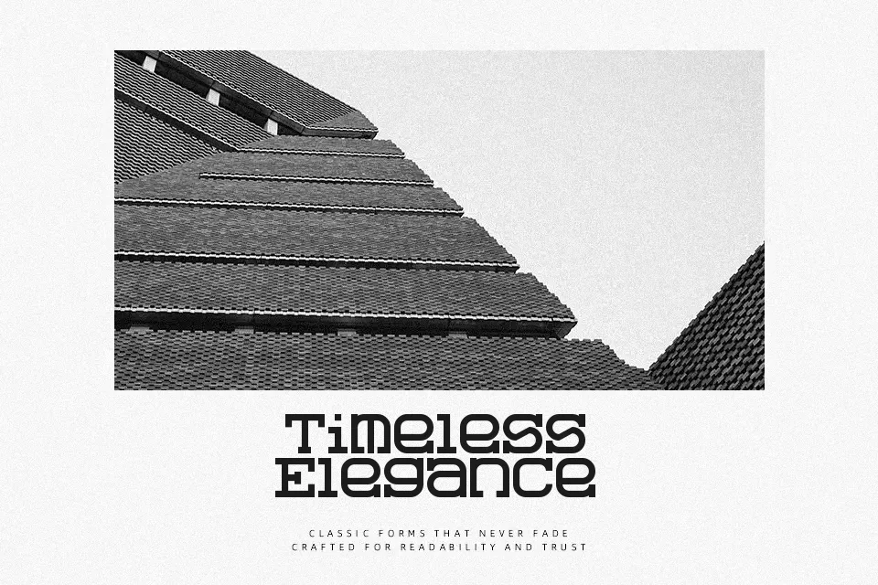
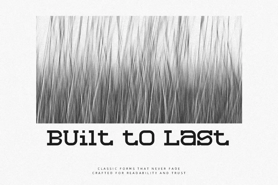
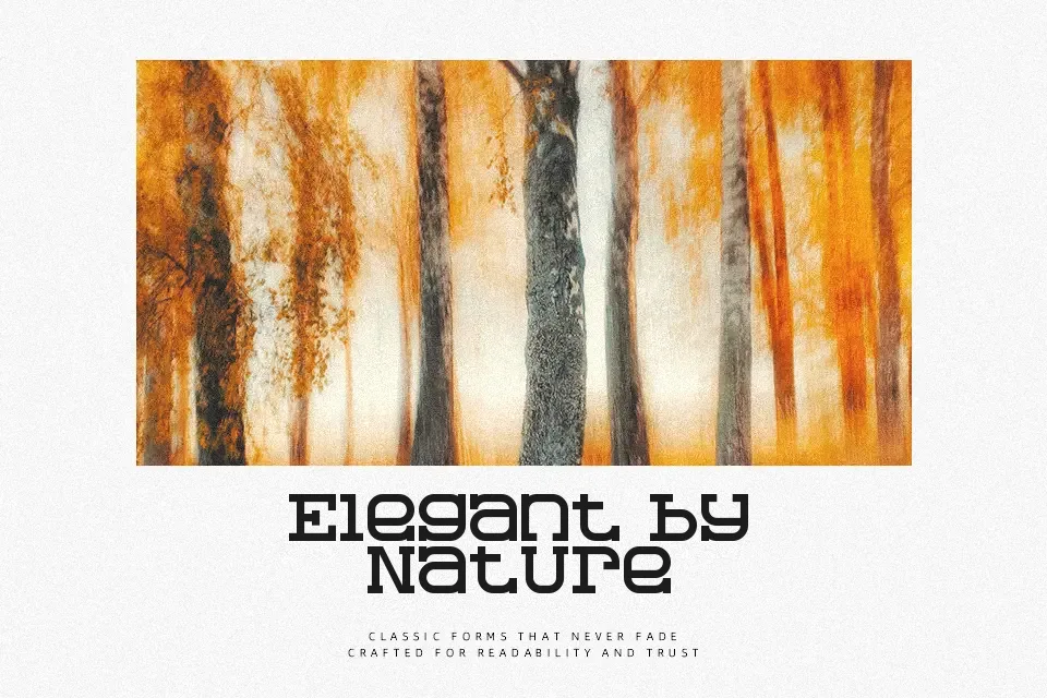
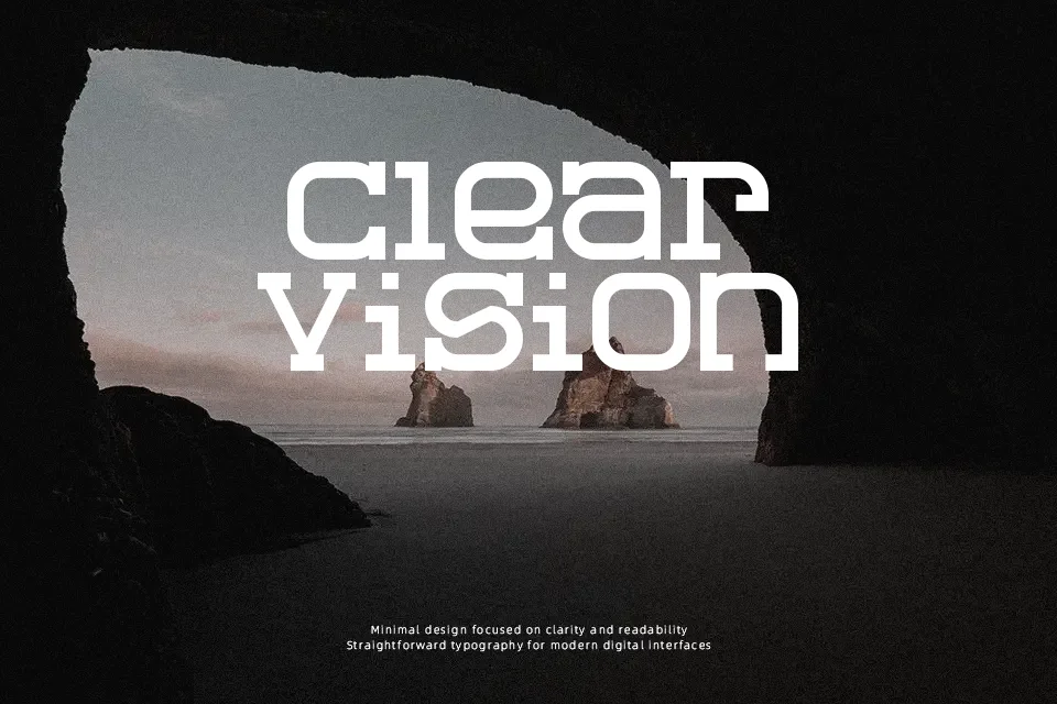
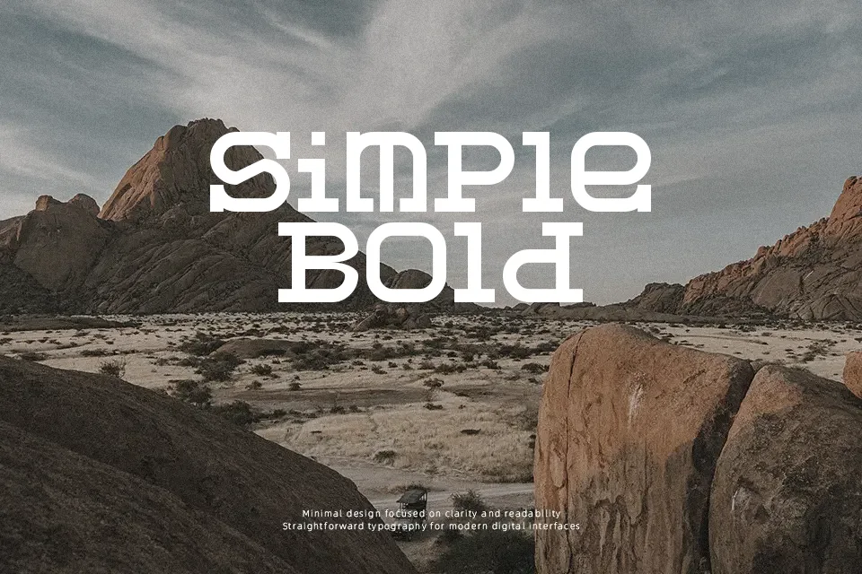
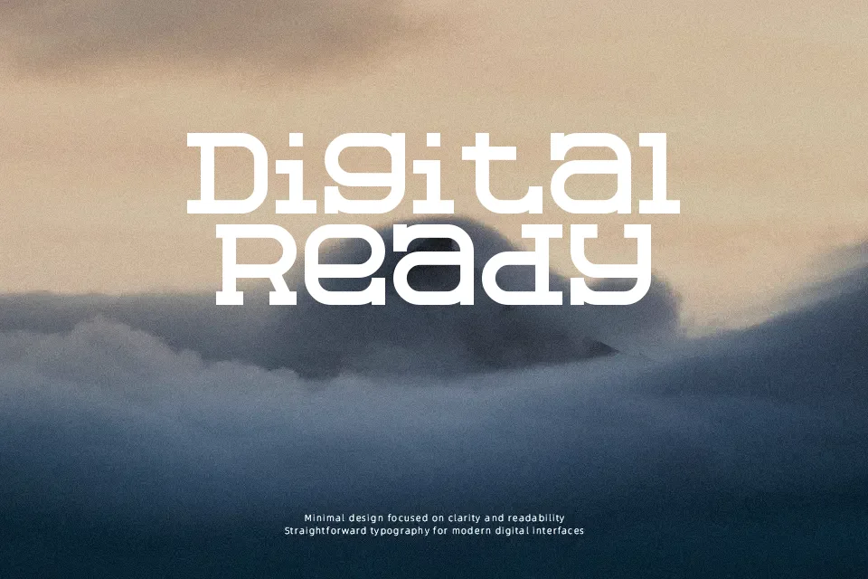
Slabberton Font uses broad slab serifs, firm vertical strokes, and compact, typewriter-inspired proportions to create a rugged display texture. The uppercase letters carry a consistent, weighty rhythm, while the lowercase forms keep short words recognizable at headline sizes. Its spacing gives titles and labels a deliberately packed appearance rather than an airy editorial feel. The font works well where a Western or old-print character is needed without relying on ornate details. It is less comfortable for extended reading, as the heavy serif structure can make dense paragraphs feel crowded. The strongest results come from concise text with room around it.
Best For: Western poster headlines,vintage product packaging,film title cards,restaurant signage
Not Ideal For: long paragraph text,small interface labels,technical manuals,dense editorial layouts
Perfect for film, headline, and packaging, with a bold and display style.
License
Gallery