Sintony Font
Free for Commercial UseAbout
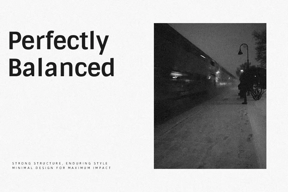
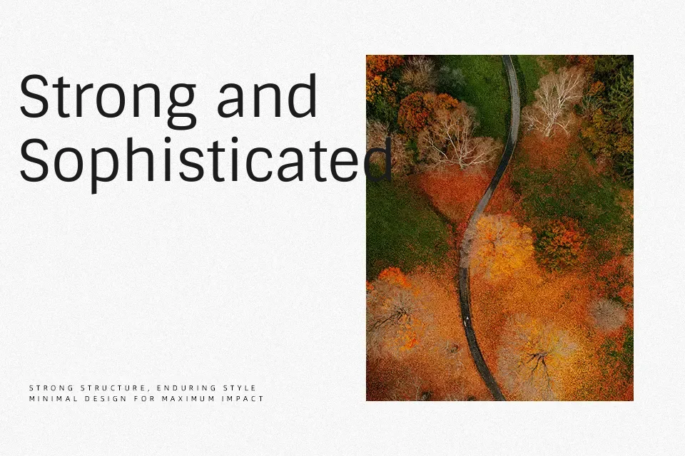
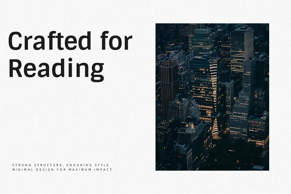
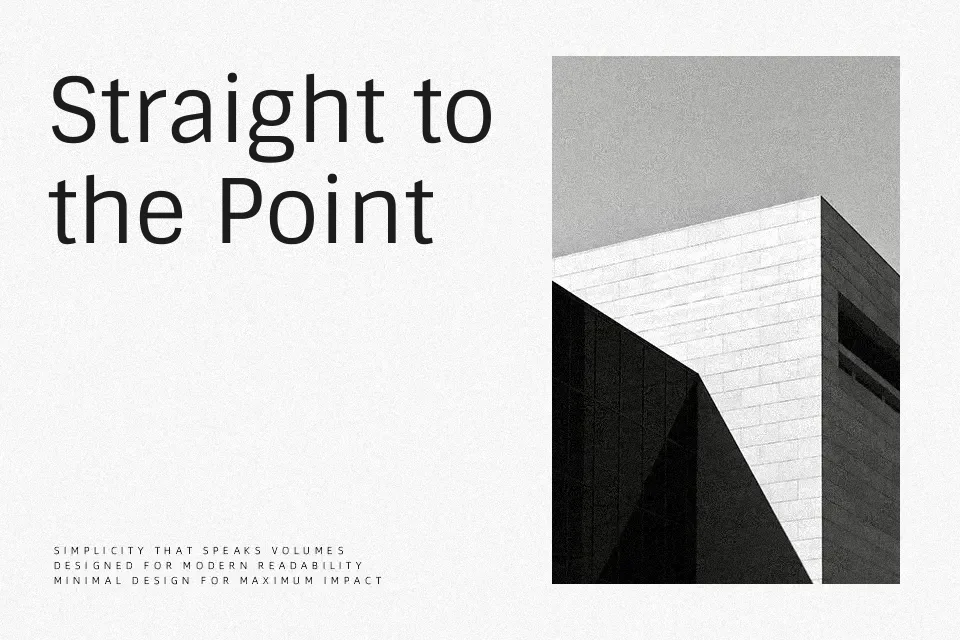
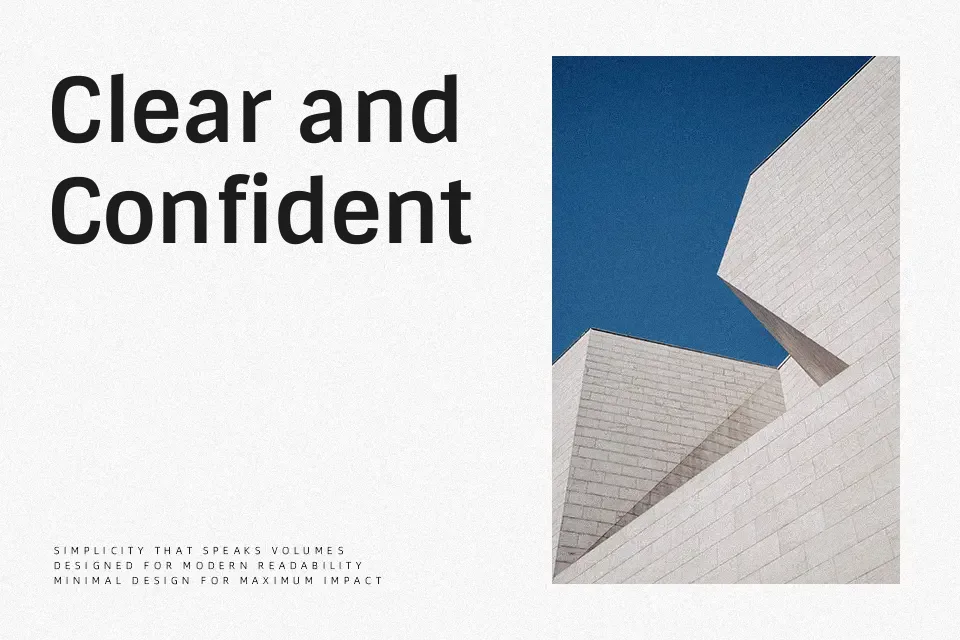
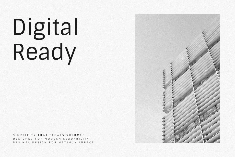
Sintony is a neo-grotesque sans serif with a subtly squared skeleton, even stroke contrast, and open letterforms that keep text airy instead of cramped. Spacing is generous enough for long reading, and regular and bold weights give you a simple hierarchy without visual noise. On screen, it feels calmer and less rigid than many geometric sans fonts, which helps when you are setting documentation, dashboards, or editorial-style articles. It can look a bit too neutral for expressive branding or loud headlines, so it works best when clarity matters more than personality.
Best For:
Web and app body text at small to medium sizes
Digital editorial layouts and documentation
Clean UI labels, menus,and dashboards
Corporate or product sites needing unobtrusive typography
Not Ideal For:
Highly expressive logos or display wordmarks
Very condensed layouts where ultra-tight spacing is required
Vintage or decorative branding systems
Perfect for body text, branding, and editorial, with a calm and geometric style.
License
Gallery