Shadows Into Light Two Font
Free for Commercial UseAbout
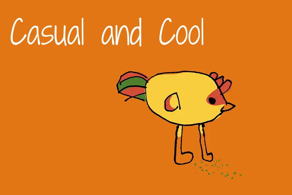
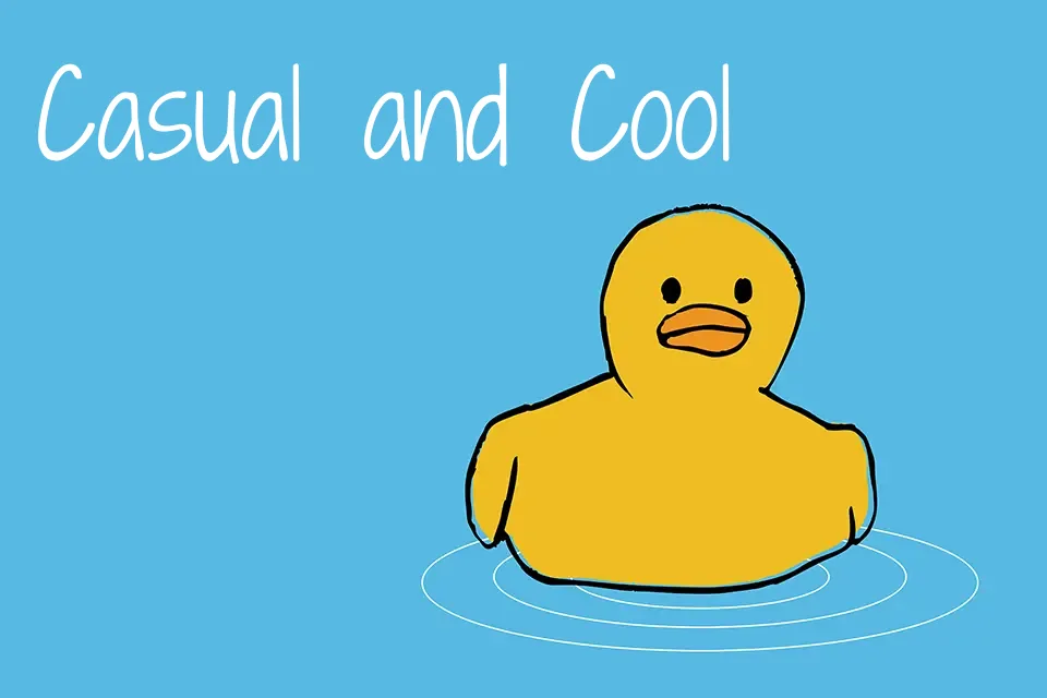
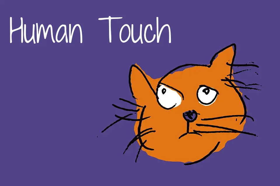
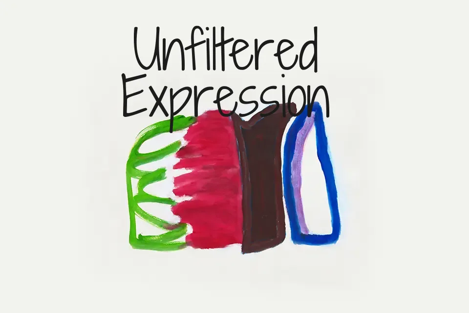
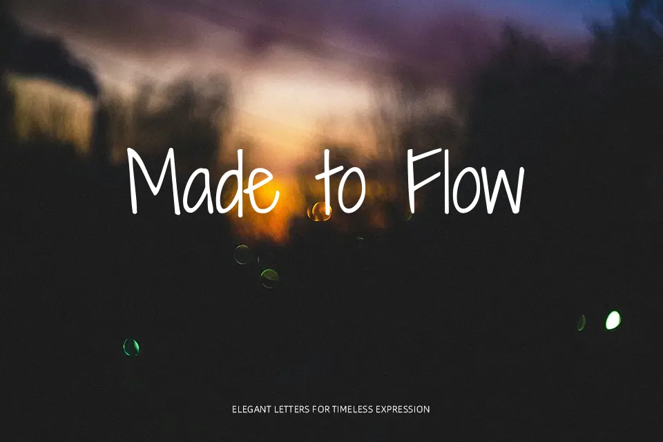
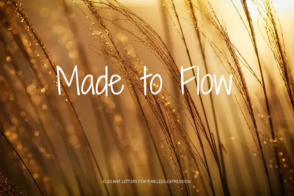
Shadows Into Light Two is a carefully reworked handwriting font with even, low‑contrast strokes, soft curves, and balanced spacing that keeps lines from looking messy. The letters lean slightly and feel casual and conversational, but the forms stay consistent enough for longer captions or notes without tiring the eye. It works nicely on recipe cards, lifestyle blogs, kids’ product packaging, and warm brand touchpoints where you want personality without chaos. For dense body copy, strict corporate documents, or tech interfaces, its handwritten rhythm can feel out of place, so it is better kept for display sizes and short text.
Best For:
Friendly headlines and callouts on blogs or websites.
Informal branding for lifestyle, craft, or kids’ products.
Captions and overlays on warm, conversational social media posts.
Not Ideal For:
Long body paragraphs that need tight, fast reading.
Formal corporate reports or technical UI layouts.
High-impact posters that rely on heavy, bold typography.
Perfect for branding, headline, and kids, with a cute and handwritten style.
License
Gallery