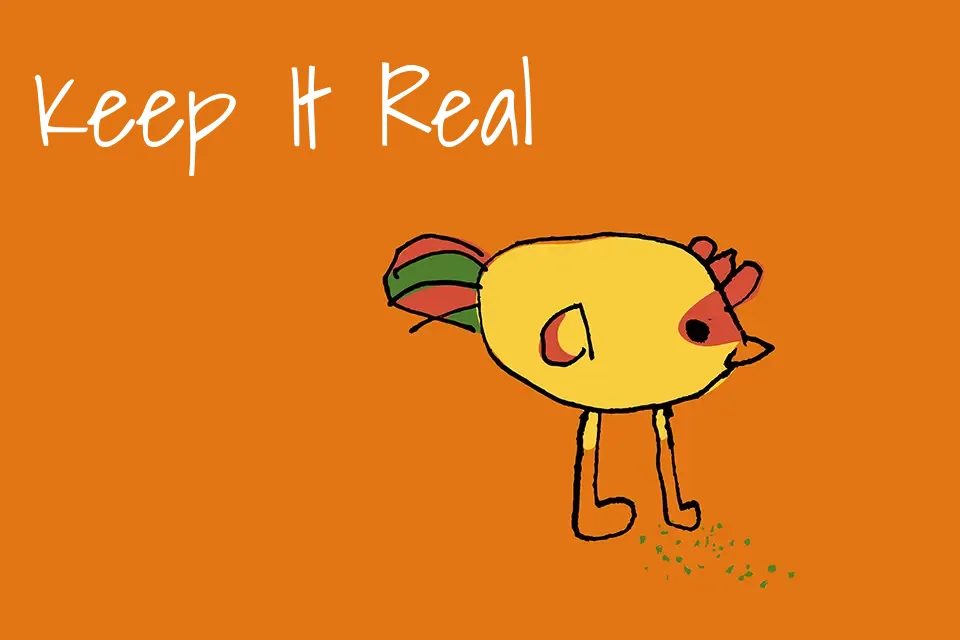
Shadows Into Light Font
Free for Commercial UseAbout
Shadows Into Light has slim, even strokes, loose letter spacing, and softly rounded forms that read like a tidy notebook hand rather than messy doodles. It comes across as casual and approachable, with just enough structure to stay legible on screens and small printed pieces. Designers often lean on it for handwritten accents in social posts, product labels, planners, and informal interfaces where a typed sans would feel too stiff. It tends to work well when used in short lines or layered with a clean sans serif, but feels out of place in dense paragraphs or highly corporate layouts.
Best For:
short quotes and annotations on social graphics
friendly headings in planners, journals, and printables
handwritten-style labels for packaging or product tags
casual branding for lifestyle or craft-focused projects
Not Ideal For:
long paragraphs or dense editorial copy
formal corporate or institutional identities
very small captions where thin strokes may disappear
high-impact posters that need bold, high-contrast type
Perfect for body text, branding, and headline, with a artistic and handwritten style.
License
Gallery