Savate Font
Free for Commercial UseAbout
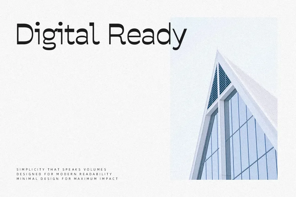
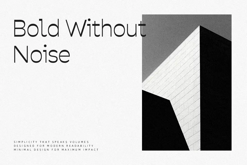
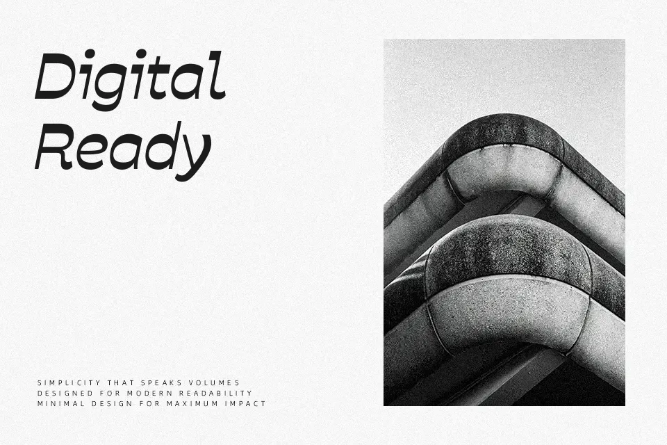
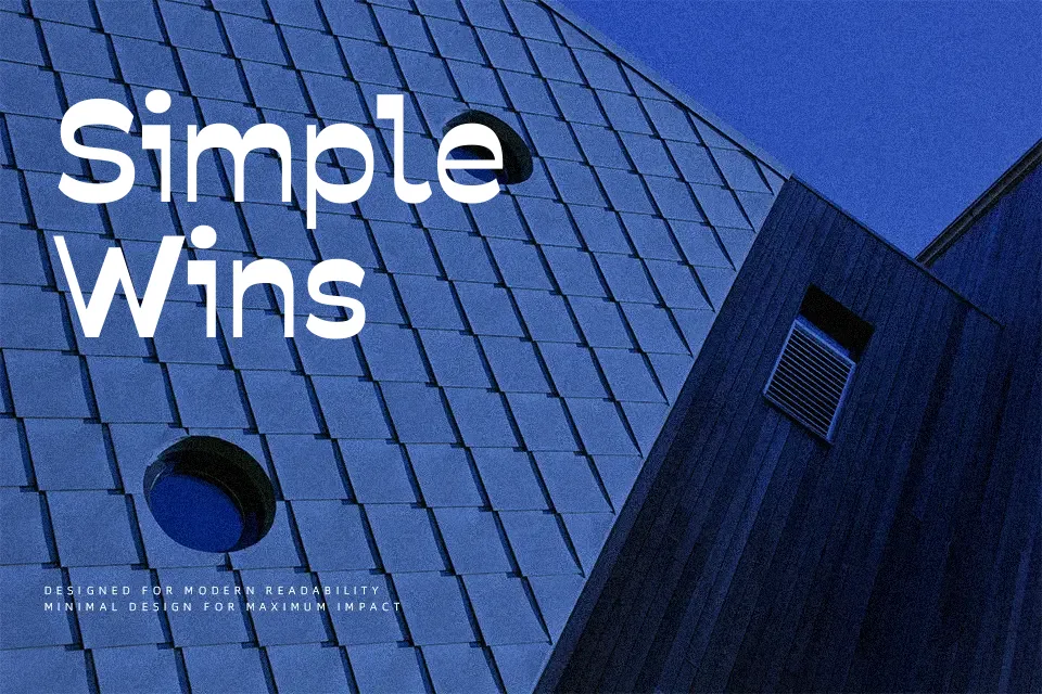
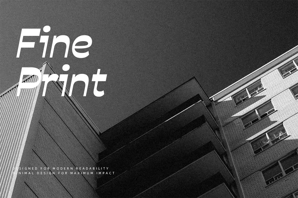
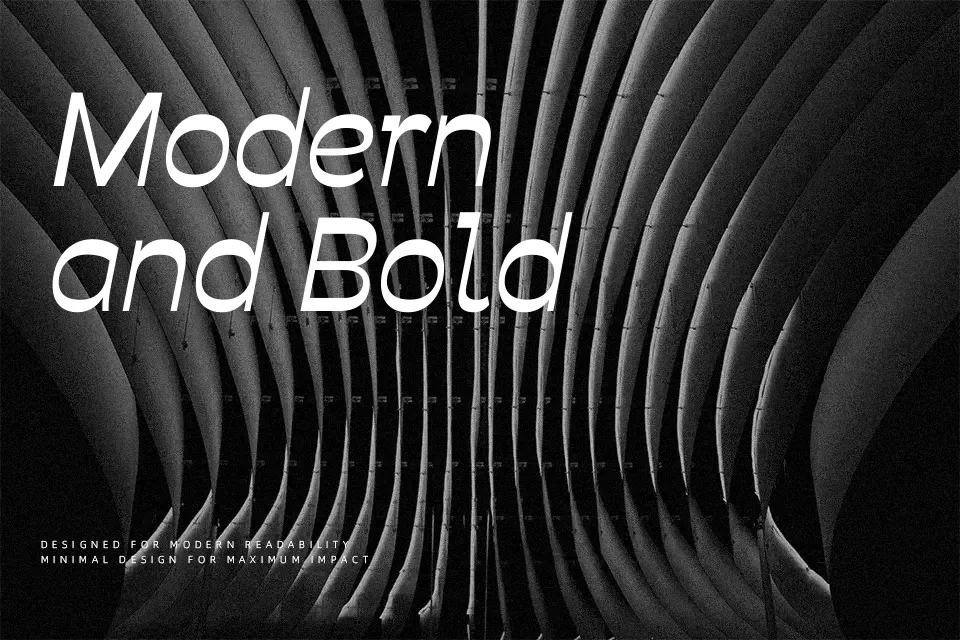
Savate combines open counters, sturdy horizontals, and slimmer verticals to create a clear reverse-contrast voice that feels lively but still controlled. Strokes stay relatively even, spacing is generous, and the humanist skeleton keeps letters recognizable at smaller sizes. In practice, it shines when you lean into that rhythm: magazine covers, expressive landing pages, section headers, and UI labels gain a distinct tone without turning into display gimmicks. Compared with more neutral grotesques, Savate brings more motion and personality, which is welcome in branding or cultural projects but can be distracting in very sober corporate reports or long legal copy.
Best For:
Expressive editorial headlines and decks
Branding for cultural, creative, or sports projects needing movement in type
Web and app interface text where a distinctive but readable sans is desired
Posters and digital campaigns that benefit from strong typographic rhythm
Not Ideal For:
Highly conservative corporate reports or financial statements
Dense legal or academic documents requiring very neutral text color
Minimalist interfaces where any visible contrast quirk feels out of place
Very small footnotes when ultra-plain sans serifs are preferred
Perfect for branding, editorial, and headline, with a artistic and display style.
License
Gallery