Running On Empty Font
Free for Commercial UseAbout
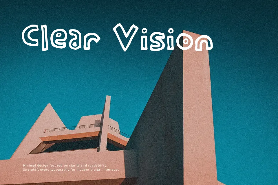
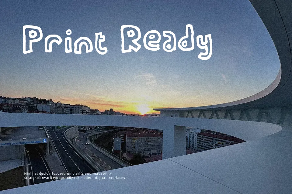
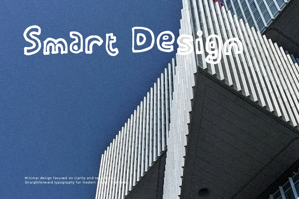
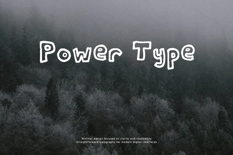
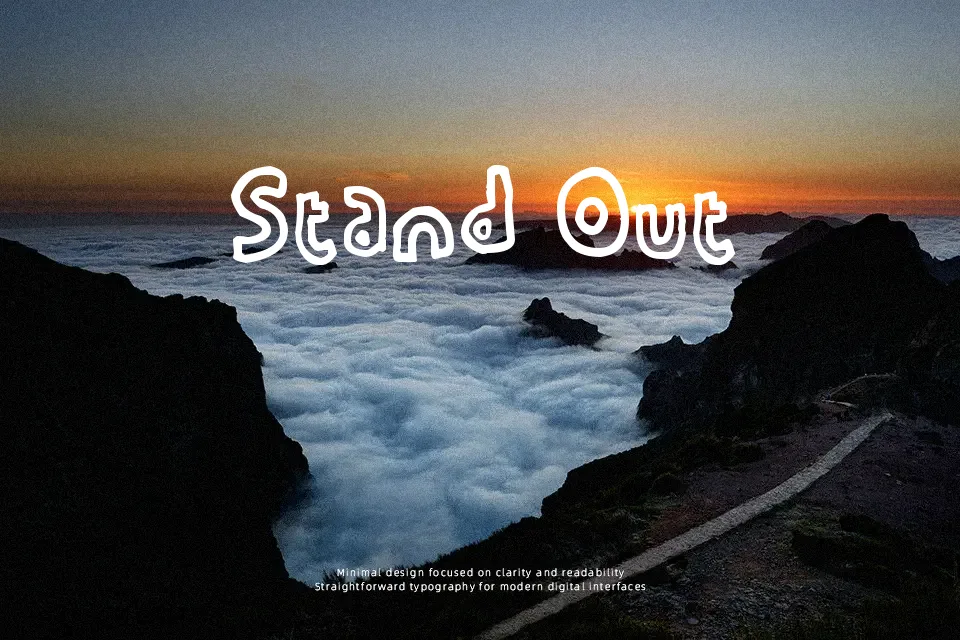
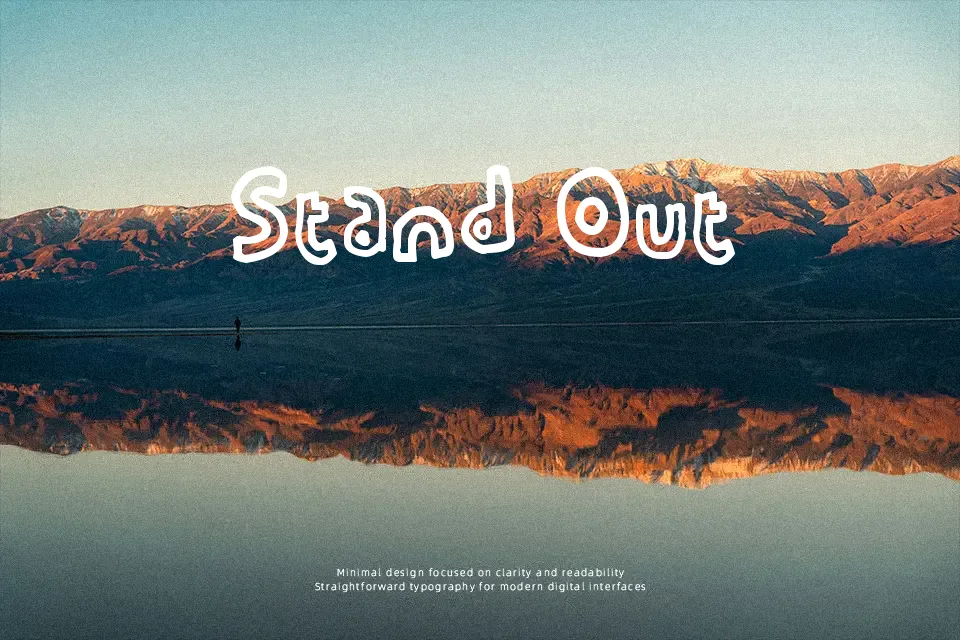
The Running On Empty Font performs best when displayed at larger sizes, revealing its quirky, hand-drawn character. The letterforms feature slightly shaky strokes and an uneven baseline, giving the design a wonderfully casual and organic rhythm. The spacing helps maintain clarity in larger headlines, allowing the bouncy proportions to shine without feeling too cluttered. It feels as though it was quickly sketched, bringing a raw, authentic energy to playful projects and comic-style layouts. However, the irregular stroke weight and distressed edges reduce continuous reading comfort, making it less suitable for long paragraphs. Overall, the dynamic structure adds excellent personality to short display text.
Best For:
comic book dialogues, playful packaging, casual apparel graphics, informal event posters
Not Ideal For:
long paragraph text, corporate reports, small interface labels, dense editorial layouts
Perfect for branding, headline, and packaging, with a energetic and cartoon style.
License
Gallery