Rubik Scribble Font
Free for Commercial UseAbout
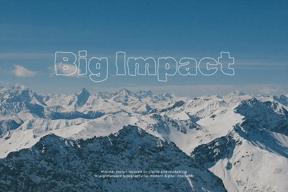
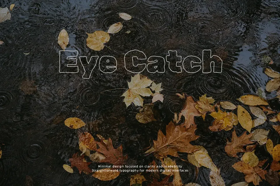
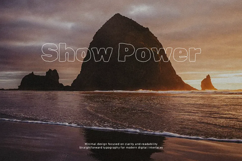
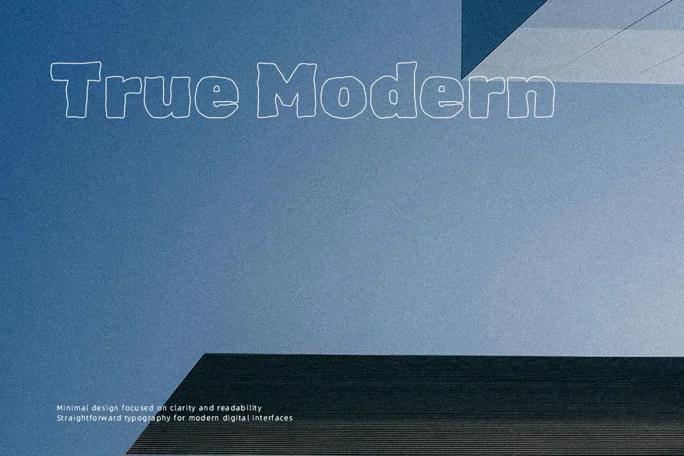
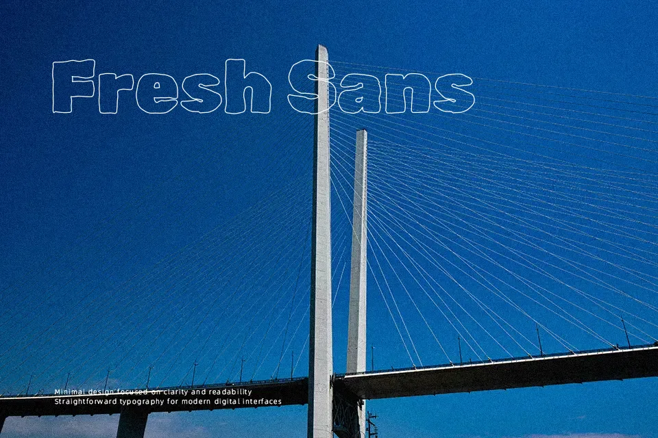
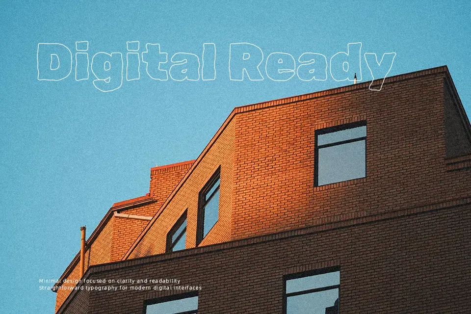
Rubik Scribble takes the geometric skeleton of Rubik and redraws it as loose, shaded scribbles, so letters feel hand-drawn yet still follow a solid underlying structure. Strokes look rough, layered, and slightly uneven, which adds motion and visual noise; spacing remains fairly regular, but the textured fills make words feel dense and graphic. Overall, it reads as a casual, decorative display font rather than something neutral or formal, better for large sizes where the shading can actually be seen. It shines in posters, music artwork, experimental social media posts, and headers for playful brands; in long body text, small captions, or strict corporate layouts, the texture quickly becomes tiring and hurts legibility. If you like the attitude of marker or graffiti lettering but want the proportions of a geometric sans, this sits nicely in that middle ground.
Best For:
bold poster titles and event flyers with a rough edge
music or youth-focused branding where a scribbled logotype feels on-theme
social media graphics that need noisy, attention-grabbing headlines
experimental editorial spreads and zine-style layouts
Not Ideal For:
long paragraphs or interface copy where clean reading is important
formal business documents or conservative corporate branding
tiny captions, footnotes, or data-heavy diagrams
projects that require a very polished, minimal aesthetic
Perfect for branding, headline, and music, with a artistic and display style.
License
Gallery