RocknRoll One Font
Free for Commercial UseAbout
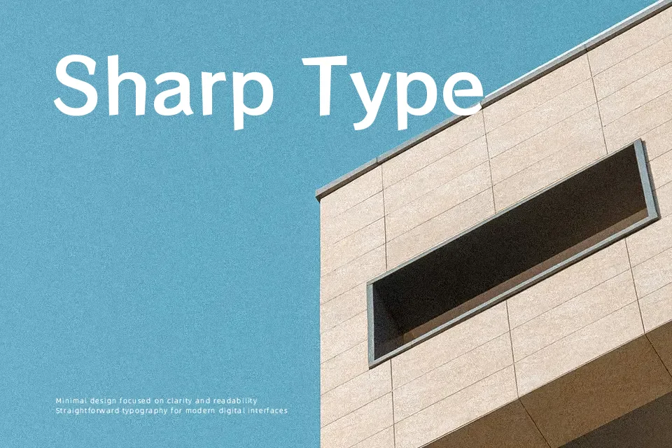
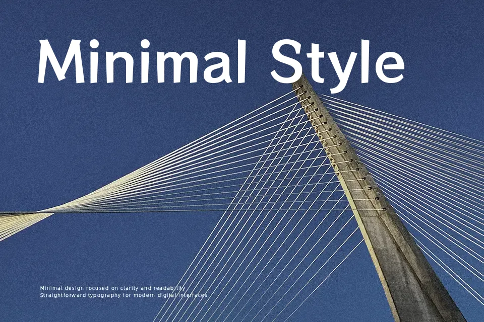
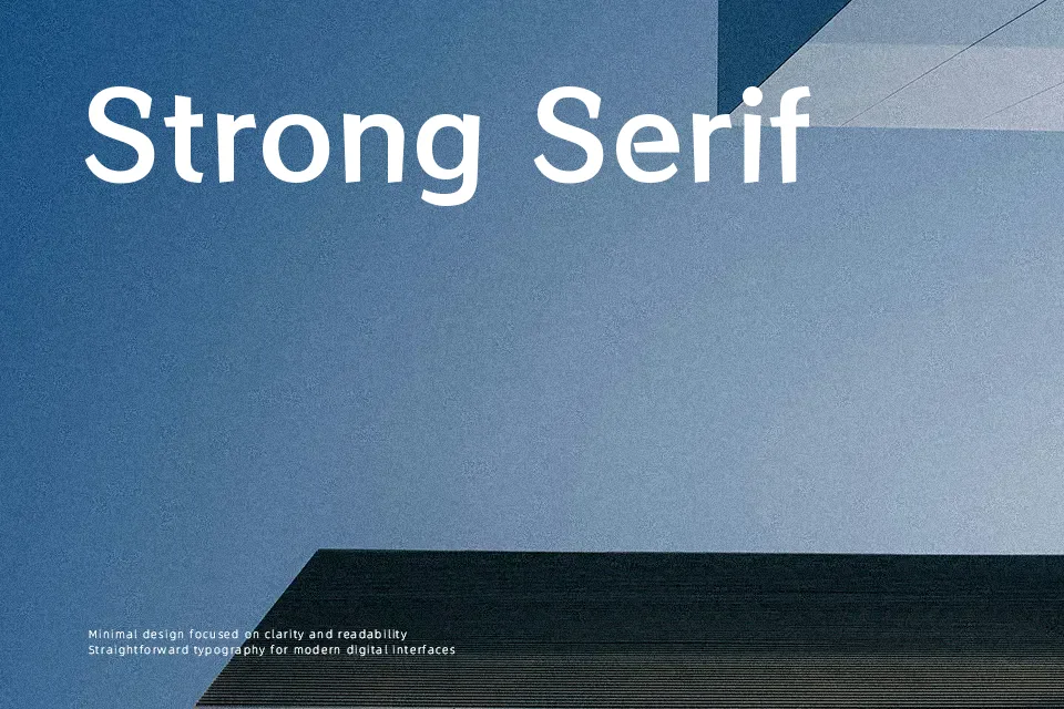
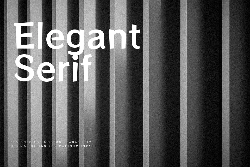
RocknRoll One leans into a pop-style look, with strokes that shift in intensity and rounded terminals that keep each letter feeling animated rather than stiff. Its weight sits on the heavier side, so text blocks feel dense yet still legible, helped by clean counters and straightforward structure. Spacing is fairly tight, which gives headlines compact impact but can feel crowded in long paragraphs. Visually it lands somewhere between a friendly geometric sans and a playful display face, making it handy for event titles, band identities, snack packaging, or bold UI labels where character matters more than neutrality. It tends to work best at medium to large sizes; small body copy, formal documents, or conservative corporate layouts can feel off-brand or visually noisy.
Best For:
music event posters and flyers
youthful branding and logo wordmarks
stream thumbnails and social banners
playful UI labels and badges
Not Ideal For:
long body text or dense editorial layouts
formal business reports or legal documents
luxury or ultra-minimal visual identities
very small caption sizes with tight spacing
Perfect for branding, headline, and music, with a bold and display style.
License
Gallery