REM Font
Free for Commercial UseAbout
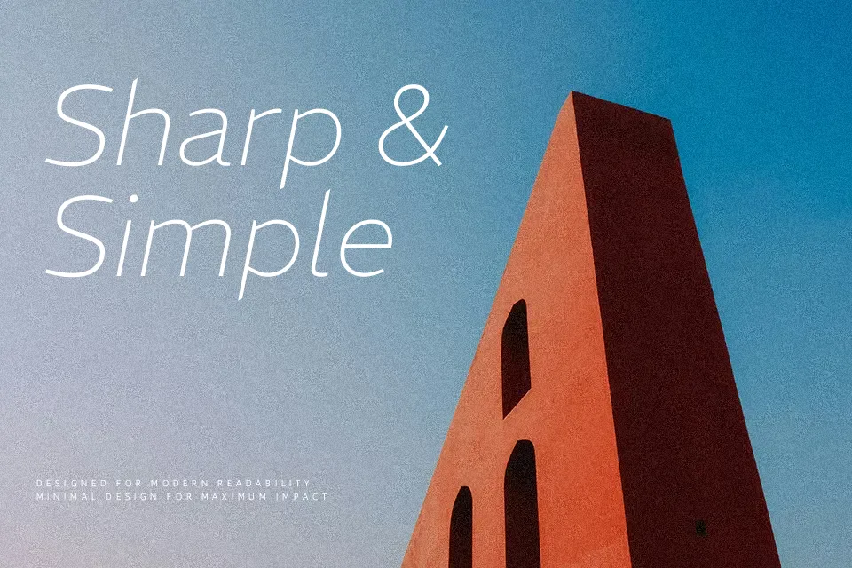
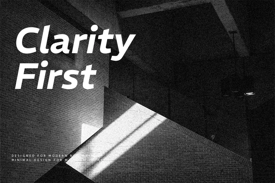
REM combines heavy, low-contrast stems with outstrokes that taper slightly, so text feels dense yet agile on the page. Its proportions lean a bit condensed, with a tall x‑height and open counters that help paragraphs hold together cleanly in tight grids or responsive layouts. On screen, the uniform stroke weight and geometric skeleton read as modern and assertive rather than neutral, which can give UI labels, dashboards, and brand headlines a firm, composed tone instead of fading into the background. In long, narrative-heavy books or very delicate editorial work, that same weight and presence can feel a bit too insistent, so I would reserve it for identity systems, product sites, and promotional pieces where you want structure and character in the same voice.
Best For:
compact editorial layouts and magazine-style grids
modern product or SaaS branding systems
interface typography where labels must stay readable in tight spaces
headlines and subheads on contemporary marketing pages
Not Ideal For:
long-form book typography that aims for a very quiet reading experience
projects needing a soft, handwritten, or highly expressive voice
tiny legal text where a more conventional text face is safer
Perfect for branding, editorial, and headline, with a bold and sans serif style.
License
Gallery