Readex Pro Font
Free for Commercial UseAbout
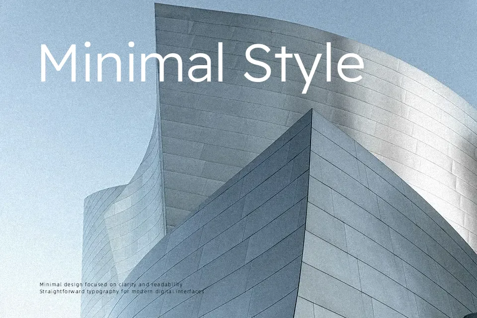
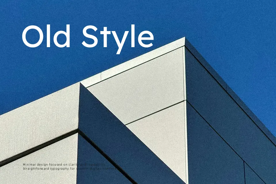
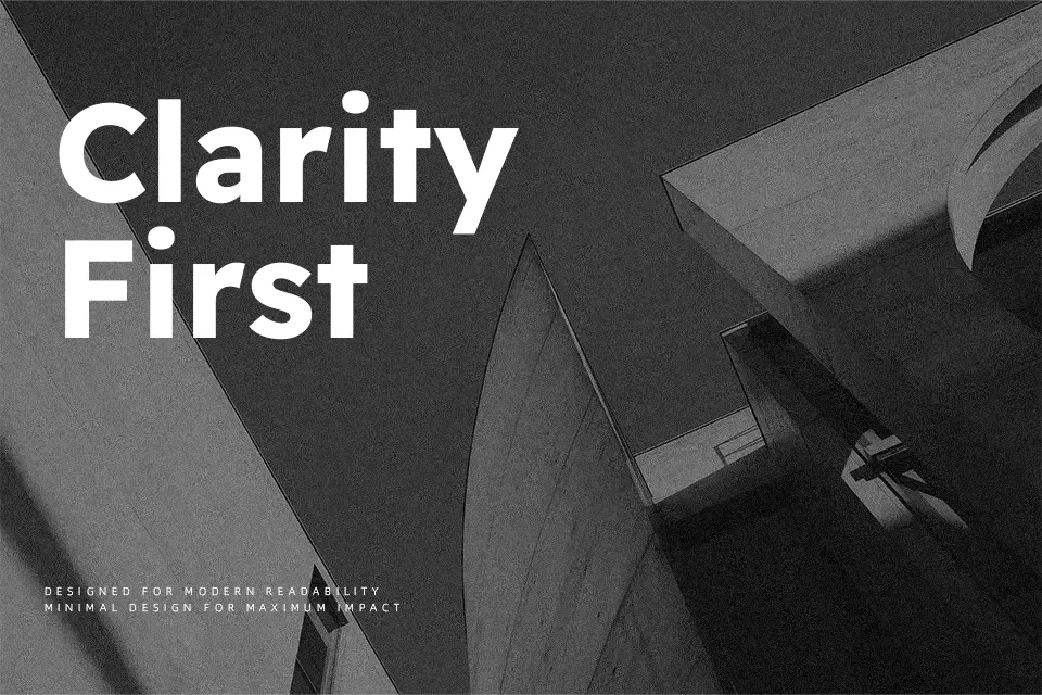
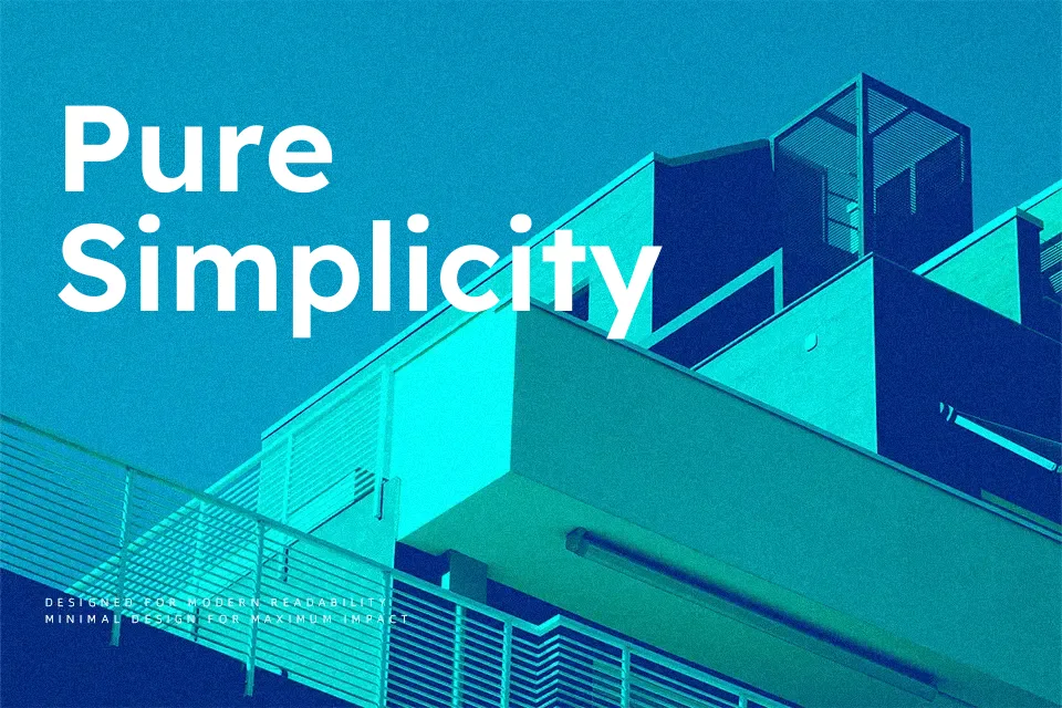
Readex Pro pairs rounded geometric structure with wide apertures, steady stroke contrast, and relaxed letterspacing that keeps dense text breathable on screen. Its tone feels modern and matter-of-fact rather than flashy, so it supports content instead of shouting over it. Because it evolved from the research-driven Lexend family, it tends to stay legible at smaller sizes and in longer reading sessions, which is valuable for knowledge bases, bilingual publications, and product dashboards. However, if you need a highly expressive display face or something with strong personality for a logo, this family can come across as too neutral and reserved.
Best For:
Accessible long-form articles and documentation where readability is critical across Latin and Arabic text.
Product dashboards, UI components, and design systems that need a calm, consistent sans serif across weights.
Multilingual corporate or educational websites that require clear hierarchy without visual noise.
Not Ideal For:
Expressive branding that relies on strong decorative character or handwritten flavor.
Highly condensed poster layouts where you must pack large amounts of text into very tight spaces.
Projects looking for a retro, serif, or script voice rather than a clean geometric sans.
Perfect for body text, editorial, and headline, with a calm and geometric style.
License
Gallery