Raisin Up Font
Free for personal useAbout
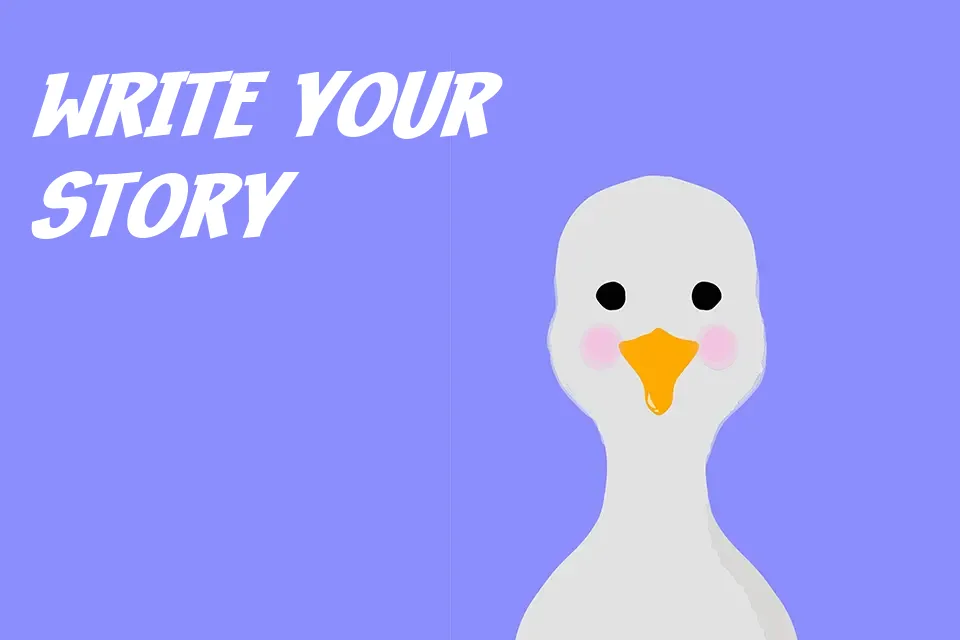
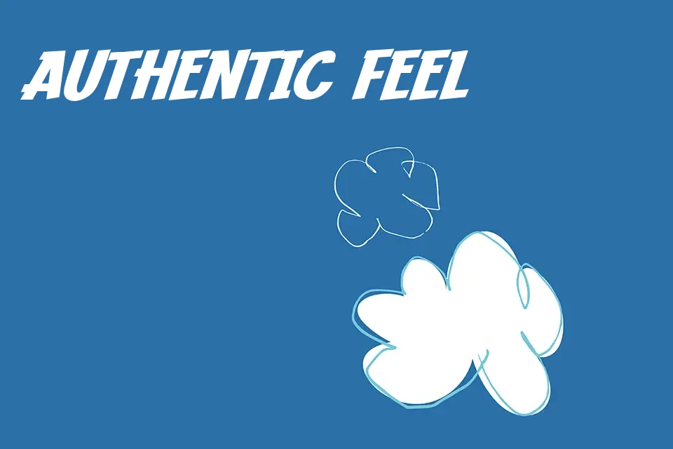
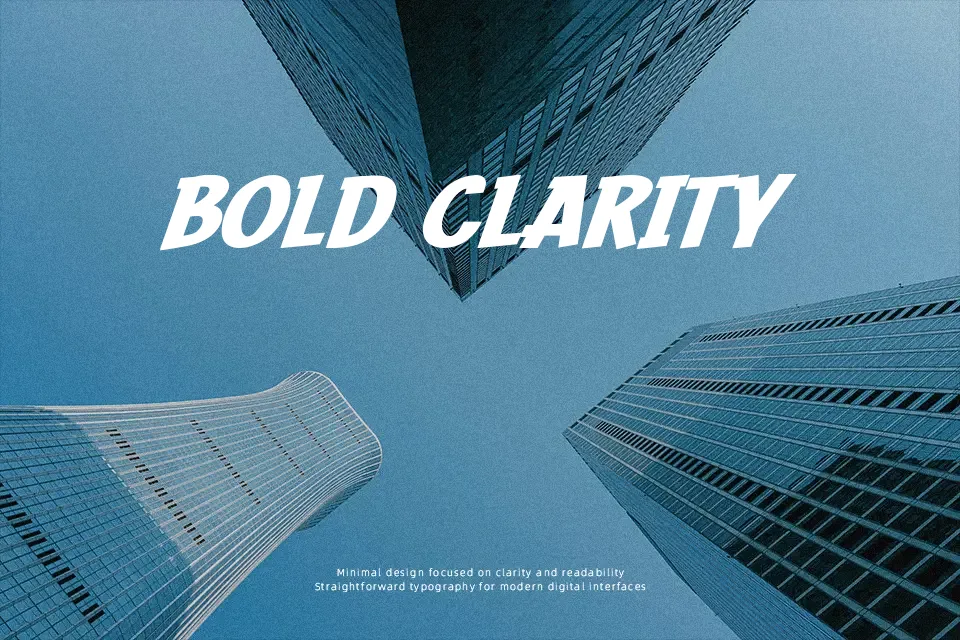
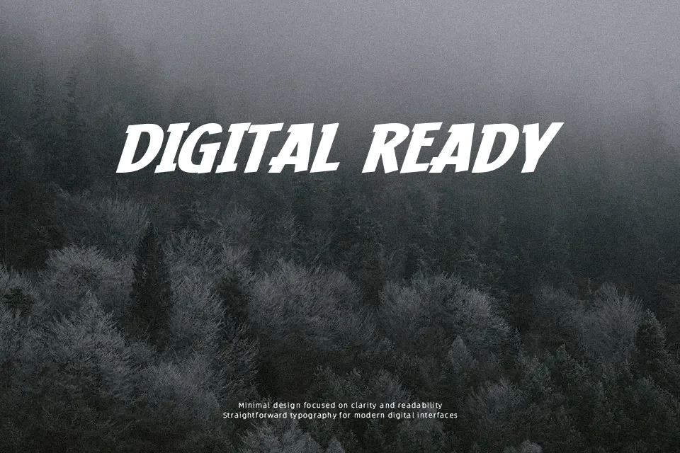
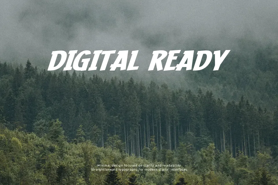
Raisin Up Font features a bold, hand-drawn structure with lively organic strokes and an intentionally irregular baseline that creates a dynamic visual rhythm. The characters exhibit a thick, consistent weight that commands attention while maintaining a highly approachable aesthetic. Its moderately tight spacing keeps words cohesive in large display formats, ensuring excellent legibility for oversized headers and titles. These heavy letterforms perform exceptionally well in playful branding and vibrant poster layouts. However, the bouncy proportions and informal nature become a noticeable limitation in dense layouts, significantly reducing reading comfort in extended paragraph text. Additionally, the tight internal counter spaces lose clarity at much smaller point sizes.
Best For: children’s book covers, casual snack packaging, comic book titles, playful event posters
Not Ideal For: long paragraph text, formal corporate reports, dense editorial layouts, small interface labels
Perfect for branding, kids, and packaging, with a bold and comic style.
License
Gallery