Rabbit Ears Font
Free for personal useAbout
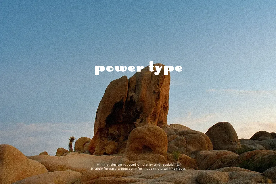
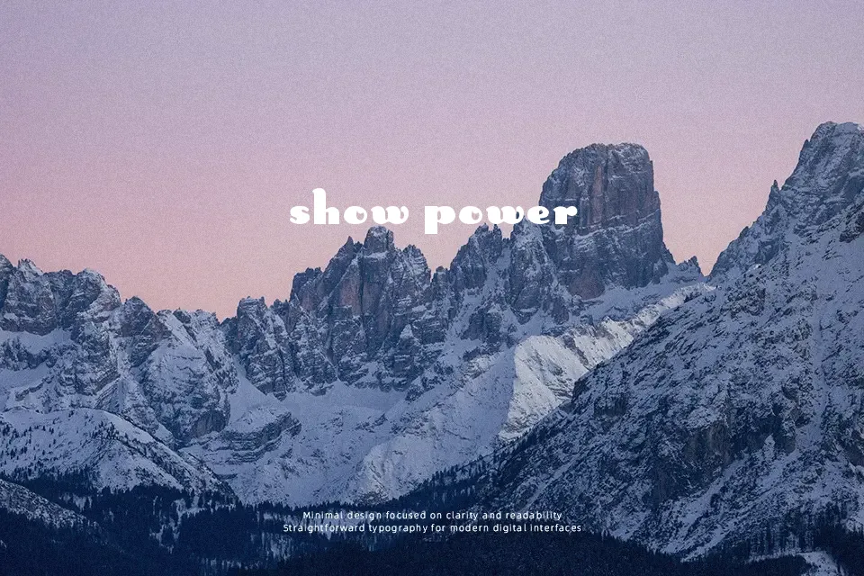
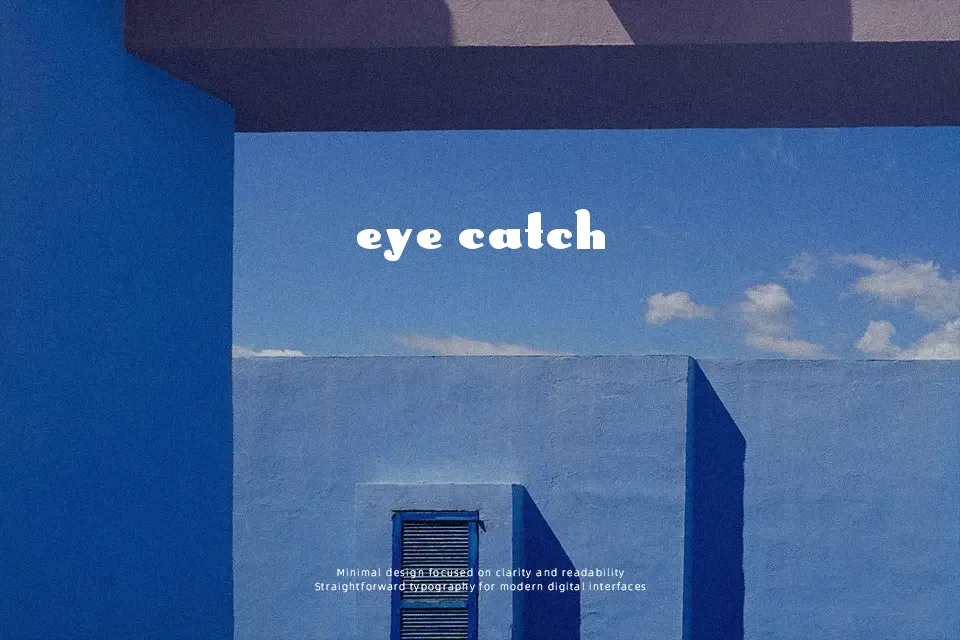
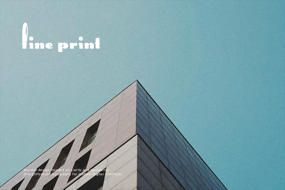
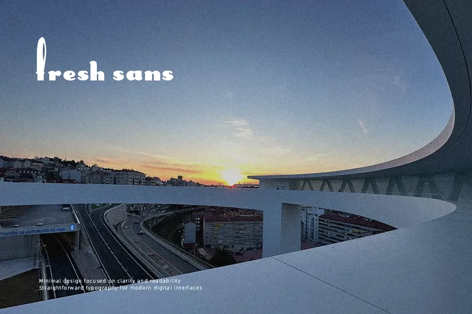
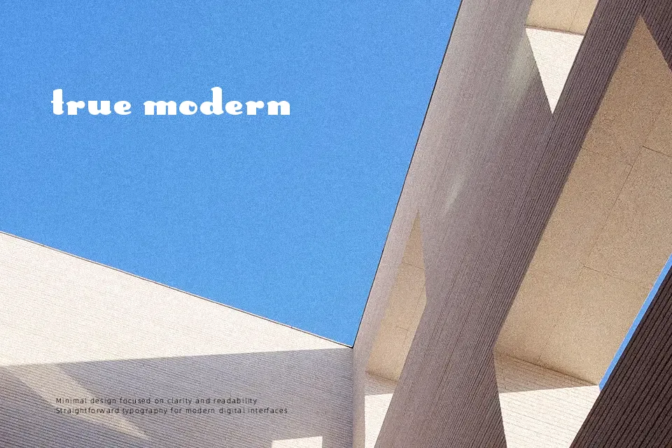
This typeface performs best when displayed at larger sizes, where the distinctive character of the Rabbit Ears Font can be fully appreciated. The design is characterized by unusually tall ascenders in the uppercase letterforms that playfully mimic bunny ears, contrasting with a modest, standard lowercase. Its stroke weight remains relatively uniform, while open spacing helps maintain clarity in vibrant headlines or music posters. Because of the extreme proportions and decorative extensions, the letterforms become visually disruptive in dense layouts. These creative details are less effective at smaller sizes, making the typeface poorly suited for continuous reading. However, for whimsical branding or event flyers, the unique vertical rhythm provides a truly memorable visual footprint.
Best For:
music festival posters, whimsical children’s branding, album cover art, creative headline typography
Not Ideal For:
long paragraph text, small interface labels, corporate reports, dense editorial layouts
Perfect for headline, kids, and music, with a creative and decorative style.
License
Gallery