Quattrocento Sans Font
Free for Commercial UseAbout
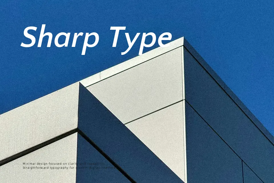
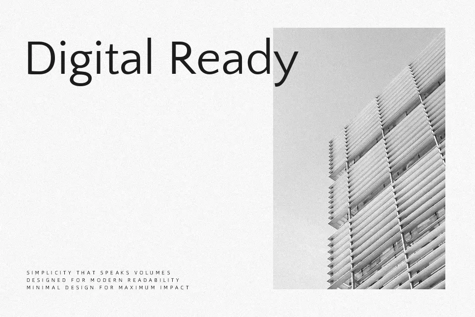
Quattrocento Sans is a humanist sans serif with wide, open counters, tall x-height, and calm, steady strokes that read comfortably on screens and in print. Its structure feels classical rather than trendy, so it supports content without shouting over it, especially in text-heavy pages, dashboards, and documentation. The tone lands between neutral and friendly, which works nicely when you want something less cold than a geometric sans but still restrained. It can handle headlines, but in very tight spacing, the wide forms may feel airy rather than punchy, so it is less convincing for highly compressed, loud display work.
Best For:
Long-form website body text and blogs
Product documentation and knowledge bases
UI layouts and dashboards needing calm, readable labels
Editorial projects pairing with a serif companion
Not Ideal For:
Very condensed headlines or cramped layouts
Loud promotional posters that rely on high visual impact
Highly decorative or expressive branding systems
Perfect for body text, branding, and editorial, with a classic and sans serif style.
License
Gallery