Press Start 2P Font
Free for Commercial UseAbout
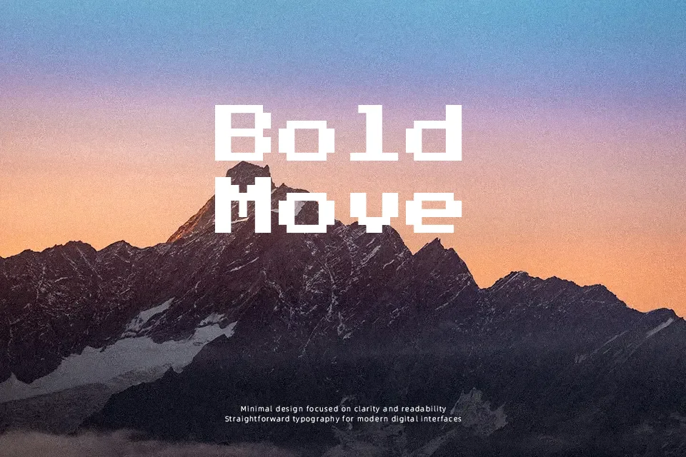
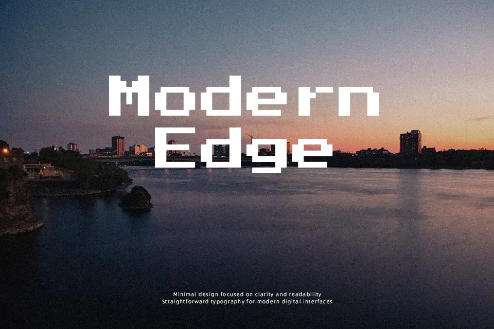
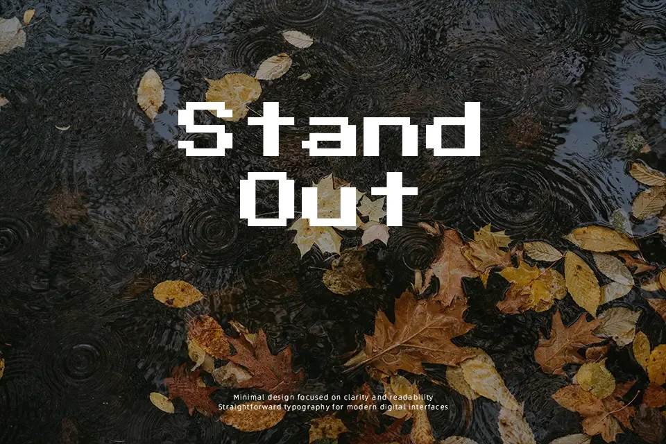
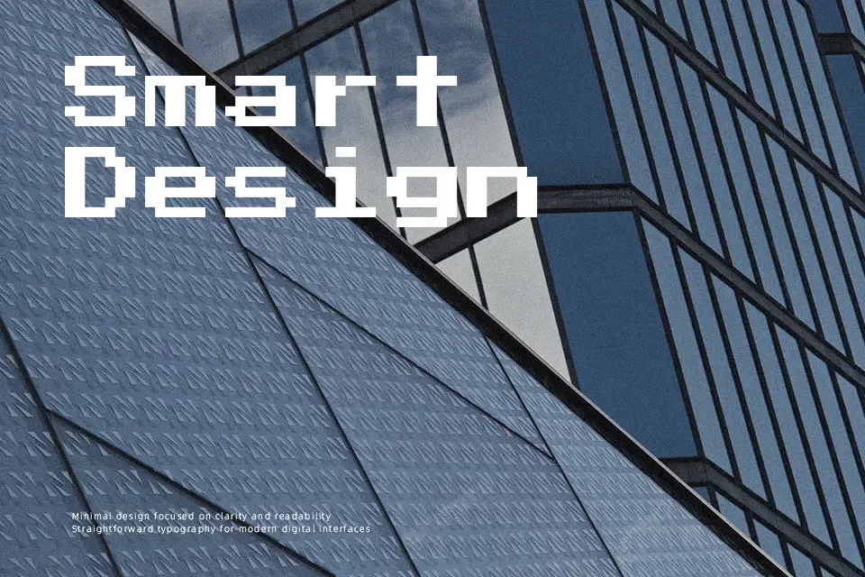
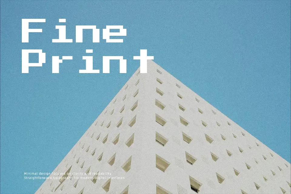
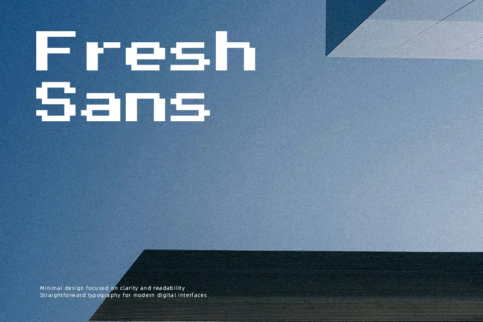
Press Start 2P recreates the chunky bitmap lettering of 1980s arcade cabinets, with square outlines, rigid monospaced spacing, and a strict 8×8-style grid that keeps every character sharply aligned. The strokes feel blocky rather than smooth, which brings strong personality but can quickly look noisy at small sizes or in long paragraphs. It works well when you commit to the retro aesthetic: game menus, stream overlays, scoreboards, event posters, or branding that leans into pixel-art nostalgia. For body copy, refined editorial layouts, or projects needing subtle hierarchy, its mechanical rhythm can overpower everything around it, so it makes more sense as a focused accent than a general-purpose workhorse.
Best For:
retro gaming logos and wordmarks
pixel-art themed UI and overlays
arcade-style posters and event graphics
stream branding and scoreboard graphics
Not Ideal For:
long paragraphs or continuous reading
formal editorial or corporate reports
very small text where pixels blur together
soft, romantic, or luxury-oriented branding
Perfect for gaming, headline, and logo, with a bold and display style.
License
Gallery