Power Font
Free for Commercial UseAbout
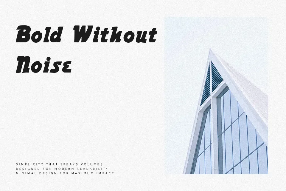
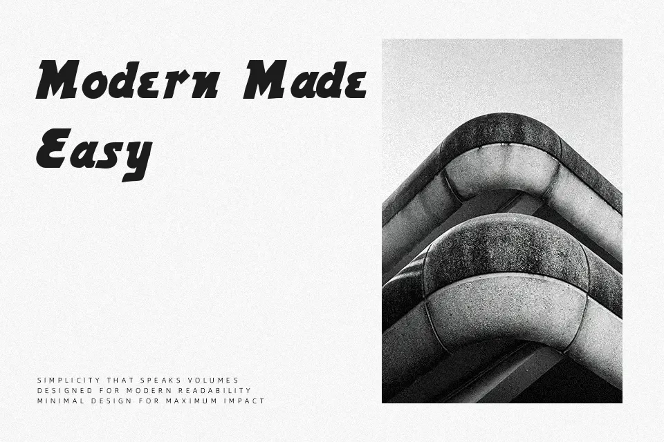
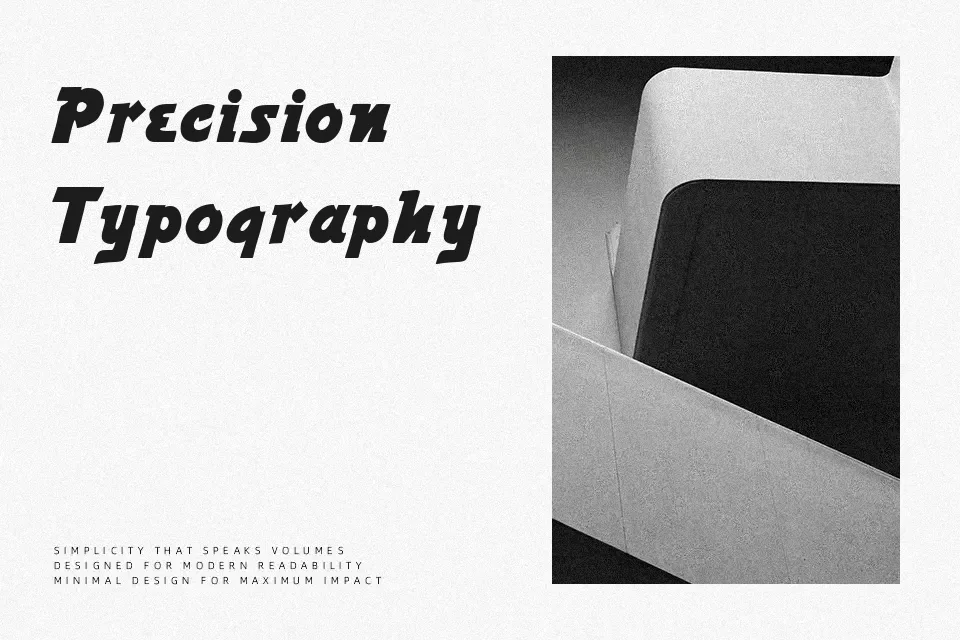
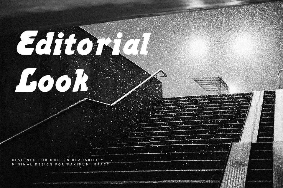
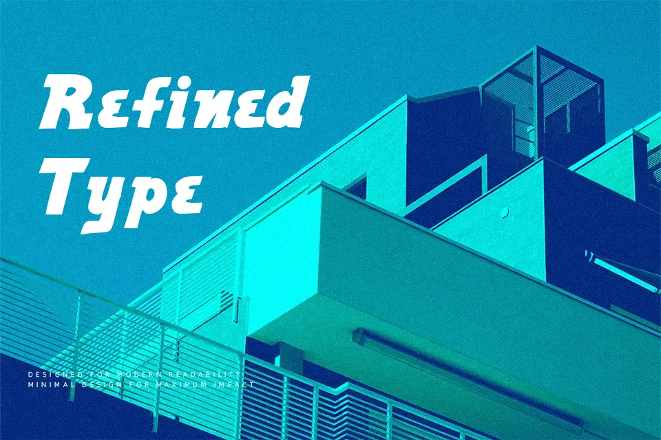
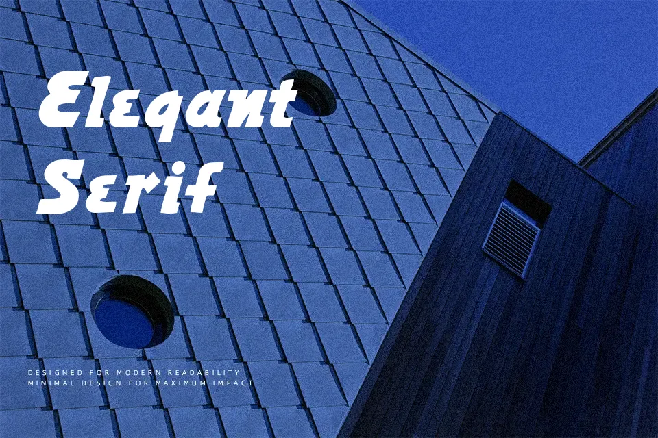
Power Font immediately draws the eye through its exceptionally heavy strokes and compact structural proportions. Designed primarily for high-impact display scenarios, the letterforms feature thick, uniform weights that create a dense, block-like visual rhythm across headlines. The tight spacing helps maintain clarity in larger headlines, ensuring the characters lock together solidly without feeling disconnected. However, these same heavy proportions make the typeface less suitable for long paragraphs, where the lack of negative space reduces continuous reading comfort. This robust display option performs best when given ample room to breathe in posters, athletic branding, or industrial packaging, commanding attention through sheer typographic weight.
Best For: athletic team apparel, industrial product packaging, music festival posters, bold website headlines
Not Ideal For: long paragraph text, small interface labels, corporate reports, spreadsheet data
Perfect for branding, headline, and packaging, with a bold and display style.
License
Gallery