Pottery Wheel Font
Free for personal useAbout
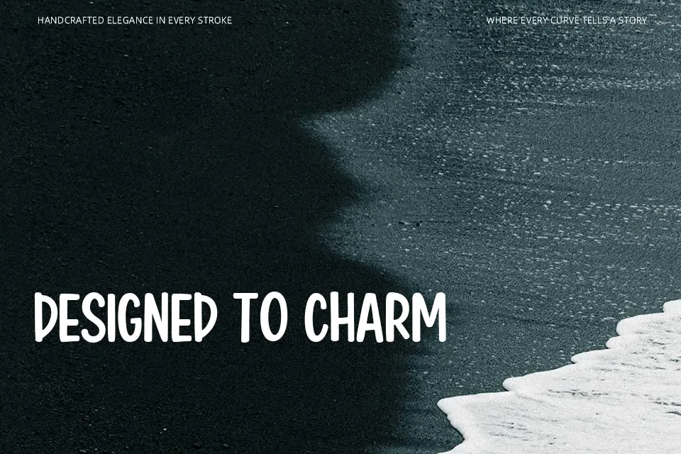
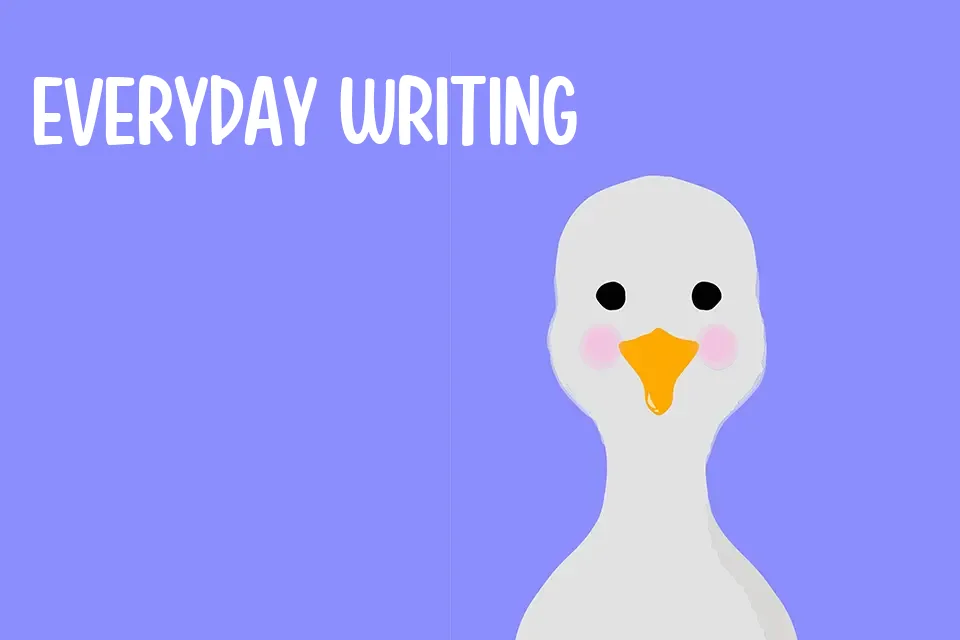
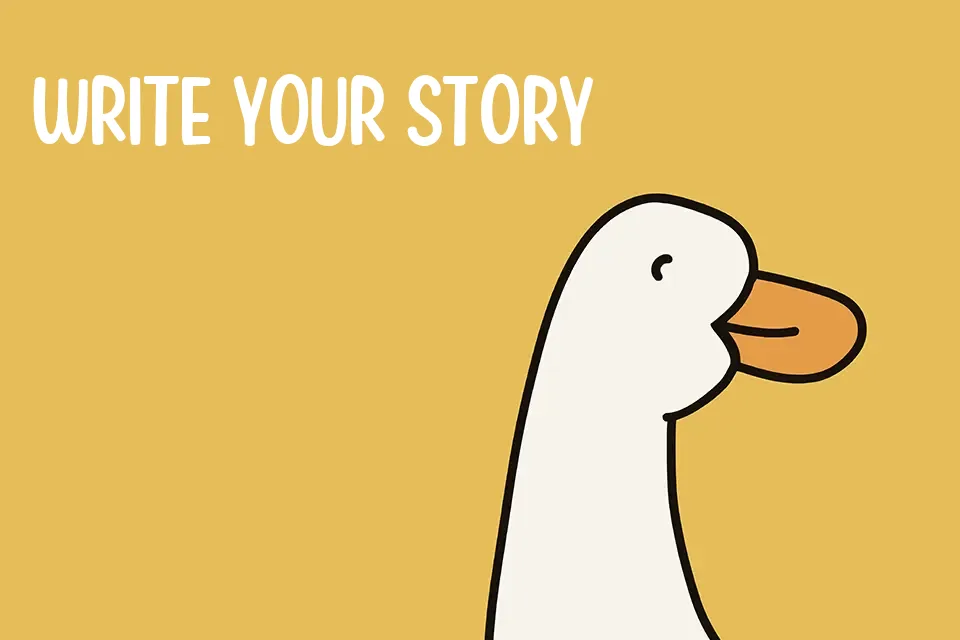
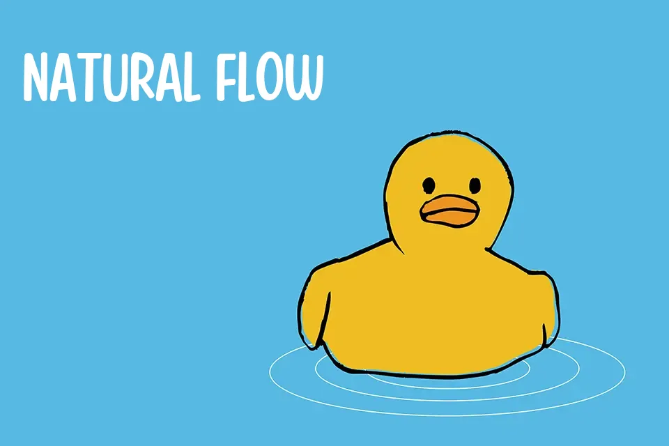
The structural charm of Pottery Wheel Font originates from its soft, organic strokes and slightly bouncy baseline that give the letterforms a playful, handcrafted appearance. This heavy cartoon typeface features tight spacing and irregular proportions, capturing a welcoming and whimsical aesthetic. The thick, rounded terminals help maintain solid visual weight in large display applications. This typeface performs best when displayed at larger sizes for children’s book titles, lively festival posters, and snack packaging. However, the irregular character shapes and tight kerning become less effective at smaller sizes. Dense forms reduce comfort during extended reading, making it less suitable for long paragraphs or interface typography where strict alignment is required.
Best For:
children’s book covers, toy packaging, festival posters, snack branding
Not Ideal For:
long paragraph text, small interface labels, dense editorial layouts
Perfect for headline, kids, and packaging, with a cute and cartoon style.
License
Gallery