Potta One Font
Free for Commercial UseAbout
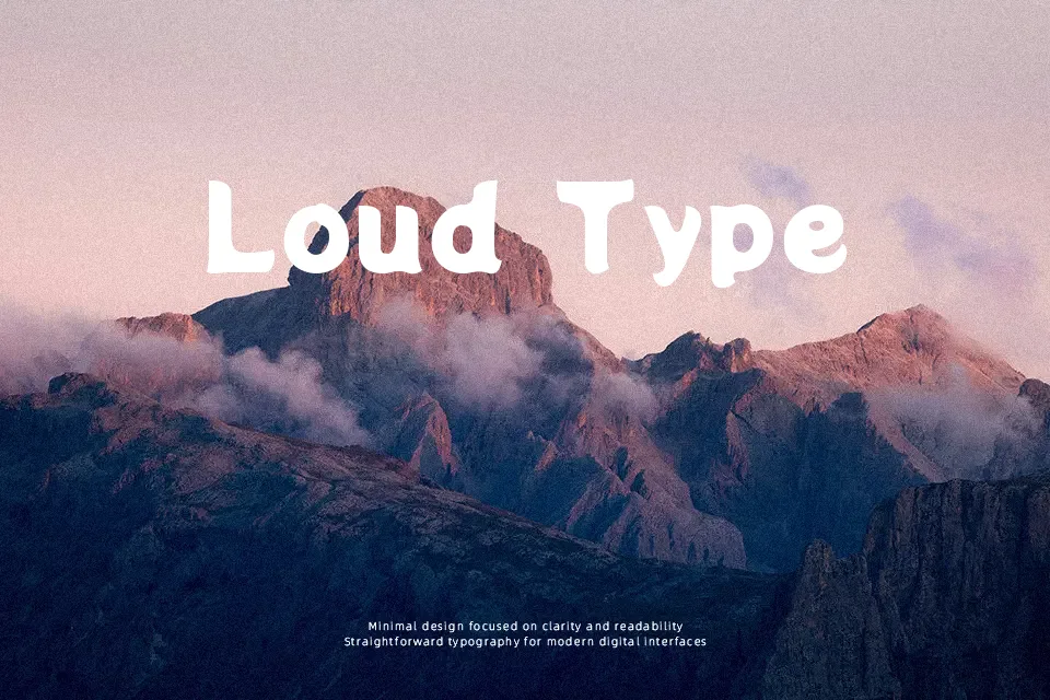
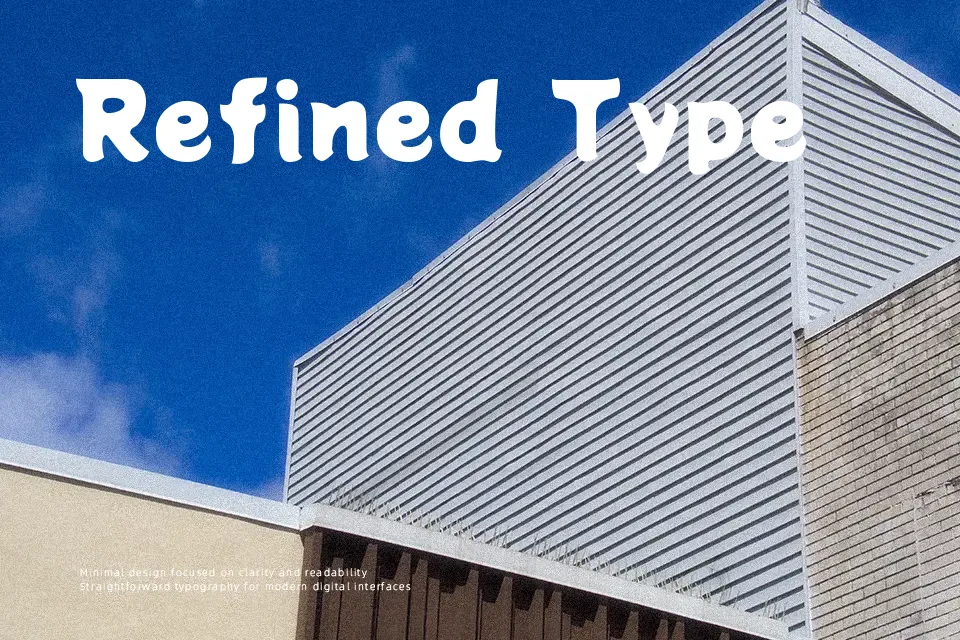
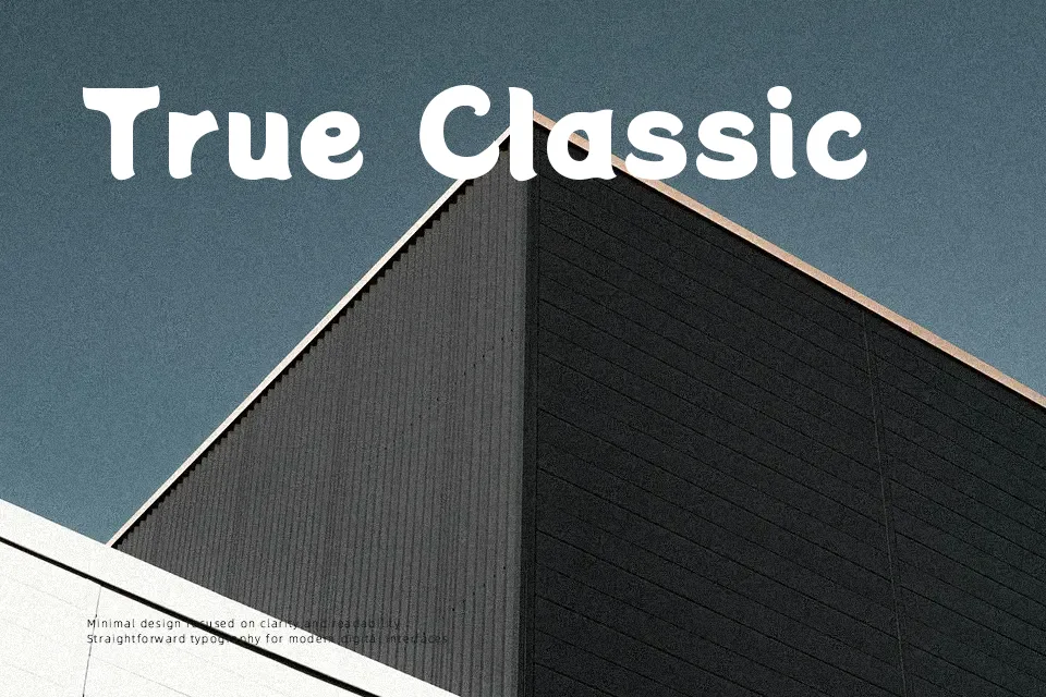
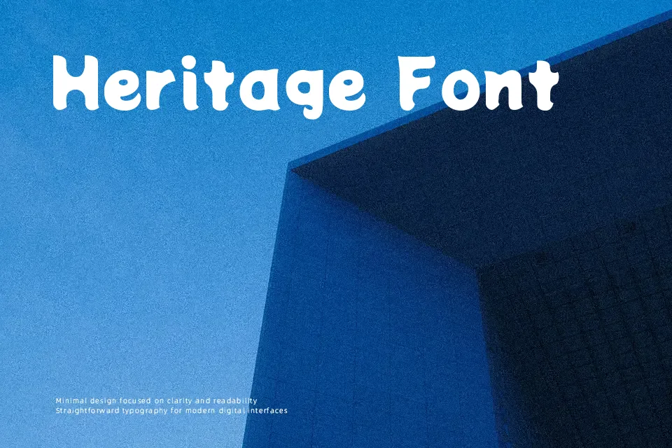
Potta One leans on thick, uniform strokes and generously rounded forms that feel almost bubble-like, so text looks friendly and loud at the same time. Counters are open, spacing is fairly tight, and the brush-inspired curves give both Latin and Japanese characters a soft, handwritten energy rather than mechanical precision. In practice it works well for manga-style title cards, casual restaurant signage, playful app interfaces, and packaging where you want a strong, cartoony voice without losing legibility in mixed-script layouts. It tends to look clumsy in dense body copy, strict corporate environments, or minimalist layouts that demand subtlety rather than character, so it is better treated as an accent or headline face than a do‑everything workhorse.
Best For:
bold manga-style headlines and game titles
kids’ products, learning materials, and playful apps
casual restaurant, café, or snack packaging with Japanese influence
bilingual posters mixing Latin and Japanese text
Not Ideal For:
long paragraphs or text-heavy layouts
formal corporate branding or legal documents
minimalist UI where typography should stay quiet
highly condensed layouts with very small font sizes
Perfect for branding, headline, and kids, with a bold and display style.
License
Gallery