Poft Sarade Font
Free for personal useAbout
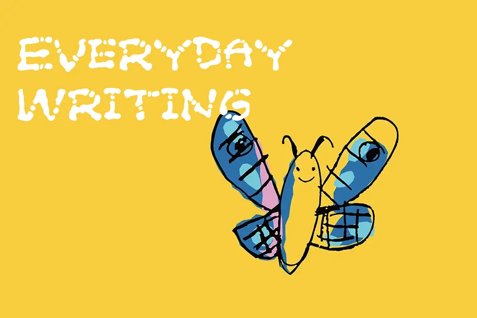
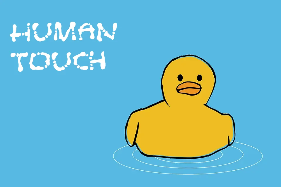
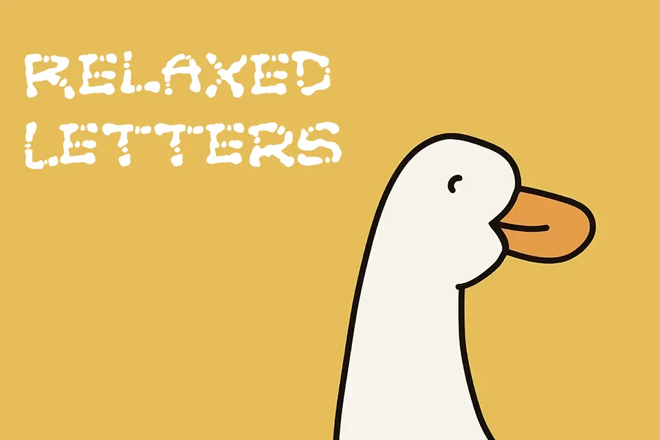
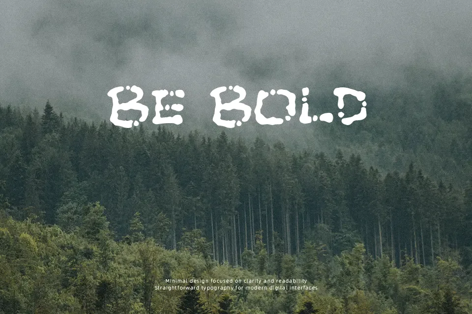
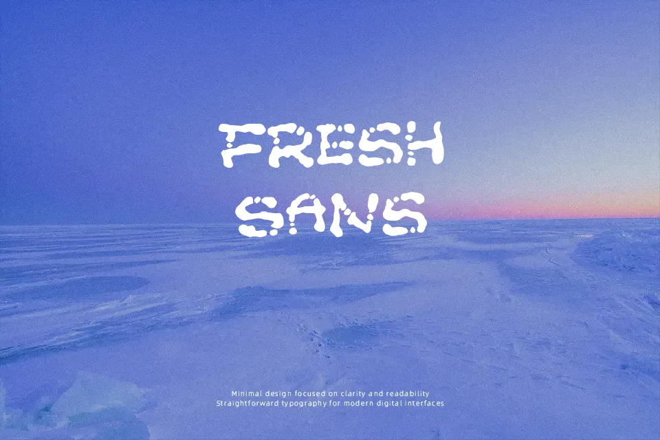
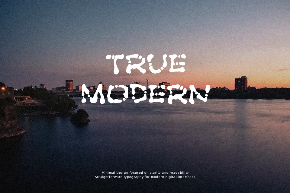
The Poft Sarade Font introduces a highly irregular, hand-cut visual structure that leans heavily into a distorted cartoon aesthetic. The letterforms display chunky, unpredictable stroke weights and uneven baseline alignments, generating a loose and bouncy rhythm across the text. Because of its thick proportions and organic spacing, the typeface performs best when displayed at larger sizes, such as playful packaging or bold festival posters. The robust strokes help maintain strong visibility in brief headlines, adding a raw, creative energy to the layout. However, the intentionally rough and mismatched characters create a significant limitation; dense forms reduce continuous reading comfort, making it less suitable for long paragraphs or small editorial captions where clarity is required.
Best For: festival posters, playful packaging, creative headlines, cartoon branding
Not Ideal For: long paragraph text, dense editorial layouts, small interface labels
Perfect for headline, kids, and packaging, with a creative and cartoon style.
License
Gallery