Playwrite NO Font
Free for Commercial UseAbout
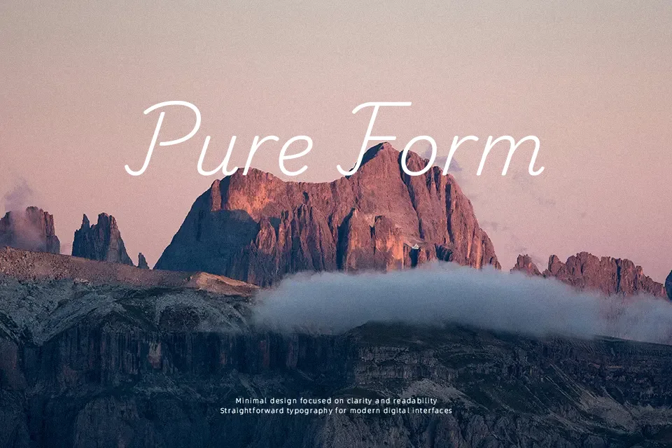
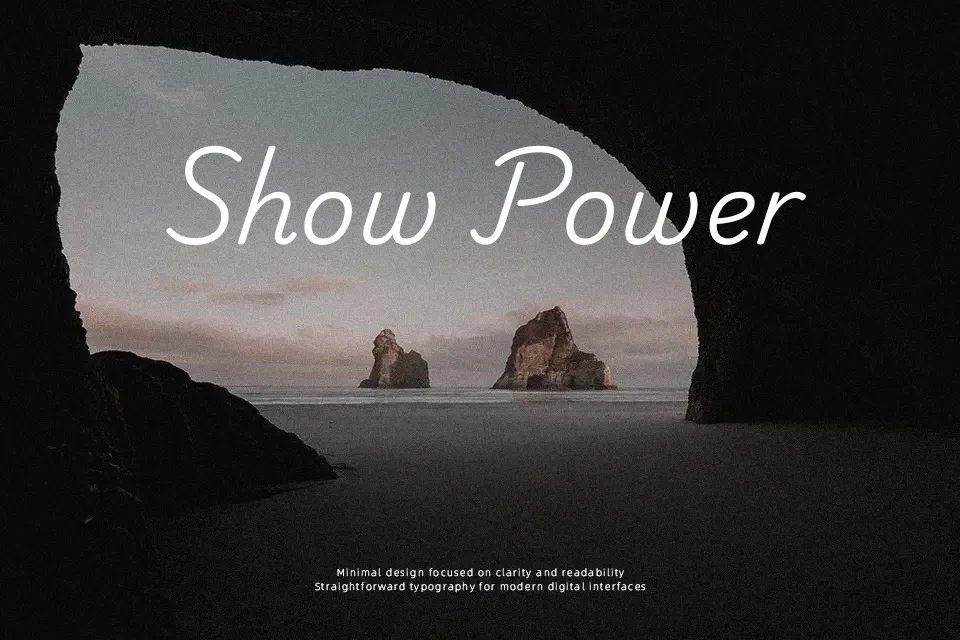
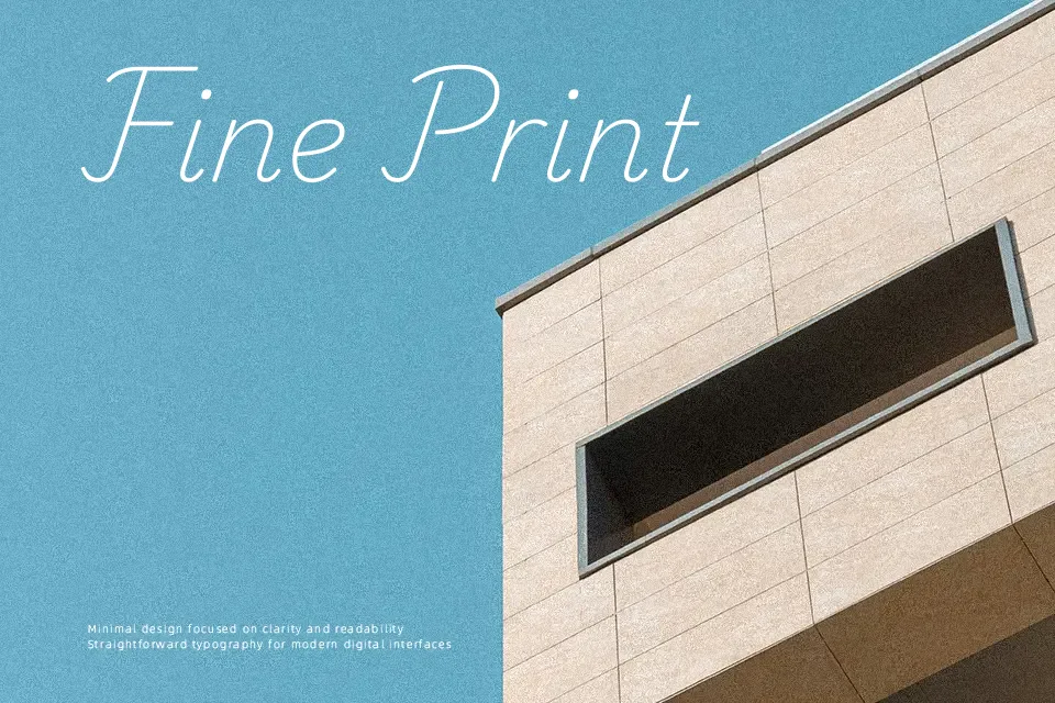
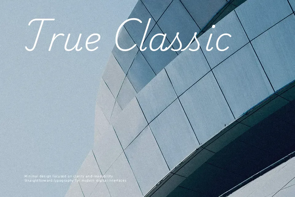
Playwrite NO belongs to the Playwrite superfamily created to teach handwriting, so its letters feel informal yet carefully controlled, with simple construction, clear joins, and generous spacing that keeps lines readable even at smaller sizes. The strokes are fairly consistent in weight, giving a calm rhythm that works well when you need text to look handwritten without drifting into messy or overly quirky shapes. Compared with playful display scripts, it stays more restrained and school-oriented, which helps in educational interfaces, child-focused products, and friendly instructions. I would reach for it in learning materials, worksheets, and explainer graphics, but avoid it for dense body copy or projects that demand a highly polished corporate tone.
Best For:
handwriting worksheets for Norwegian learners
school and classroom printables with a friendly feel
child-focused apps that teach letter shapes
approachable branding that hints at handwriting
Not Ideal For:
long-form editorial body text
strictly corporate or luxury branding
very small UI labels where spacing must be tight
projects needing highly formal typography
Perfect for branding, headline, and poster, with a creative and handwritten style.
License
Gallery