Play Leaves Font
Free for personal useAbout
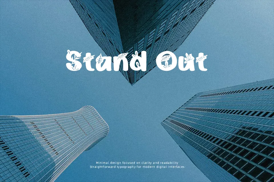
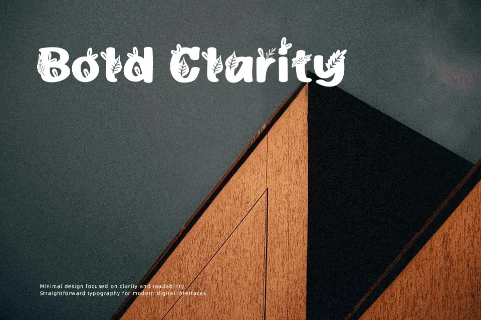
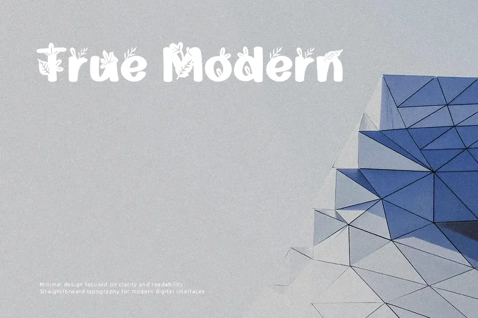
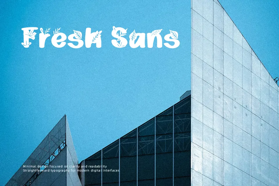
Play Leaves Font works best when its decorative letterforms have room to be seen. The characters combine recognizable alphabetic structure with leafy embellishments, creating an organic display appearance that suits short titles and names. Strokes appear varied rather than strictly uniform, while the proportions and spacing give individual letters a noticeable presence. It is most effective in larger headlines, where the decorative details remain clear and contribute to the layout. The typeface is less comfortable for extended reading, since its ornamented forms can slow recognition in dense text or small sizes.
Best For: botanical product labels,nature-themed posters,garden event invitations,eco-conscious packaging
Not Ideal For: long paragraph text,small interface labels,technical manuals,dense editorial layouts
Perfect for branding, invitation, and packaging, with a artistic and decorative style.
License
Gallery