Patrick Hand Font
Free for Commercial UseAbout
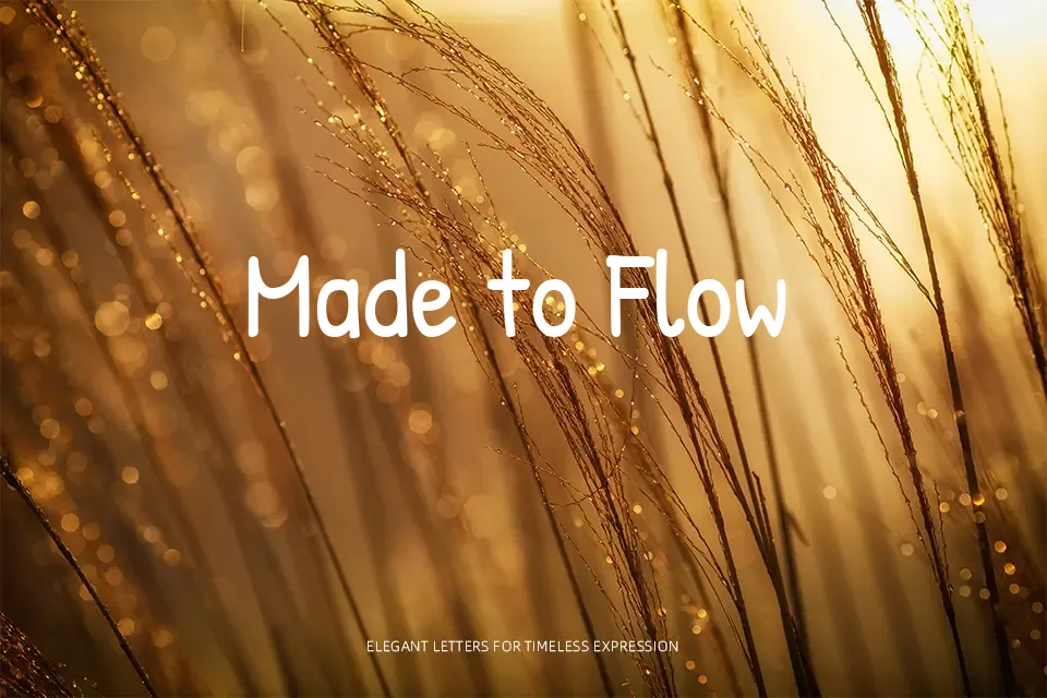
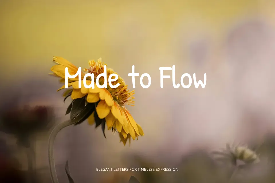
Patrick Hand looks like neat, everyday handwriting: medium weight strokes, gentle curves, and slightly loose spacing that stays very readable even at smaller sizes. It sits between casual script and clean sans serif, so it brings warmth without turning your layout into a doodle page. This works nicely for teacher worksheets, kids’ printables, onboarding flows, and social posts where you want text to feel spoken rather than announced. Compared to more bouncy comic styles, it feels calmer and more grown-up, but it can look underpowered in luxury branding or dense editorial columns that demand stricter typographic rhythm.
Best For:
friendly UI labels and microcopy
education materials and classroom worksheets
informal posters and event flyers
personal blogs and casual social graphics
Not Ideal For:
high-end luxury branding systems
formal corporate reports or legal documents
very long body text in print editorials
minimal tech interfaces needing strict geometry
Perfect for headline, kids, and poster, with a creative and handwritten style.
License
Gallery