Panforte Font
Free for personal useAbout
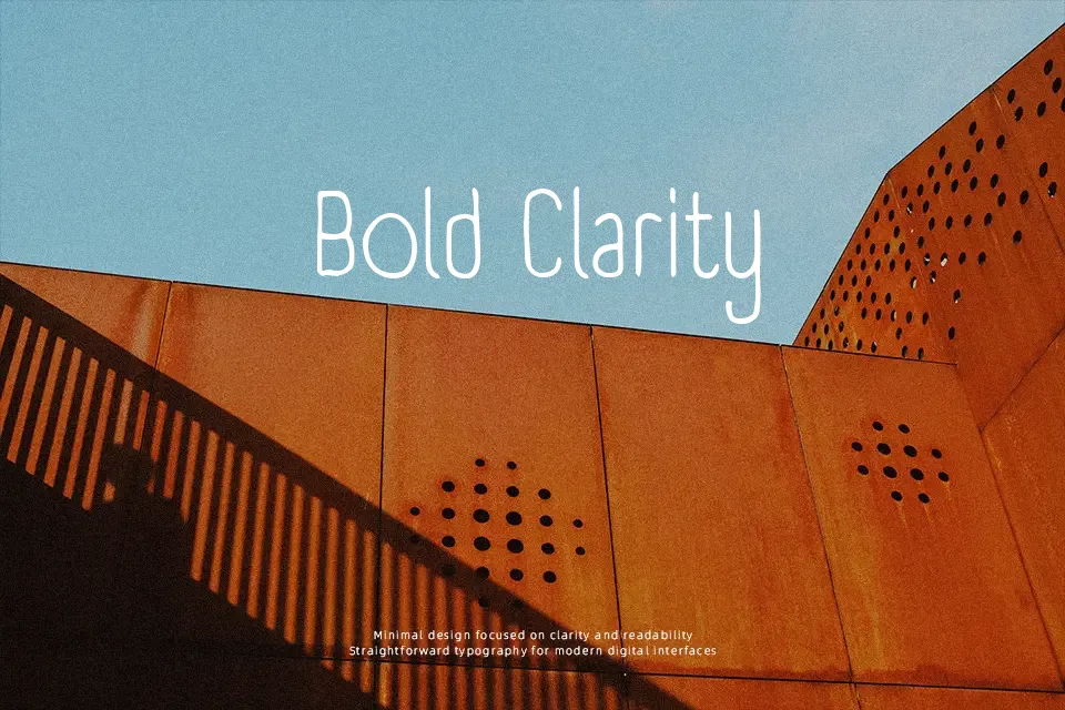
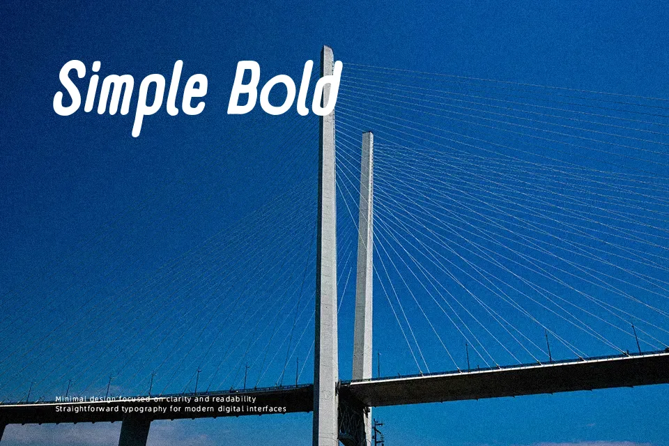
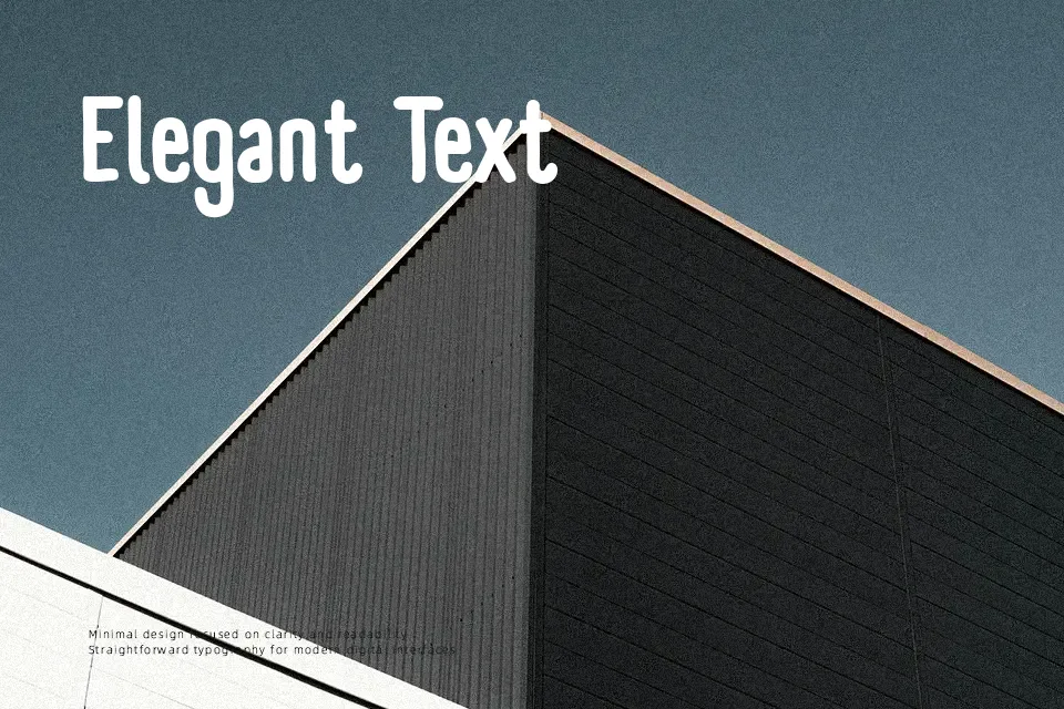
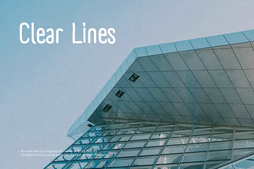
Panforte Font works best in prominent display settings where its narrow, hand-drawn letterforms can establish a lively visual rhythm. The strokes are bold and uneven, with textured edges and condensed proportions that make words feel compact without becoming rigid. Spacing remains controlled enough for short headlines, labels, and menu titles, while the irregular construction gives each line a casual printed character. Its tall forms help maintain visibility at larger sizes, particularly in packaging and poster layouts. However, the rough details and compressed shapes are less comfortable in small text or extended reading. The typeface is a practical choice when a handcrafted headline needs to fit a limited width.
Best For: restaurant menu headers,food packaging labels,promotional posters,artisan product branding
Not Ideal For: long paragraph text,small interface labels,legal documents,dense editorial layouts
Perfect for branding, headline, and packaging, with a creative and condensed style.
License
Gallery