About
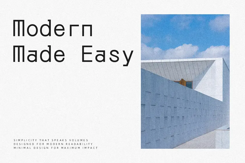
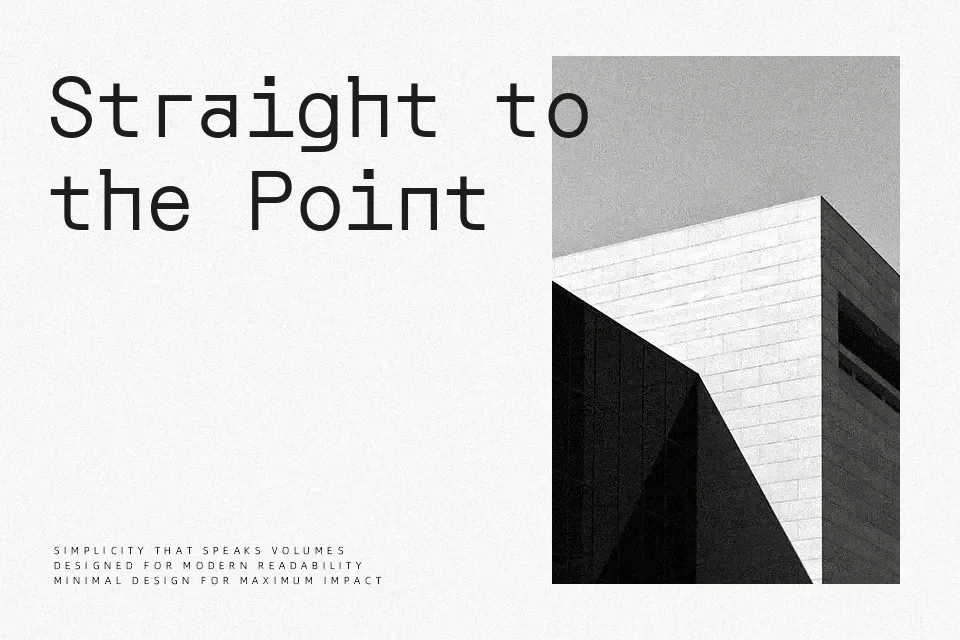
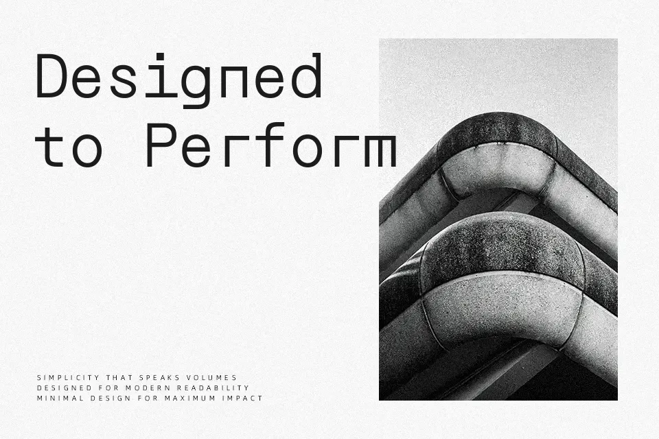
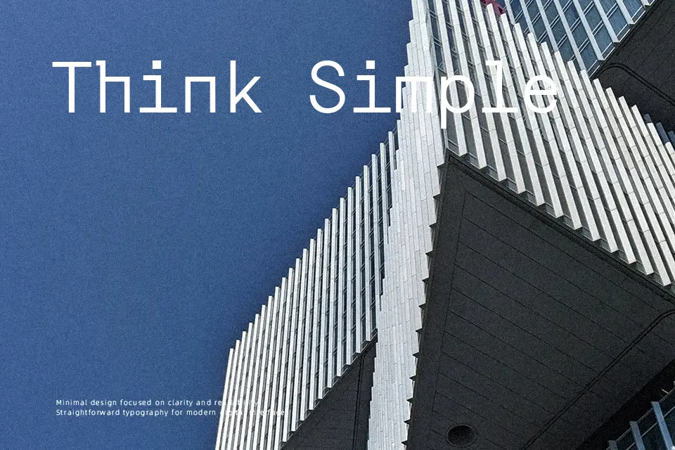
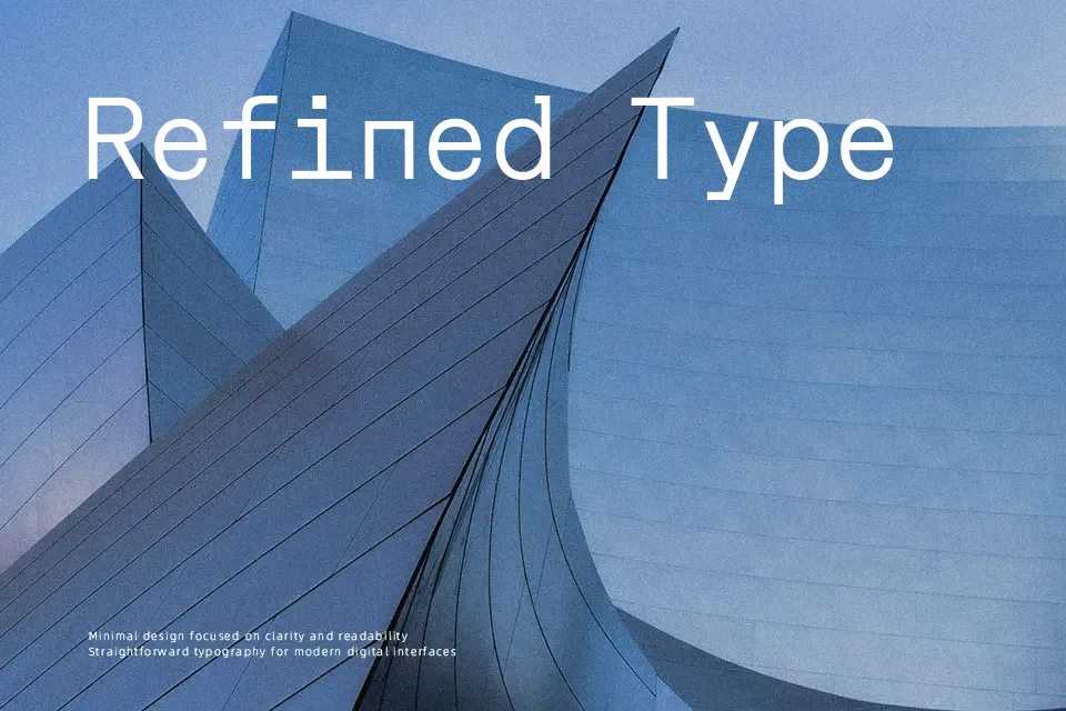
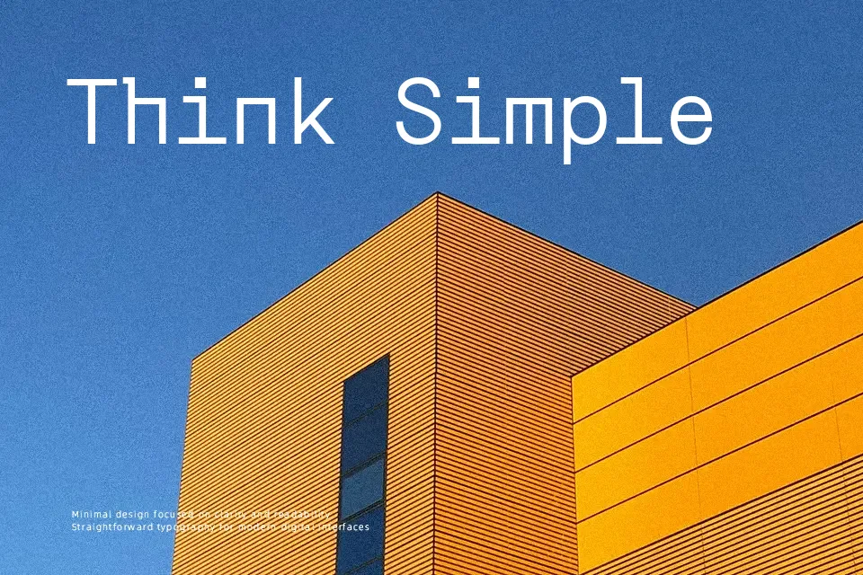
Orbit blends the logic of monospaced coding fonts with a more refined sans serif structure, giving Korean and Latin text a measured, almost mathematical feel. Strokes stay clean and fairly even in weight, with right-angled details and circular counters that read clearly even when you push sizes below 10pt on high‑resolution screens. The overall impression leans modern and functional rather than decorative, so it sits quietly in system UIs, data-heavy layouts, and code-adjacent products without drawing unnecessary attention. I reach for it when I need a pragmatic screen typeface with a subtle tech edge, but I avoid it for expressive branding or long editorial reading where softer spacing and more personality matter.
Best For:
UI labels and system menus on dark themes
Data dashboards and coding-related interfaces
Compact captions in multilingual Korean–Latin layouts
Not Ideal For:
Expressive lifestyle or fashion branding
Long-form editorial reading
Projects needing highly decorative or calligraphic tone
Perfect for body text, editorial, and headline, with a clean and geometric style.
License
Gallery