Oldenburg Font
Free for Commercial UseAbout
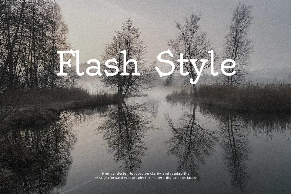
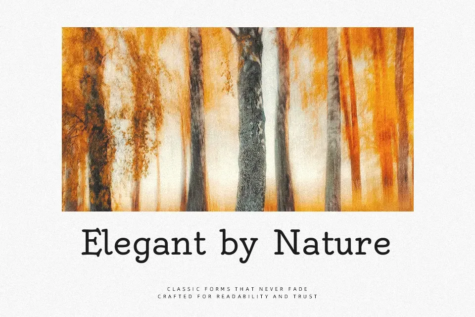
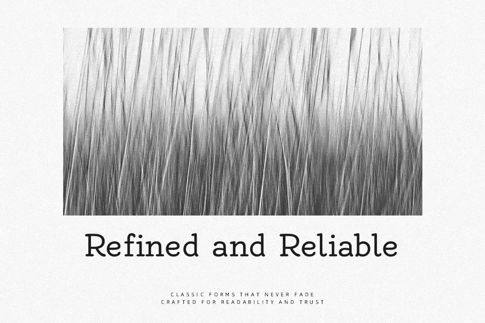
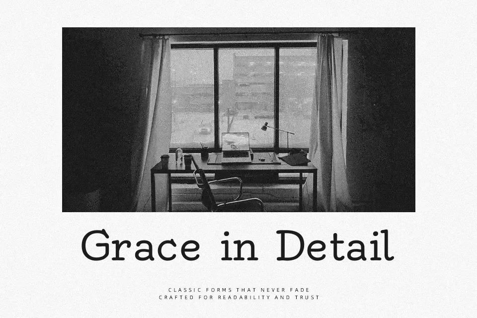
Oldenburg takes cues from nearly monoline German poster lettering, then tightens the structure into a sturdy, slab-flavored serif with soft curves and a slightly quirky rhythm. Strokes feel even, counters stay open, and spacing is generous enough that titles remain legible at medium sizes while still feeling informal. The overall voice leans casual and nostalgic rather than corporate, so it shines in friendly branding, illustrated packaging, editorial pull quotes, and signage where you want personality without chaos. I would hesitate to set long body copy or serious corporate reports in Oldenburg, as its playful details start to distract, especially compared to more restrained book serifs.
Best For:
Friendly branding wordmarks and logotypes with a retro touch
Cafe, bakery, and restaurant menus or chalkboard-style signage
Editorial headlines, pull quotes, and short intros that need personality
Posters and packaging aimed at creative, nostalgic audiences
Not Ideal For:
Dense body text or long-form reading
Strictly formal corporate documents or reports
Highly technical interfaces or data-heavy UI layouts
Tiny caption sizes where the quirky shapes may blur
Perfect for branding, headline, and logo, with a creative and display style.
License
Gallery