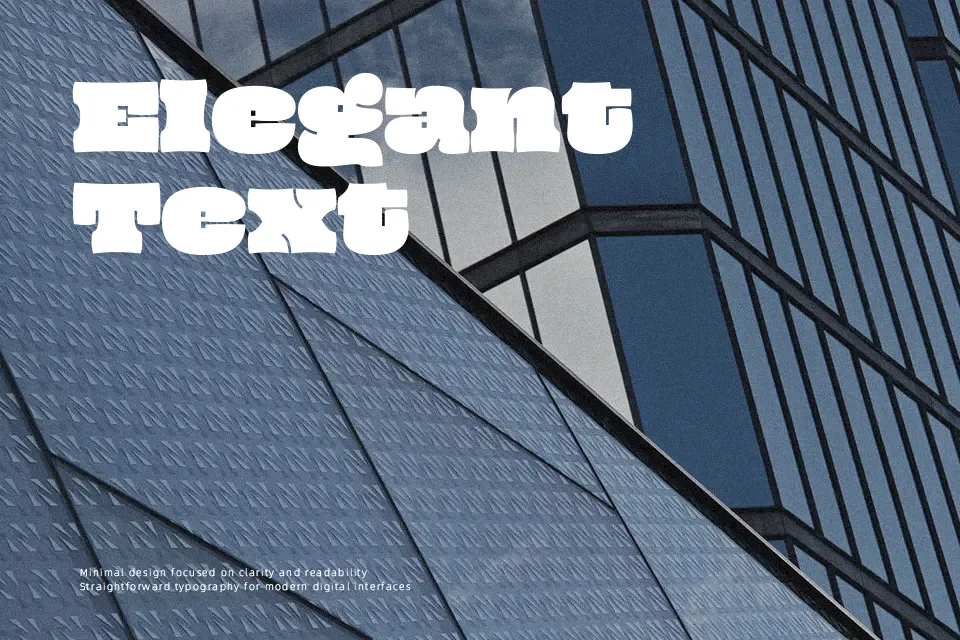
Oi Font
Free for Commercial UseAbout
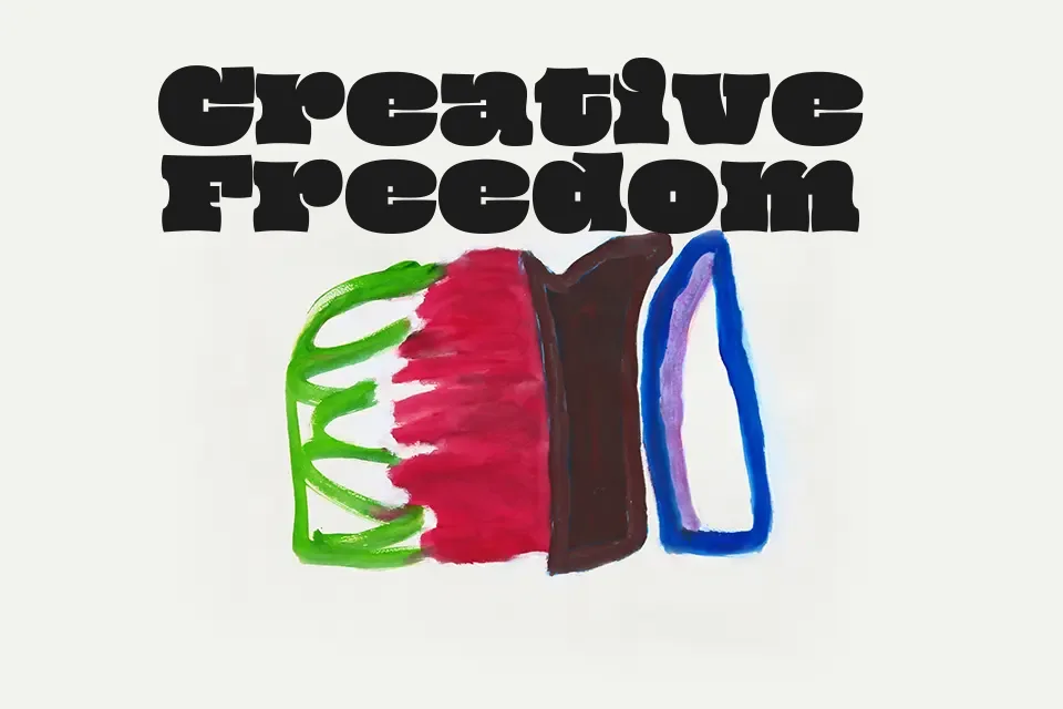
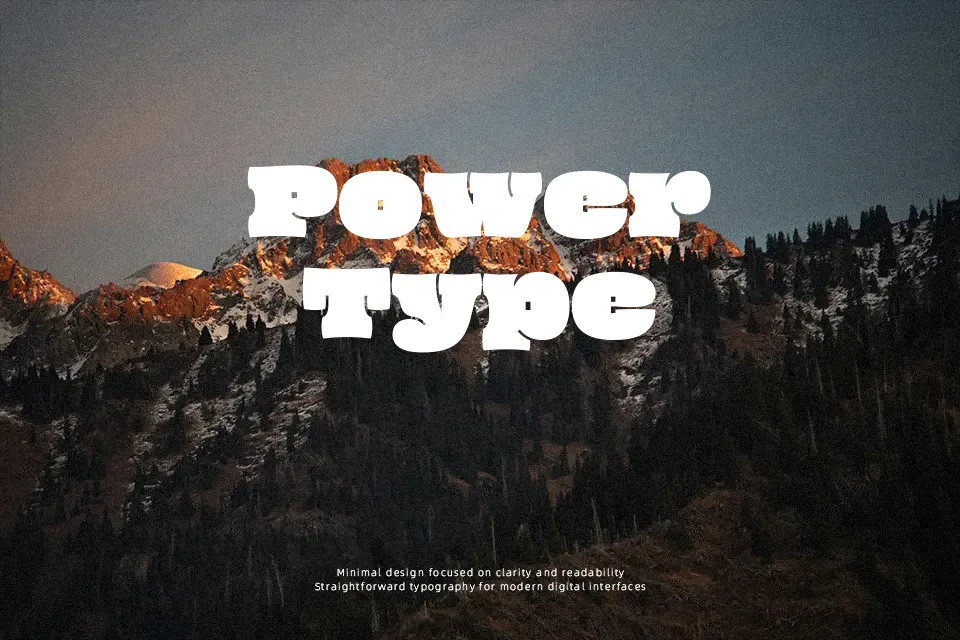
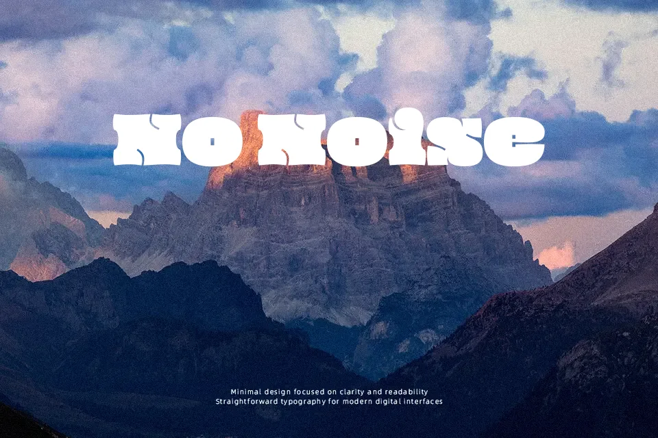
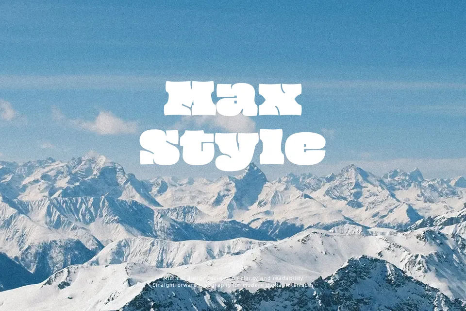
Oi is a chunky, ultra-fat display typeface with grotesque slab DNA, exaggerated curves, and thick, almost blocky strokes that push letters right to the edge of their counters. The spacing is generous enough to keep the letterforms legible at large sizes, but the condensed interiors and unusual shapes quickly feel overwhelming when used in long passages. Visually it comes across as loud, playful, and a little rough around the edges, more like a typographic shout than a polite sentence. It works well on posters, event titles, music artwork, and branding that wants a bold, mischievous voice, especially when paired with a calmer companion typeface for body copy. For serious editorial layouts, dense UI, or text-heavy documents, its weight and eccentric forms can become tiring and distract from the content.
Best For:
bold event posters and flyers
statement headlines in music or streetwear branding
short social graphics with punchy phrases
title treatments on creative packaging
Not Ideal For:
long-form editorial reading or articles
dense UI text or dashboards
formal corporate documents and reports
small captions or fine-print information
Perfect for branding, headline, and music, with a bold and display style.
License
Gallery