Noto Sans JP Font
Free for Commercial UseAbout
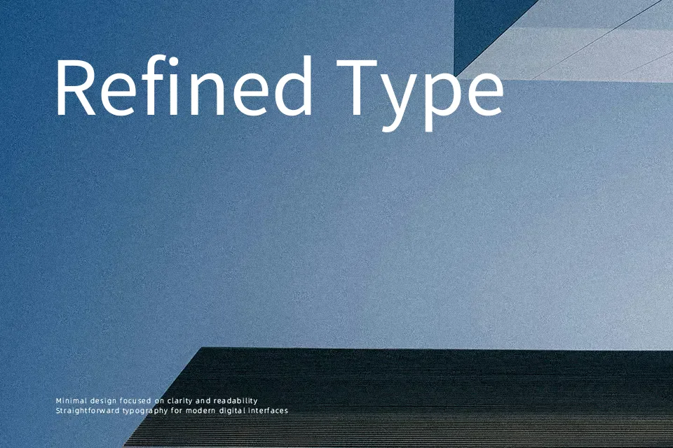
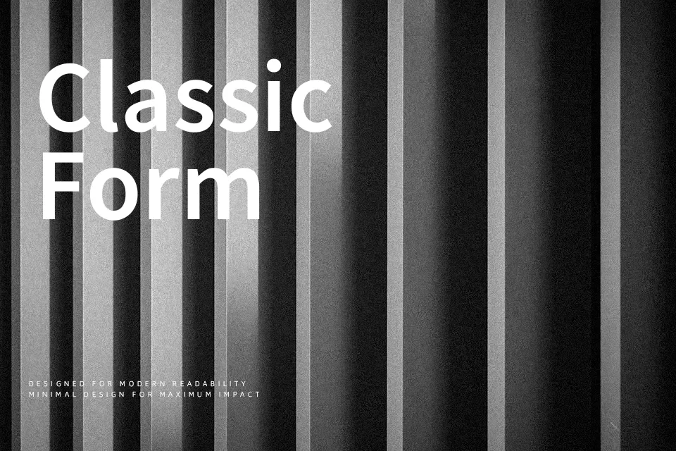
Noto Sans JP combines open counters, balanced stroke contrast, and carefully tuned spacing to stay readable even in dense Japanese text. Lighter weights feel airy on screens, while the heavier cuts add just enough presence for banners, navigation, or data-heavy dashboards without shouting. The overall impression is functional and **professional** rather than flashy, which makes it handy for products and content that need to speak clearly to a broad Japanese audience. If you want something expressive for character-driven branding or highly decorative titles, this family can feel too neutral and restrained on its own.
Best For:
app UI labels and menus
multilingual product interfaces
long-form Japanese articles
data dashboards and admin tools
Not Ideal For:
highly expressive logos
playful kids packaging
ornate event invitations
loud display wordmarks
Perfect for body text, editorial, and headline, with a calm and geometric style.
License
Gallery