Noises in the Attic Font
Free for personal useAbout
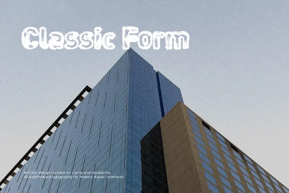
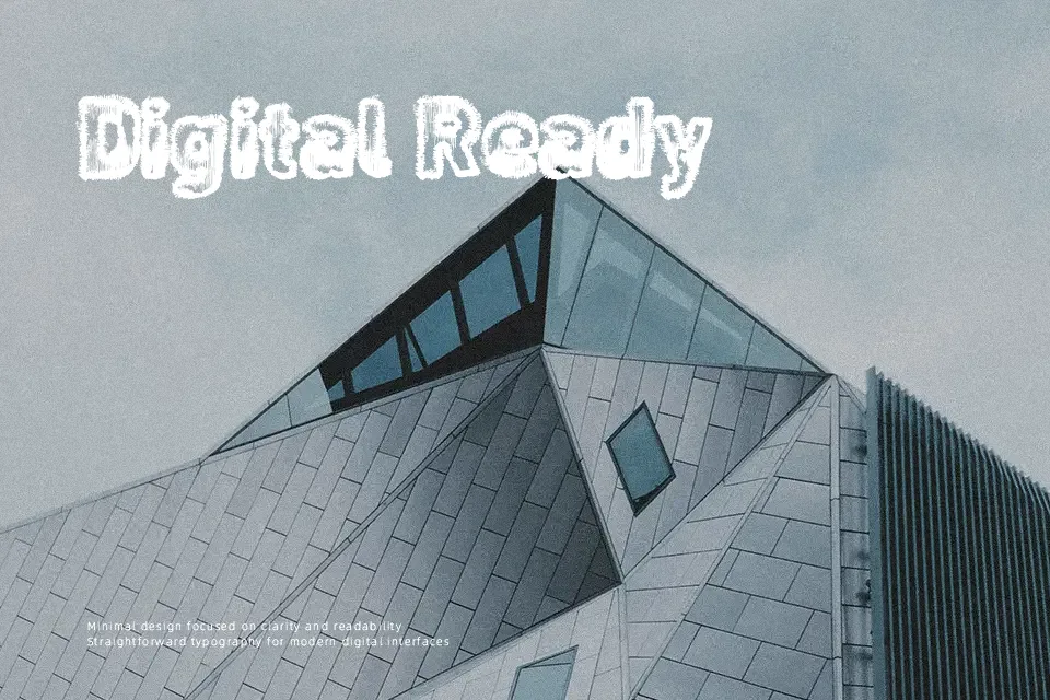
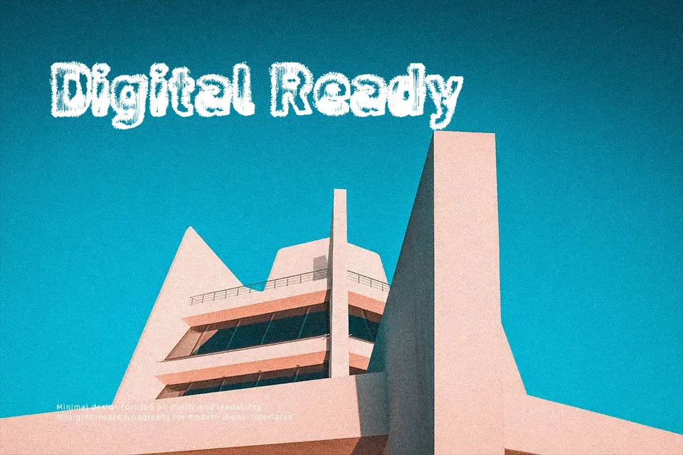
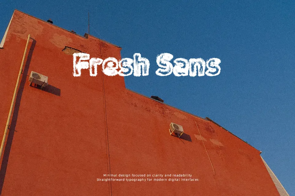
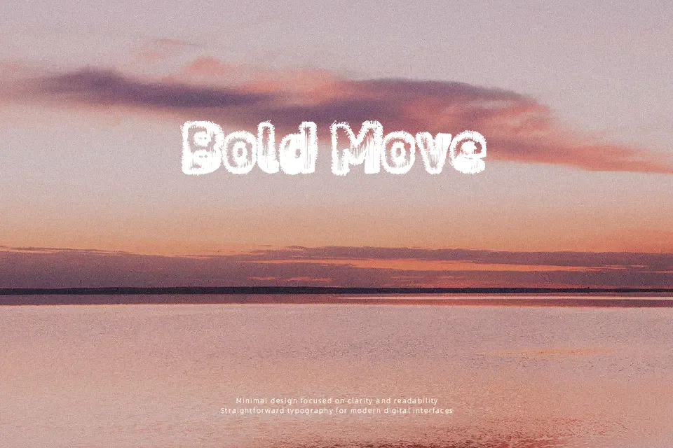
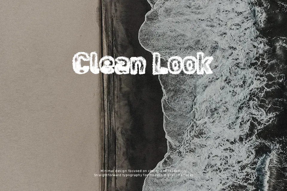
Noises in the Attic Font uses irregular, broken-looking letterforms with sharp edges and a deliberately unsettled rhythm. The heavy decorative treatment gives uppercase characters a rough, distressed presence, while the narrow internal spaces and uneven contours make each word feel visually active. Spacing is most effective when the type is given room to breathe in large headlines or short titles. It works well for horror-themed artwork, especially when the text needs an aged or damaged appearance. The dense, textured shapes remain noticeable at display sizes, but fine details become harder to distinguish in small captions and continuous copy.
Best For: horror movie posters,haunted house event graphics,Halloween invitations,dark music artwork
Not Ideal For: long paragraph text,small interface labels,legal documents,dense editorial layouts
Perfect for film, halloween, and headline, with a dark and decorative style.
License
Gallery