Nine Feet Under Font
Free for personal useAbout
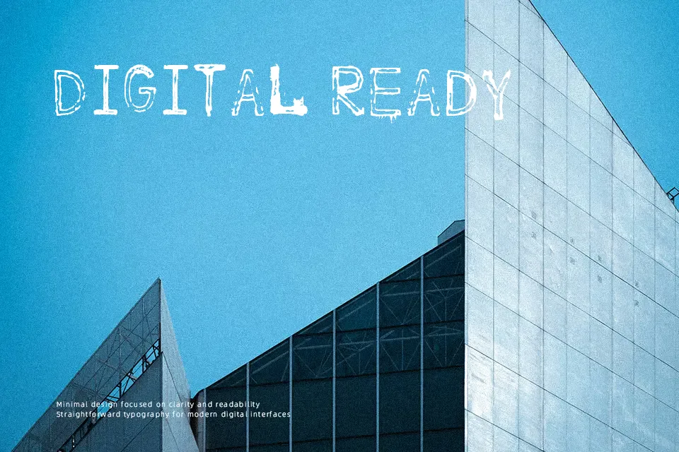
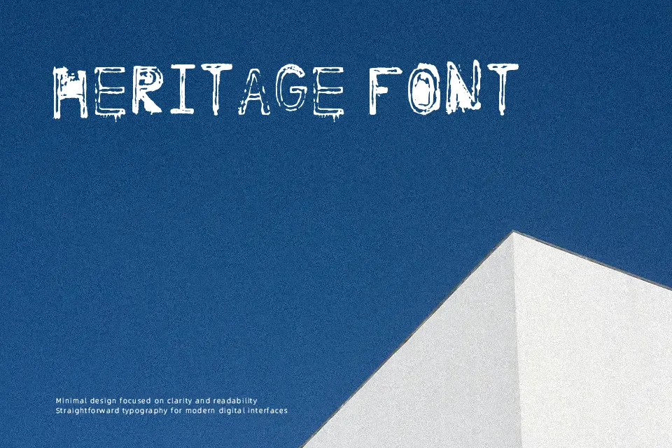
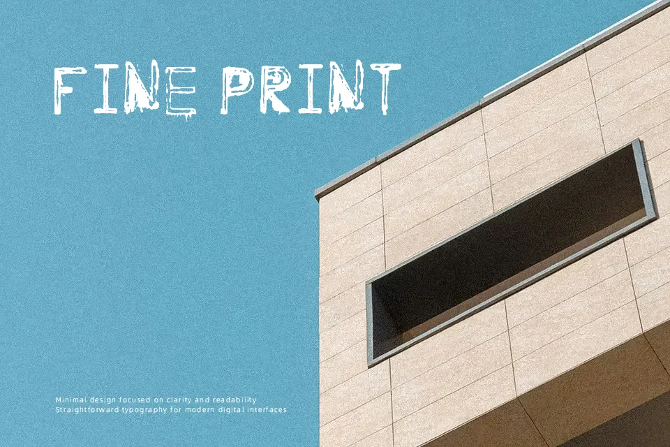
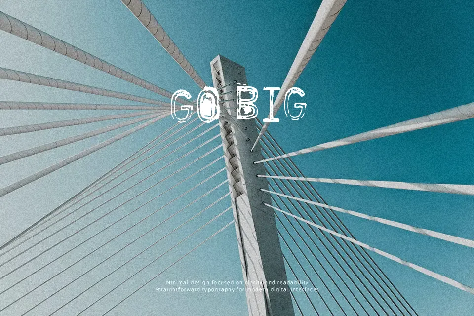
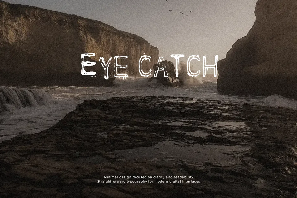
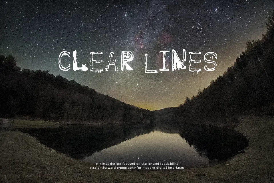
Nine Feet Under Font uses uneven, distressed display letterforms with fractured edges and a deliberately worn surface. The strokes appear heavy and irregular, giving uppercase text a rough, damaged rhythm rather than a clean geometric structure. Its proportions and visual texture create strong impact in short words, while the spacing remains more effective when the design has room to breathe. The typeface works well for large titles, cover art, and dramatic graphic treatments. The distressed detailing helps headlines stand out at larger sizes, but it can make individual characters harder to distinguish in compact settings. It is less comfortable for sustained reading or fine supporting text.
Best For: horror movie posters,heavy music cover art,grunge apparel graphics,dark event headlines
Not Ideal For: long paragraph text,small interface labels,legal documents,dense editorial layouts
Perfect for film, headline, and music, with a dark and decorative style.
License
Gallery