Nicotine Font
Free for Commercial UseAbout
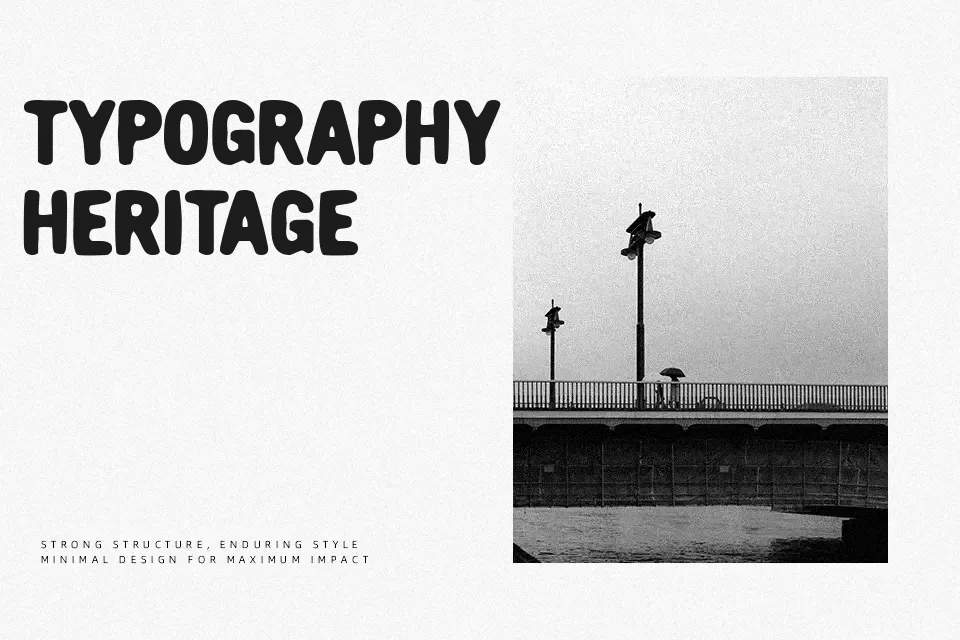
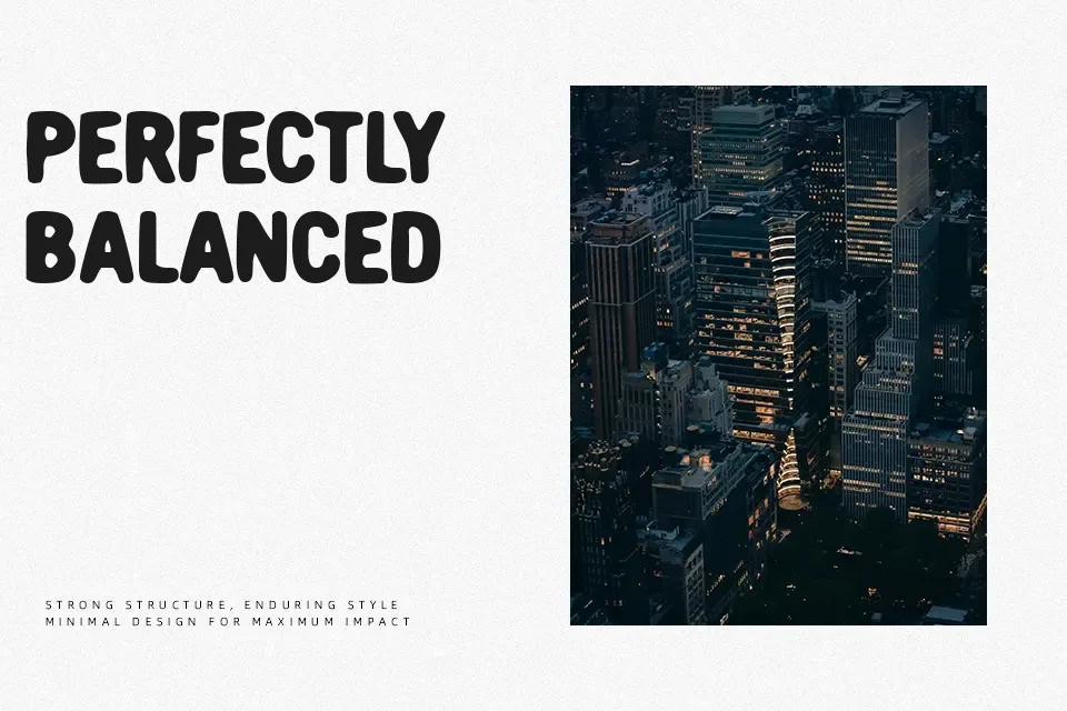
Nicotine presents each letterform with pronounced erosion, chipped contours, and broken stroke segments that give the design a visibly weathered surface. The strokes are fairly bold, but their irregular texture reduces smoothness and introduces strong visual noise, while spacing appears moderately tight, causing characters to sit close together and heightening the dense, gritty impression. Proportions lean toward sturdy, upright shapes with consistent uppercase forms, though the heavy distressing lowers clarity when reduced too far. This typeface works best at larger display sizes where the rough detailing can be appreciated and the outlines remain legible. Decorative abrasion makes it less comfortable for extended reading or small captions, and the overall design favors short, impactful text over continuous content.
Best For:
grunge music posters
extreme sports event titles
distressed branding for apparel
vintage-style product labels
Not Ideal For:
long body text
formal corporate reports
small ui labels
dense technical documentation
Perfect for branding, headline, and logo, with a bold and decorative style.
License
Gallery