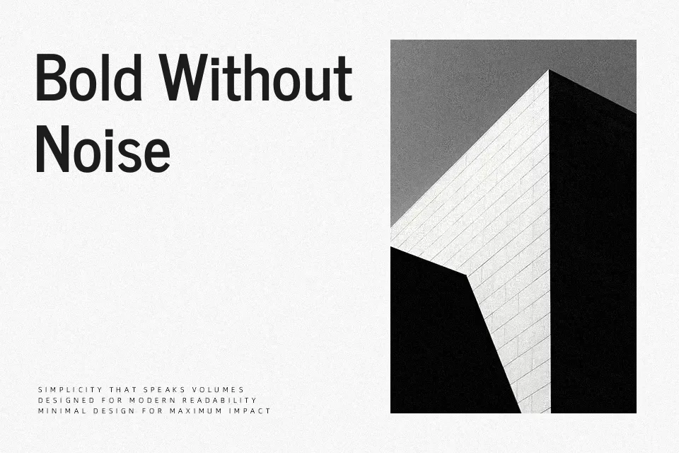
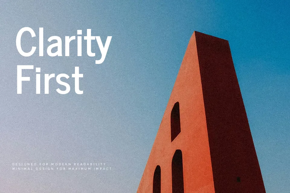
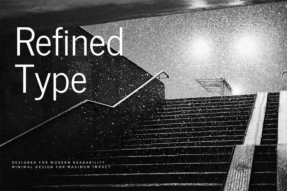
News Cycle Font
Free for Commercial UseAbout
News Cycle takes the crisp, newsprint feel of early twentieth‑century gothic type and translates it into a modern, screen-ready sans serif. Strokes are even, contrast is low, and the letters are subtly condensed, so you can fit more information without the page feeling cramped. Generous x-height and open counters keep headlines punchy and longer text surprisingly readable, especially in responsive layouts and data-heavy dashboards. I like using it when a project needs a straightforward, journalistic voice rather than something flashy. However, the lack of italics and expressive weights can be limiting for complex editorial hierarchies or highly branded identities that rely on strong contrast between styles.
Best For:
news and magazine websites
editorial-style landing pages
data dashboards and web apps
informational posters and reports
Not Ideal For:
long book interiors
formal corporate documents
brands needing expressive italics
highly decorative logo wordmarks
Perfect for advertising, body text, and editorial, with a clean and condensed style.
License
Gallery